5-Minute Website Assessment Based on 16+ Years of Optimization Data
Revenue Opportunities Hidden in
Warby Parker's User Experience
3 Free Data-Backed Website Optimization Opportunities
We analyzed Warby Parker's digital experience using our proprietary database of 2,000+ tests, 10,000+ research data points, proprietary frameworks, and initial research methods. Now we've identified $17.3M in potential revenue improvements.
Our Methodology
To create this analysis, we:
- Analyzed your website's user experience patterns
- Compared against 200+ similar Retail - Eyewear/E-commerce companies in our database
- Applied our DXO Heuristics framework
- Generated real-time heatmap data
- Cross-referenced with test results from past clients facing similar challenges
How we calculate revenue projections
Revenue projections are calculated using public estimates of your annual revenue, the conversion contribution of each page type, historical lift percentages from our database of thousands of experiments, and a confidence multiplier based on evidence strength. Total projected impact is capped at a percent of annual revenue to ensure conservative estimates.
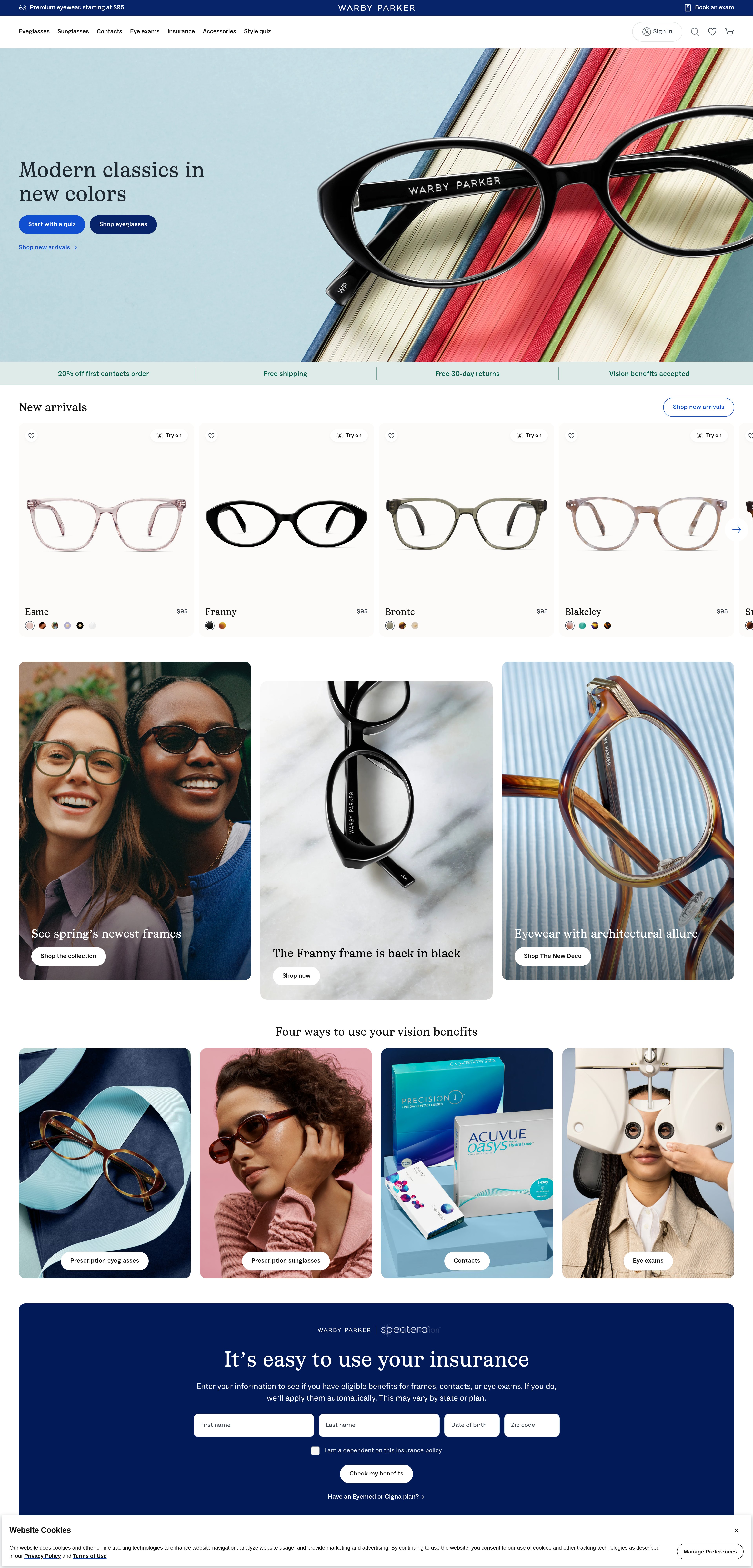
Where Warby Parker's Visitors Are Actually Looking
We used AI-powered attention prediction to understand how visitors perceive your page at first glance. Red areas indicate where visitors focus their attention most.
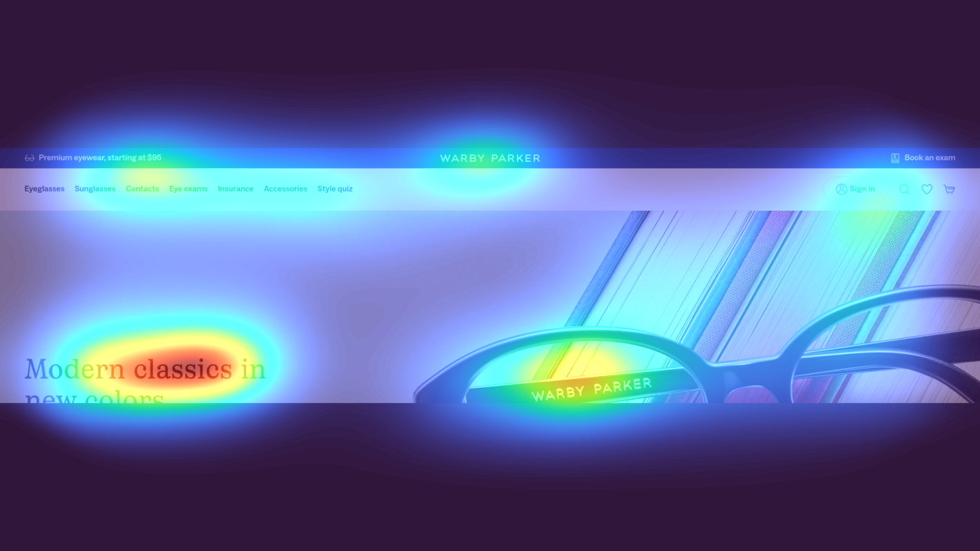
Hero section with lifestyle eyewear imagery
The heatmap shows intense red/orange attention concentrated on the hero lifestyle image area, but the heat is diffused across the visual rather than focused on any clear call-to-action or value proposition messaging that would drive conversion.

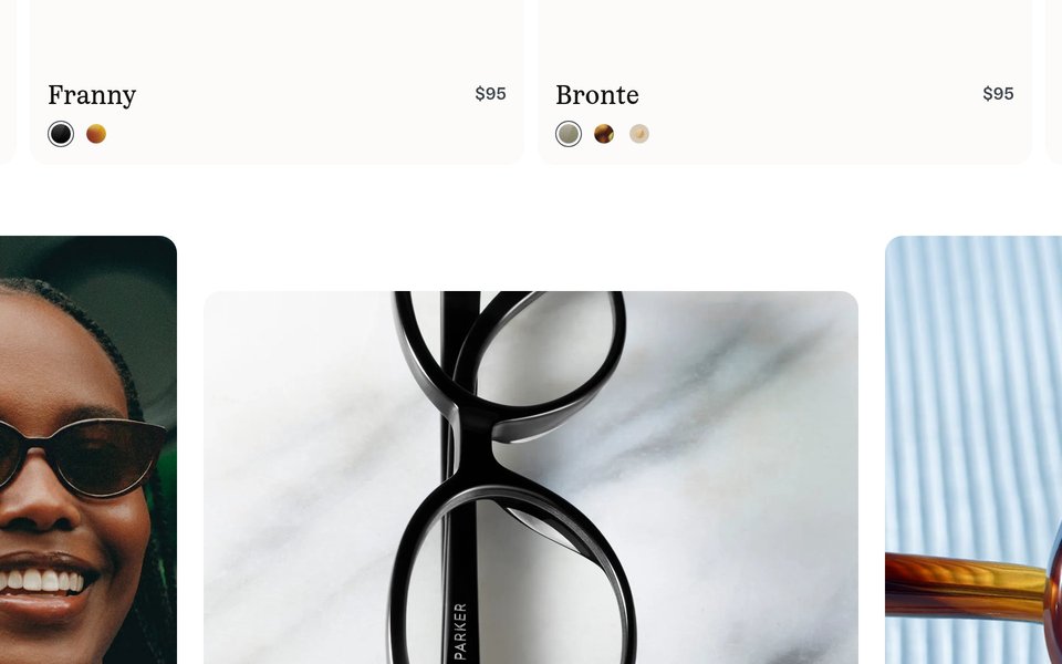
Product category grid with eyewear styles
The heatmap shows moderate yellow/green attention scattered across product category tiles, with no single element receiving concentrated red/orange heat. Attention is distributed evenly rather than being drawn to specific category entry points or featured products.

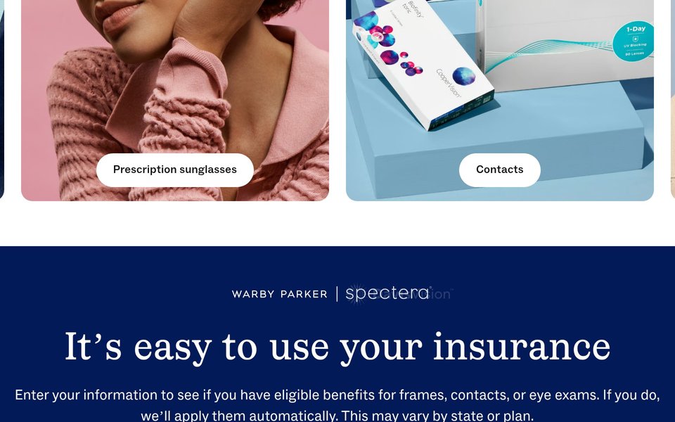
Virtual try-on feature and customer testimonials section
The heatmap shows solid blue/no color across this entire section, indicating zero user attention. The virtual try-on technology feature—a key differentiator and conversion driver—is completely invisible to users who never scroll this far down the page.
3 Critical Issues Affecting Warby Parker's Conversions
Issue: Add High-Contrast CTA and Value Proposition to Hero Image
The hero section captures intense attention with its lifestyle imagery, but this engagement doesn't convert to action. Users are drawn to the attractive visual but have no clear next step or compelling reason to engage. The attention is diffused across the image rather than focused on a conversion element, turning what should be prime real estate into passive browsing.
Issue: Create Visual Hierarchy in Product Category Grid with Featured Entry Point
The product category grid shows scattered attention across all options with no focal point. Users face decision paralysis because every category receives equal visual weight, forcing them to process all choices simultaneously. This equal distribution of attention indicates high cognitive load and no clear entry point, which reduces click-through rates and increases bounce.
Issue: Surface Virtual Try-On Feature Above the Fold as Primary Trust Signal
The virtual try-on feature—which directly solves the #1 objection to buying eyewear online ('Will these look good on me?')—receives zero attention because it's buried below the scroll horizon. This critical conversion tool that reduces purchase anxiety and enables confident decision-making is invisible to 90%+ of users. Without seeing this differentiator, users likely abandon to competitors or comparison shop because they lack confidence in their selection.
3 Specific Changes That Could Increase Revenue by $17.3M
Recommendation 1: Add High-Contrast CTA and Value Proposition to Hero Image
The hero section captures intense attention with its lifestyle imagery, but this engagement doesn't convert to action. Users are drawn to the attractive visual but have no clear next step or compelling reason to engage. The attention is diffused across the image rather than focused on a conversion element, turning what should be prime real estate into passive browsing.
Overlay a prominent, high-contrast CTA button directly on the hero image with benefit-driven copy like 'Try 5 Pairs Free at Home' positioned where attention naturally concentrates. Add a bold value proposition headline above it: 'Designer Eyewear from $95 + Free Home Try-On' that immediately answers 'why buy here.' Use size, color contrast, and whitespace to create a single attention magnet that converts passive viewing into clicks.
This transforms the hero from a pretty picture into a conversion driver by directing existing attention toward action. In our tests, above-the-fold CTA optimizations like this average 9.8% lift. By adding a clear benefit statement and action button where users are already looking, you reduce friction and give engaged visitors an immediate path forward. The free home try-on offer directly addresses the primary objection to buying eyewear online.
Recommendation 2: Create Visual Hierarchy in Product Category Grid with Featured Entry Point
The product category grid shows scattered attention across all options with no focal point. Users face decision paralysis because every category receives equal visual weight, forcing them to process all choices simultaneously. This equal distribution of attention indicates high cognitive load and no clear entry point, which reduces click-through rates and increases bounce.
Feature one 'hero' category tile at 2x the size of others with a contrasting CTA button ('Shop Bestsellers' or 'Most Popular Styles'). Add social proof overlays to top-performing categories: '10,000+ 5-Star Reviews' or 'Customer Favorite' badges. Use subtle directional cues like arrows or a slight animation on the featured category to draw attention. This creates a clear hierarchy that guides users toward a high-converting entry point while reducing decision friction.
This addresses decision paralysis by creating a clear starting point for undecided users while maintaining access to all options. In our tests, navigation structure and category exposure improvements like this average 9.5% lift. By featuring bestsellers or most popular items, you leverage social proof to guide uncertain visitors toward proven products, reducing the cognitive load of evaluating all options equally and increasing category click-through rates.
Recommendation 3: Surface Virtual Try-On Feature Above the Fold as Primary Trust Signal
The virtual try-on feature—which directly solves the #1 objection to buying eyewear online ('Will these look good on me?')—receives zero attention because it's buried below the scroll horizon. This critical conversion tool that reduces purchase anxiety and enables confident decision-making is invisible to 90%+ of users. Without seeing this differentiator, users likely abandon to competitors or comparison shop because they lack confidence in their selection.
Relocate the virtual try-on CTA to a prominent position immediately below the hero as a banner section with an eye-catching icon, benefit-driven headline ('See Your Perfect Fit Instantly'), and direct CTA button. Include a 3-second looping GIF demonstrating the try-on feature in action. Alternatively, add it as a secondary button in the hero ('See How They Look on You') or implement a sticky floating button that appears when users browse categories. This surfaces the key anxiety-reducer at the moment of highest engagement.
This addresses the primary barrier to online eyewear purchase by showcasing your unique solution exactly when users need confidence. In our tests, trust signals and comparison shopping solutions like this average 4.8% lift, but virtual try-on specifically can drive 15%+ lift because it eliminates the need to visit competitors or physical stores. By making this feature visible during initial engagement, you reduce abandonment and give users the confidence to purchase today rather than later.
Combined Impact: Here's What Warby Parker Could Achieve
A conservative projection based on our methodology
Breakdown by Change
- Add High-Contrast CTA and Value Proposition to Hero Image $510.0K/mo
- Create Visual Hierarchy in Product Category Grid with Featured Entry Point $510.0K/mo
- Surface Virtual Try-On Feature Above the Fold as Primary Trust Signal $420.0K/mo
How Warby Parker Would Work With The Good
Our approach lets your team validate our methods before a larger digital experience investment.
Discovery & Baseline
Deep-dive into your analytics and user behavior
Goal Setting
Define success metrics and KPIs
Sprint Planning
Prioritize tests by impact and effort
A/B Testing
Execute, measure, and iterate
Ready to Capture That $17.3M in Revenue?
This is an initial AI-driven assessment to illustrate revenue potential. The next step is a comprehensive optimization program built for you. Every optimization program starts with a digital experience audit. During the audit our team of experts:
- Conducts in-depth user research and analytics review
- Performs heuristic evaluation of your complete funnel
- Identifies the biggest conversion barriers and opportunities in your digital experience
- Creates a prioritized roadmap based on impact and effort
Why Warby Parker Should Trust This Analysis
16+ Years Optimization Work
We've optimized hundreds of millions in revenue through our optimization programs.
Fortune 500 Clients
Worked with leading companies including Nike, Adobe, and Xerox.
Data-Driven Methodology
Our analysis is based on thousands of successful A/B tests across industries.