5-Minute Website Assessment Based on 16+ Years of Optimization Data
Revenue Opportunities Hidden in
Warby Parker's User Experience
3 Free Data-Backed Website Optimization Opportunities
We analyzed Warby Parker's digital experience using our proprietary database of 2,000+ tests, 10,000+ research data points, proprietary frameworks, and initial research methods. Now we've identified $17.3M in potential revenue improvements.
Our Methodology
To create this analysis, we:
- Analyzed your website's user experience patterns
- Compared against 200+ similar Retail - Eyewear/E-commerce companies in our database
- Applied our DXO Heuristics framework
- Generated real-time heatmap data
- Cross-referenced with test results from past clients facing similar challenges
How we calculate revenue projections
Revenue projections are calculated using public estimates of your annual revenue, the conversion contribution of each page type, historical lift percentages from our database of thousands of experiments, and a confidence multiplier based on evidence strength. Total projected impact is capped at a percent of annual revenue to ensure conservative estimates.
Where Warby Parker's Visitors Are Actually Looking
We used AI-powered attention prediction to understand how visitors perceive your page at first glance. Red areas indicate where visitors focus their attention most.

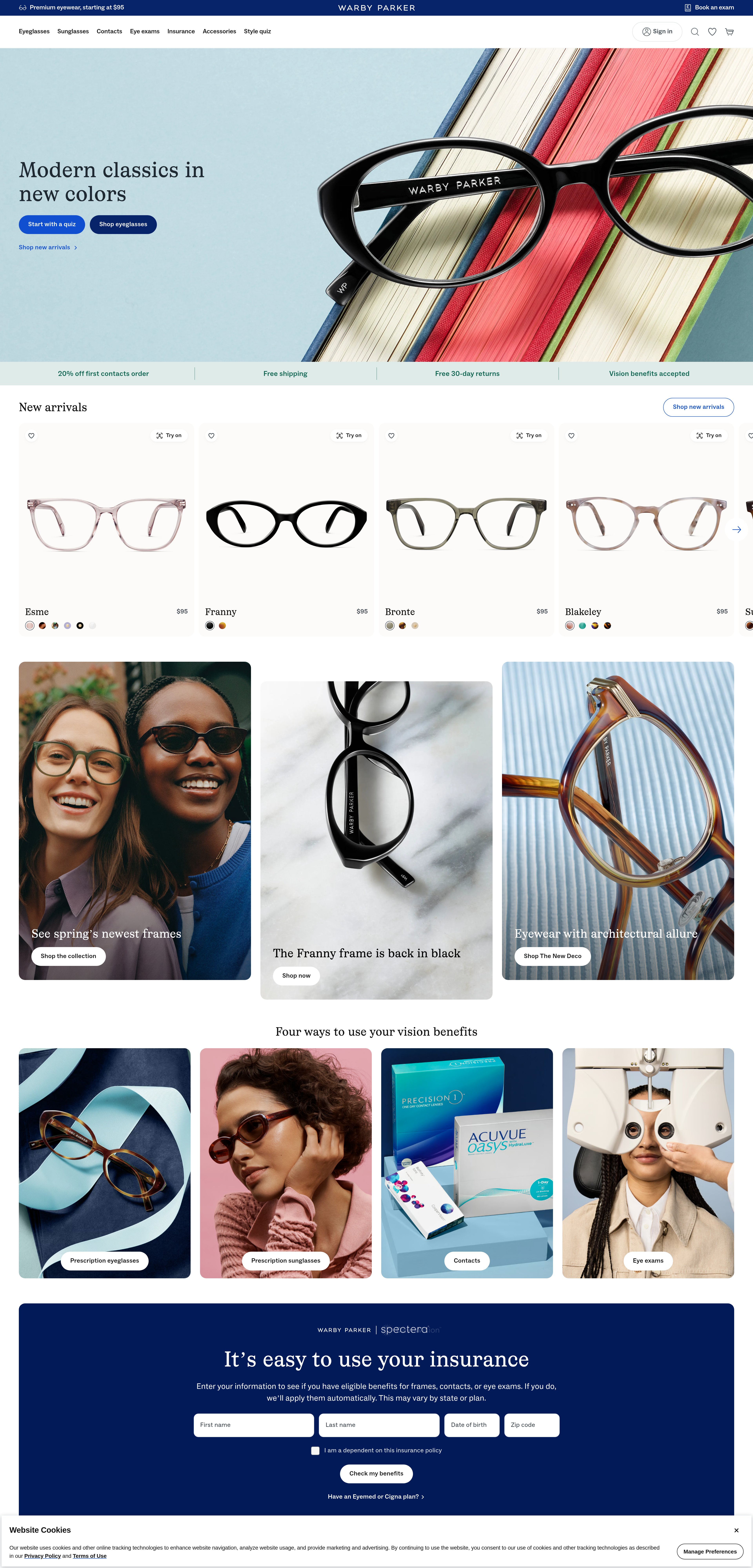
Hero section with large lifestyle image and overlaid text
The heatmap shows intense red/orange attention concentrated on the top navigation bar and logo area, with moderate yellow attention on the hero image itself. However, the heat is dispersed across the entire navigation width rather than focused on any specific call-to-action or entry point into the shopping experience.
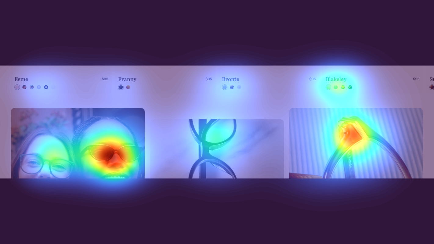
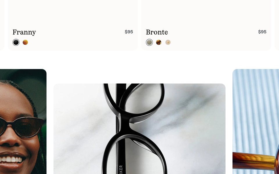
Product category grid with eyewear images
The heatmap shows minimal yellow attention with primarily green/blue coloring across what appears to be a product category grid or collection showcase. The product images and category labels are receiving significantly less attention than the hero section above, indicating users are not engaging with the core shopping content.

Virtual try-on feature section with app demonstration
The heatmap shows solid blue with no color (zero attention) across what appears to be a virtual try-on or app feature demonstration section. This critical differentiator and conversion tool is completely invisible to users, indicating severe scroll abandonment or content fatigue by this page depth.
3 Critical Issues Affecting Warby Parker's Conversions
Issue: Add Dominant Primary CTA to Hero Section
The hero section captures attention on the navigation and branding, but users aren't being directed toward a clear next action. Attention is scattered across the header rather than focused on starting the shopping journey, creating decision paralysis at the critical first impression.
Issue: Redesign Product Category Section with Attention-Grabbing Elements
The product category grid in the middle of the page receives minimal attention—mostly green/blue heat indicating users are scrolling past without engaging. This is the primary path to browse and purchase, yet it's being overlooked, creating a major conversion funnel leak.
Issue: Elevate Virtual Try-On Feature to High-Attention Zones
The virtual try-on section receives zero attention (solid blue on heatmap), meaning users never discover Warby Parker's key differentiator that reduces purchase anxiety. This friction-reducing tool that answers 'Will these look good on me?' is invisible, likely contributing to cart abandonment and returns.
3 Specific Changes That Could Increase Revenue by $17.3M
Recommendation 1: Add Dominant Primary CTA to Hero Section
The hero section captures attention on the navigation and branding, but users aren't being directed toward a clear next action. Attention is scattered across the header rather than focused on starting the shopping journey, creating decision paralysis at the critical first impression.
Add a high-contrast primary CTA button (e.g., 'Take Our Quiz' or 'Shop Bestsellers') positioned prominently in the hero area where natural reading patterns begin. Use bold color contrast, larger sizing, and surrounding whitespace to make this button the dominant focal point. Reduce visual weight of secondary navigation elements to eliminate competition for attention.
In our tests, above-the-fold optimization improvements like this average 9.8% lift. By creating a clear visual hierarchy with one dominant action, you eliminate decision paralysis and guide users directly into the conversion funnel. The hero section is your highest-attention real estate—it must convert that attention into action.
Recommendation 2: Redesign Product Category Section with Attention-Grabbing Elements
The product category grid in the middle of the page receives minimal attention—mostly green/blue heat indicating users are scrolling past without engaging. This is the primary path to browse and purchase, yet it's being overlooked, creating a major conversion funnel leak.
Redesign the product category section with larger, higher-contrast imagery and bolder category labels. Add social proof overlays to each category tile (e.g., '2,000+ 5-star reviews' or 'Bestseller' badges) to create attention-grabbing visual anchors. Consider adding subtle hover animations or auto-playing video loops on scroll to break monotony and recapture attention.
In our tests, homepage content blocks and category exposure improvements average 9.5% lift. Product categories are your primary discovery mechanism—if users don't engage here, they can't convert. Social proof elements and dynamic content create pattern interrupts that recapture declining attention as users scroll.
Recommendation 3: Elevate Virtual Try-On Feature to High-Attention Zones
The virtual try-on section receives zero attention (solid blue on heatmap), meaning users never discover Warby Parker's key differentiator that reduces purchase anxiety. This friction-reducing tool that answers 'Will these look good on me?' is invisible, likely contributing to cart abandonment and returns.
Move virtual try-on prominence to high-attention areas: add a secondary CTA button in the hero section ('Try Glasses Virtually' with phone icon) and implement a persistent floating button in the bottom-right corner that appears after 3 seconds with micro-copy: 'See how they look on you.' Also add linked text near product CTAs higher on the page: 'Not sure? Use our Virtual Try-On.'
In our tests, trust signals and tools that reduce comparison shopping average 4.8% lift. Virtual try-on directly addresses the #1 objection to buying glasses online—fit and appearance uncertainty. By surfacing this feature where users actually look, you reduce friction at the consideration stage and lower return rates.
Combined Impact: Here's What Warby Parker Could Achieve
A conservative projection based on our methodology
Breakdown by Change
- Add Dominant Primary CTA to Hero Section $510.0K/mo
- Redesign Product Category Section with Attention-Grabbing Elements $510.0K/mo
- Elevate Virtual Try-On Feature to High-Attention Zones $420.0K/mo
How Warby Parker Would Work With The Good
Our approach lets your team validate our methods before a larger digital experience investment.
Discovery & Baseline
Deep-dive into your analytics and user behavior
Goal Setting
Define success metrics and KPIs
Sprint Planning
Prioritize tests by impact and effort
A/B Testing
Execute, measure, and iterate
Ready to Capture That $17.3M in Revenue?
This is an initial AI-driven assessment to illustrate revenue potential. The next step is a comprehensive optimization program built for you. Every optimization program starts with a digital experience audit. During the audit our team of experts:
- Conducts in-depth user research and analytics review
- Performs heuristic evaluation of your complete funnel
- Identifies the biggest conversion barriers and opportunities in your digital experience
- Creates a prioritized roadmap based on impact and effort
Why Warby Parker Should Trust This Analysis
16+ Years Optimization Work
We've optimized hundreds of millions in revenue through our optimization programs.
Fortune 500 Clients
Worked with leading companies including Nike, Adobe, and Xerox.
Data-Driven Methodology
Our analysis is based on thousands of successful A/B tests across industries.