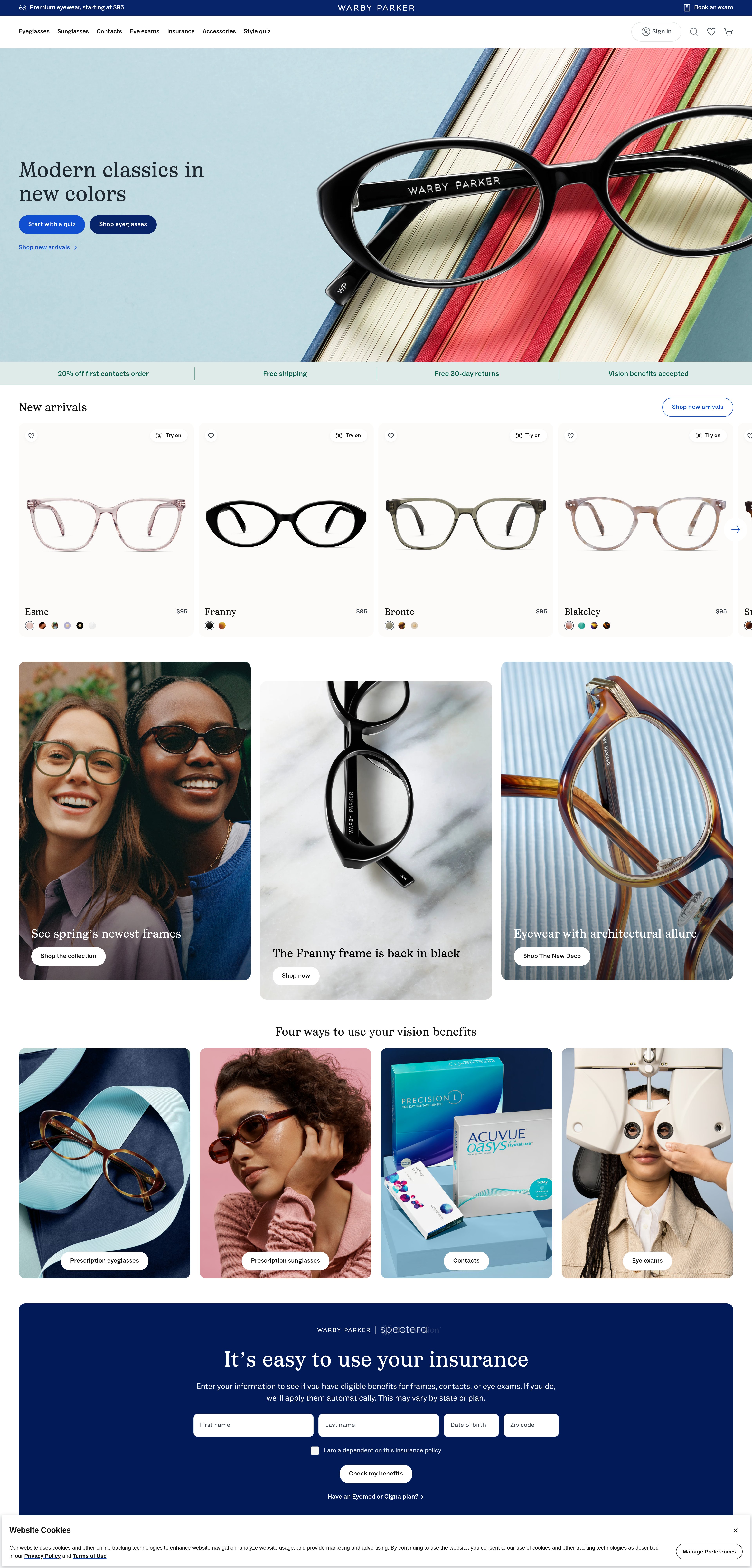
5-Minute Website Assessment Based on 16+ Years of Optimization Data
Revenue Opportunities Hidden in
Warby Parker's User Experience
3 Free Data-Backed Website Optimization Opportunities
We analyzed Warby Parker's digital experience using our proprietary database of 2,000+ tests, 10,000+ research data points, proprietary frameworks, and initial research methods. Now we've identified $18.4M in potential revenue improvements.
Our Methodology
To create this analysis, we:
- Analyzed your website's user experience patterns
- Compared against 200+ similar E-commerce Retail - Eyewear companies in our database
- Applied our DXO Heuristics framework
- Generated real-time heatmap data
- Cross-referenced with test results from past clients facing similar challenges
How we calculate revenue projections
Revenue projections are calculated using public estimates of your annual revenue, the conversion contribution of each page type, historical lift percentages from our database of thousands of experiments, and a confidence multiplier based on evidence strength. Total projected impact is capped at a percent of annual revenue to ensure conservative estimates.
Where Warby Parker's Visitors Are Actually Looking
We used AI-powered attention prediction to understand how visitors perceive your page at first glance. Red areas indicate where visitors focus their attention most.
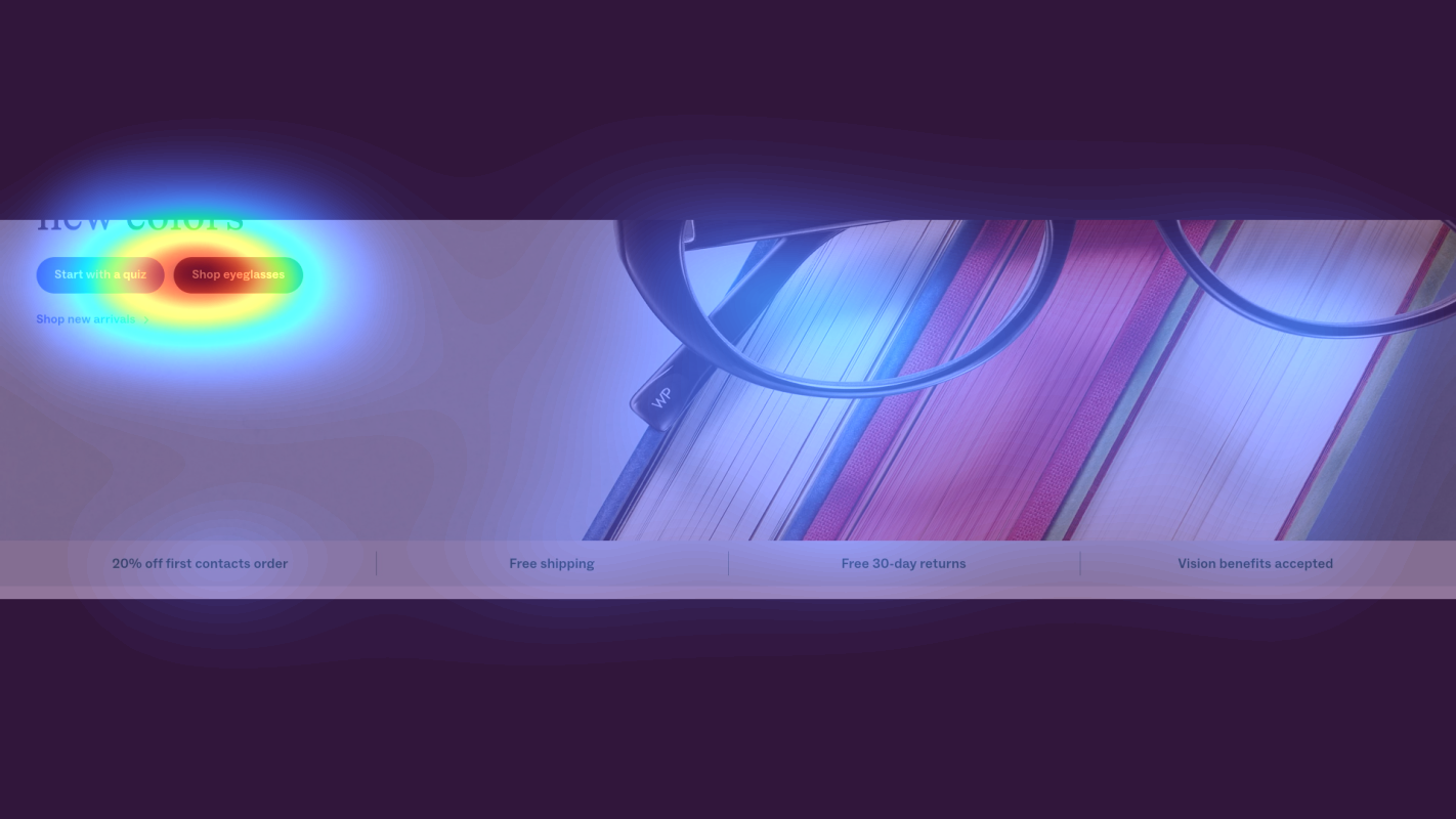
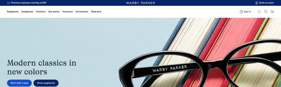
Hero section with large eyeglasses product image
The heatmap shows intense red/orange attention concentrated on the large product image of eyeglasses in the hero section, but the navigation menu and any CTAs in this area receive significantly less attention, appearing in cooler yellow/green zones
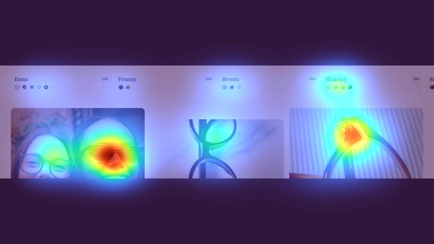
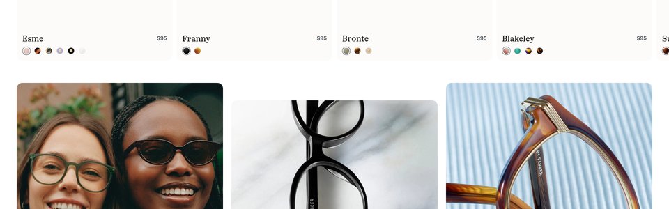
Mid-page product grid with multiple eyeglass frames displayed in rows
The heatmap reveals scattered yellow/green attention across the product grid with no clear focal point - attention is diffused across multiple product thumbnails without concentrating on any specific frame or CTA. No red/orange heat appears on product titles, prices, or action buttons

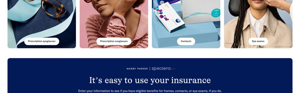
Bottom section featuring customer testimonials carousel with star ratings and 'Free Home Try-On' program details
The heatmap shows solid blue/no color across the entire testimonials and Free Home Try-On section, indicating zero user attention. The customer review cards showing 5-star ratings, the 'Try 5 frames at home for free' value proposition, and associated trust-building content are completely invisible to users who never scroll this far
3 Critical Issues Affecting Warby Parker's Conversions
Issue: Bridge Product Interest to Action with Strategic CTA Placement
The hero section's large eyeglasses product image successfully captures attention, but users' eyes aren't being guided to the primary conversion action. The heatmap shows intense red/orange heat on the product image while navigation and CTAs receive minimal attention in cooler yellow/green zones, creating a disconnect between interest and action.
Issue: Create Visual Hierarchy to Combat Decision Paralysis
The product grid shows scattered yellow/green attention with no focal point—users scan across frames without engaging deeply with any option. Critical information like pricing, frame names, and 'Try On' CTAs receive zero attention (blue zones), indicating the uniform grid creates too many equal-weight choices and decision paralysis.
Issue: Surface Risk-Free Try-On Offer Above the Fold
Warby Parker's strongest differentiator—the Free Home Try-On program—receives zero visibility. The heatmap shows solid blue (no attention) across customer testimonials and try-on details in this bottom section. Users considering a purchase never see the key trust signal that would overcome hesitation to buy eyeglasses online without trying them first.
3 Specific Changes That Could Increase Revenue by $18.4M
Recommendation 1: Bridge Product Interest to Action with Strategic CTA Placement
The hero section's large eyeglasses product image successfully captures attention, but users' eyes aren't being guided to the primary conversion action. The heatmap shows intense red/orange heat on the product image while navigation and CTAs receive minimal attention in cooler yellow/green zones, creating a disconnect between interest and action.
Reposition the primary CTA button to sit directly adjacent to or overlap the high-attention product image zone. Increase button size by 40% and use a high-contrast color (bright blue or green) to create a visual bridge from product to action. Add a directional cue like 'Start Shopping' with a subtle arrow pointing from the eyeglasses to the CTA, leveraging the existing attention flow.
Users are clearly interested in the product but aren't finding the next step. Above-the-fold optimizations like this average 9.8% lift in our test data. By positioning the CTA within the natural attention flow rather than fighting it, we reduce friction and guide engaged users directly to conversion. The high-contrast treatment ensures the button stands out even within the visually rich hero area.
Recommendation 2: Create Visual Hierarchy to Combat Decision Paralysis
The product grid shows scattered yellow/green attention with no focal point—users scan across frames without engaging deeply with any option. Critical information like pricing, frame names, and 'Try On' CTAs receive zero attention (blue zones), indicating the uniform grid creates too many equal-weight choices and decision paralysis.
Feature 2-3 bestseller frames at 1.5x size in the first row with prominent 'Most Popular' or '#1 Bestseller' badges in yellow. Add hover interactions that enlarge frames by 20% and display tooltips with key benefits ('Lightweight titanium', '500+ 5-star reviews'). Replace individual product CTAs with a persistent 'Virtual Try-On' button that follows scroll, positioned center-screen in the high-attention zone.
Navigation structure improvements like this average 9.4% lift in our tests, and product attribute visibility changes average 10.5% lift. By breaking the monotony with featured bestsellers, we give users a clear starting point and reduce cognitive load. The persistent try-on CTA keeps the conversion path visible as users browse, addressing the current problem where action buttons are completely ignored.
Recommendation 3: Surface Risk-Free Try-On Offer Above the Fold
Warby Parker's strongest differentiator—the Free Home Try-On program—receives zero visibility. The heatmap shows solid blue (no attention) across customer testimonials and try-on details in this bottom section. Users considering a purchase never see the key trust signal that would overcome hesitation to buy eyeglasses online without trying them first.
Add a secondary CTA in the hero section next to the main shop button: 'Try 5 Frames Free at Home' with '📦 No risk, free shipping' subtext. Insert a persistent banner between product grid rows 2-3 featuring a customer photo with '⭐⭐⭐⭐⭐ 4.9/5 from 50,000+ Home Try-On customers' linking to full details. Place top 3 testimonial snippets as badge callouts directly next to 'Add to Cart' buttons on product cards.
Trust signals and social proof average 4.8% lift in our tests, but this recommendation also addresses homepage content block optimization (9.5% avg lift) by surfacing buried value propositions. For eyeglasses—a high-consideration purchase with fit/style risk—the try-on program removes the primary objection. By making it visible during the browsing phase rather than after scroll-off, we reduce abandonment and build confidence at the critical decision moment.
Combined Impact: Here's What Warby Parker Could Achieve
A conservative projection based on our methodology
Breakdown by Change
- Bridge Product Interest to Action with Strategic CTA Placement $510.0K/mo
- Create Visual Hierarchy to Combat Decision Paralysis $510.0K/mo
- Surface Risk-Free Try-On Offer Above the Fold $510.0K/mo
How Warby Parker Would Work With The Good
Our approach lets your team validate our methods before a larger digital experience investment.
Discovery & Baseline
Deep-dive into your analytics and user behavior
Goal Setting
Define success metrics and KPIs
Sprint Planning
Prioritize tests by impact and effort
A/B Testing
Execute, measure, and iterate
Ready to Capture That $18.4M in Revenue?
This is an initial AI-driven assessment to illustrate revenue potential. The next step is a comprehensive optimization program built for you. Every optimization program starts with a digital experience audit. During the audit our team of experts:
- Conducts in-depth user research and analytics review
- Performs heuristic evaluation of your complete funnel
- Identifies the biggest conversion barriers and opportunities in your digital experience
- Creates a prioritized roadmap based on impact and effort
Why Warby Parker Should Trust This Analysis
16+ Years Optimization Work
We've optimized hundreds of millions in revenue through our optimization programs.
Fortune 500 Clients
Worked with leading companies including Nike, Adobe, and Xerox.
Data-Driven Methodology
Our analysis is based on thousands of successful A/B tests across industries.