5-Minute Website Assessment Based on 16+ Years of Optimization Data
Revenue Opportunities Hidden in
Rippling's User Experience
3 Free Data-Backed Website Optimization Opportunities
We analyzed Rippling's digital experience using our proprietary database of 2,000+ tests, 10,000+ research data points, proprietary frameworks, and initial research methods. Now we've identified $6.8M in potential revenue improvements.
Our Methodology

To create this analysis, we:
- Analyzed your website's user experience patterns
- Compared against 200+ similar SaaS companies in our database
- Applied our DXO Heuristics framework
- Generated real-time heatmap data
- Cross-referenced with test results from past clients facing similar challenges
How we calculate revenue projections
Revenue projections are calculated using public estimates of your annual revenue, the conversion contribution of each page type, historical lift percentages from our database of thousands of experiments, and a confidence multiplier based on evidence strength. Total projected impact is capped at a percent of annual revenue to ensure conservative estimates.
Where Rippling's Visitors Are Actually Looking
We used AI-powered attention prediction to understand how visitors perceive your page at first glance. Red areas indicate where visitors focus their attention most.
Primary CTA button
The main CTA button receives relatively low attention (green/blue) despite its important conversion role
Value proposition section
The main value proposition headline shows moderate attention (yellow) but lacks strong engagement
Navigation menu
Navigation menu items are receiving high attention (red/orange) compared to conversion-focused elements
3 Critical Issues Affecting Rippling's Conversions
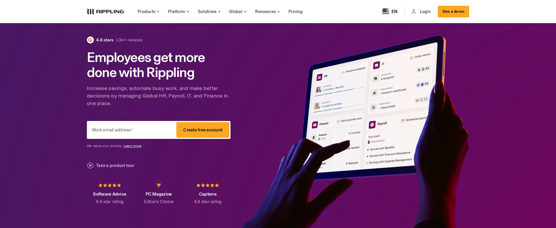
Issue: Enhance Hero CTA Visibility and Form Focus
The hero section's CTA receives low attention (green/blue on heatmap) and combines multiple competing elements creating decision paralysis
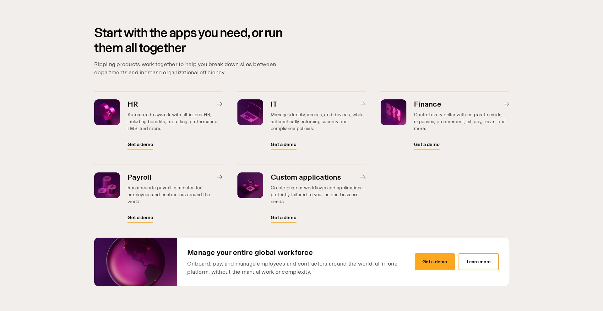
Issue: Consolidate Product Grid CTAs
Multiple identical 'Get a demo' CTAs across product cards create choice fatigue and dilute conversion focus, with moderate attention (yellow) on value propositions
Issue: Simplify Navigation Menu Structure
Navigation menu items receive excessive attention (red/orange on heatmap) compared to conversion elements, with multiple high-level categories creating confusion
3 Specific Changes That Could Increase Revenue by $6.8M
Recommendation 1: Enhance Hero CTA Visibility and Form Focus
The hero section's CTA receives low attention (green/blue on heatmap) and combines multiple competing elements creating decision paralysis
Simplify the hero section by removing the registration banner, increasing CTA contrast with a vibrant blue button, and adding white space around the form area to create visual hierarchy
Reducing visual noise and increasing CTA visibility will improve form completion rates by making the primary action more obvious and compelling
Recommendation 2: Consolidate Product Grid CTAs
Multiple identical 'Get a demo' CTAs across product cards create choice fatigue and dilute conversion focus, with moderate attention (yellow) on value propositions
Replace individual demo CTAs with a single prominent 'See Full Platform Demo' button below the product grid, and lead with specific metrics in product card headlines
A unified CTA reduces decision complexity while stronger benefit-focused headlines will increase engagement with product offerings
Recommendation 3: Simplify Navigation Menu Structure
Navigation menu items receive excessive attention (red/orange on heatmap) compared to conversion elements, with multiple high-level categories creating confusion
Implement a simplified mega menu with clear category groupings and visual hierarchy, reducing the number of top-level items from 5 to 3
Streamlined navigation reduces cognitive load and helps visitors focus on core conversion elements instead of getting lost in menu options
Combined Impact: Here's What Rippling Could Achieve
A conservative projection based on our methodology
Breakdown by Change
- Enhance Hero CTA Visibility and Form Focus $212.5K/mo
- Consolidate Product Grid CTAs $175.0K/mo
- Simplify Navigation Menu Structure $175.0K/mo
How Rippling Would Work With The Good
Our approach lets your team validate our methods before a larger digital experience investment.
Discovery & Baseline
Deep-dive into your analytics and user behavior
Goal Setting
Define success metrics and KPIs
Sprint Planning
Prioritize tests by impact and effort
A/B Testing
Execute, measure, and iterate
Ready to Capture That $6.8M in Revenue?
This is an initial AI-driven assessment to illustrate revenue potential. The next step is a comprehensive optimization program built for you. Every optimization program starts with a digital experience audit. During the audit our team of experts:
- Conducts in-depth user research and analytics review
- Performs heuristic evaluation of your complete funnel
- Identifies the biggest conversion barriers and opportunities in your digital experience
- Creates a prioritized roadmap based on impact and effort
Why Rippling Should Trust This Analysis
16+ Years Optimization Work
We've optimized hundreds of millions in revenue through our optimization programs.
Fortune 500 Clients
Worked with leading companies including Nike, Adobe, and Xerox.
Data-Driven Methodology
Our analysis is based on thousands of successful A/B tests across industries.