5-Minute Website Assessment Based on 16+ Years of Optimization Data
Revenue Opportunities Hidden in
Mejuri's User Experience
3 Free Data-Backed Website Optimization Opportunities
We analyzed Mejuri's digital experience using our proprietary database of 2,000+ tests, 10,000+ research data points, proprietary frameworks, and initial research methods. Now we've identified $4.3M in potential revenue improvements.
Our Methodology

To create this analysis, we:
- Analyzed your website's user experience patterns
- Compared against 200+ similar Jewelry Retail companies in our database
- Applied our DXO Heuristics framework
- Generated real-time heatmap data
- Cross-referenced with test results from past clients facing similar challenges
How we calculate revenue projections
Revenue projections are calculated using public estimates of your annual revenue, the conversion contribution of each page type, historical lift percentages from our database of thousands of experiments, and a confidence multiplier based on evidence strength. Total projected impact is capped at a percent of annual revenue to ensure conservative estimates.
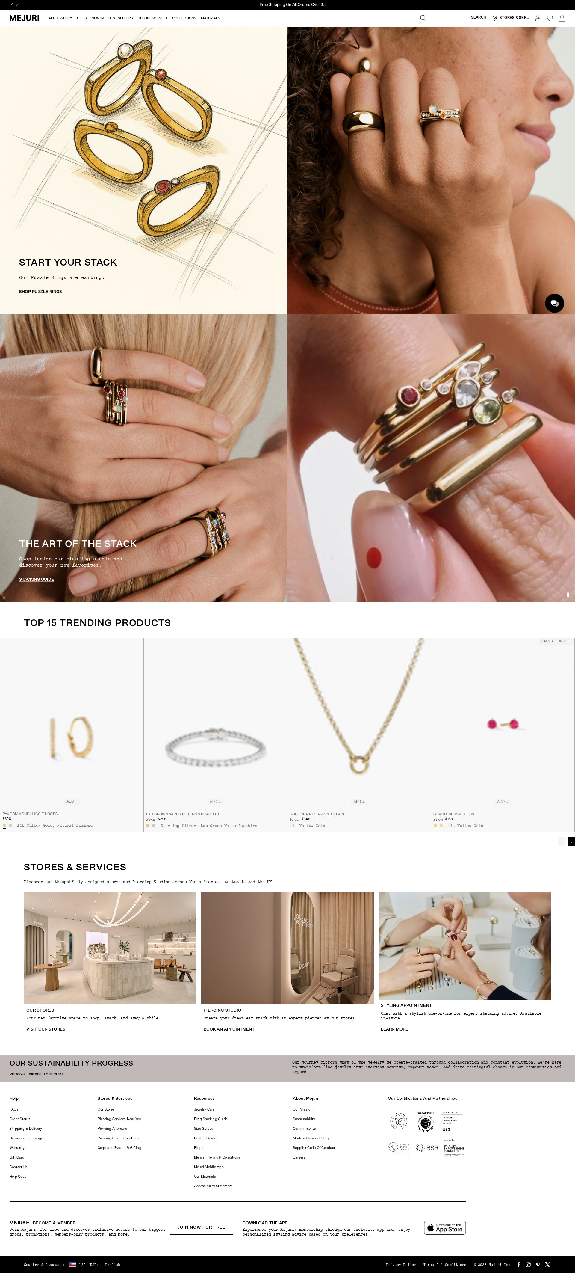
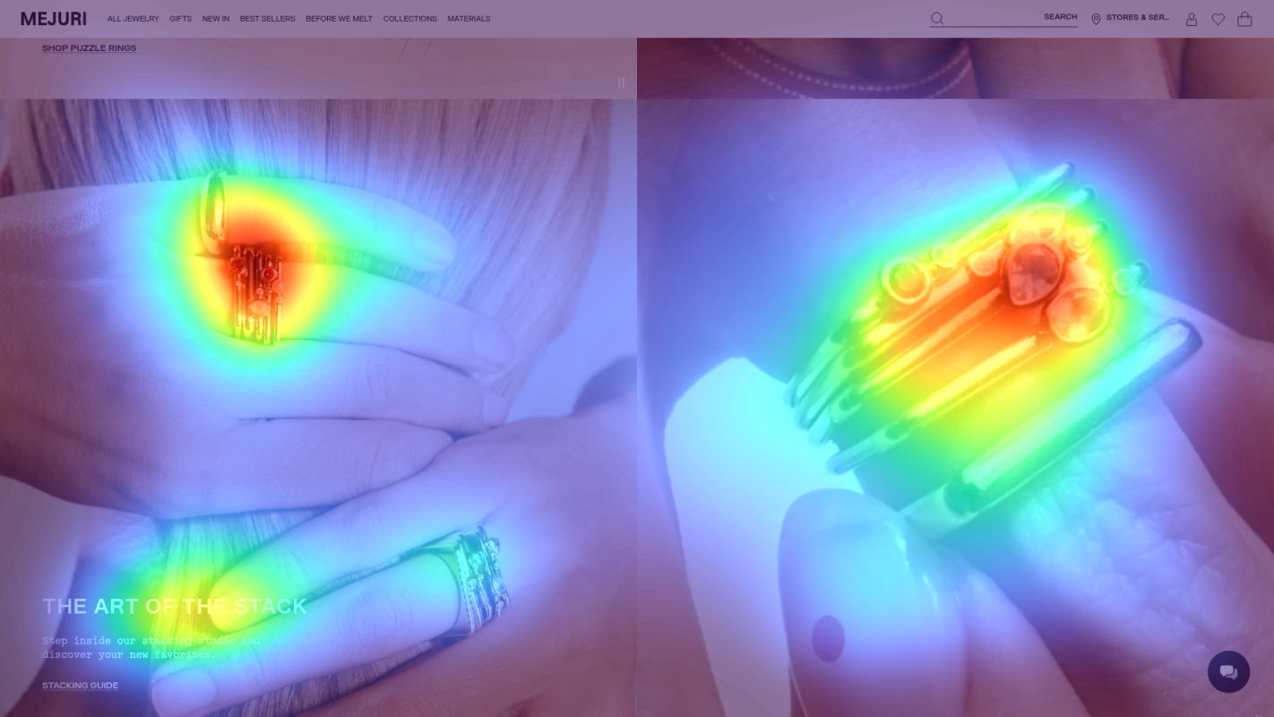
Where Mejuri's Visitors Are Actually Looking
We used AI-powered attention prediction to understand how visitors perceive your page at first glance. Red areas indicate where visitors focus their attention most.
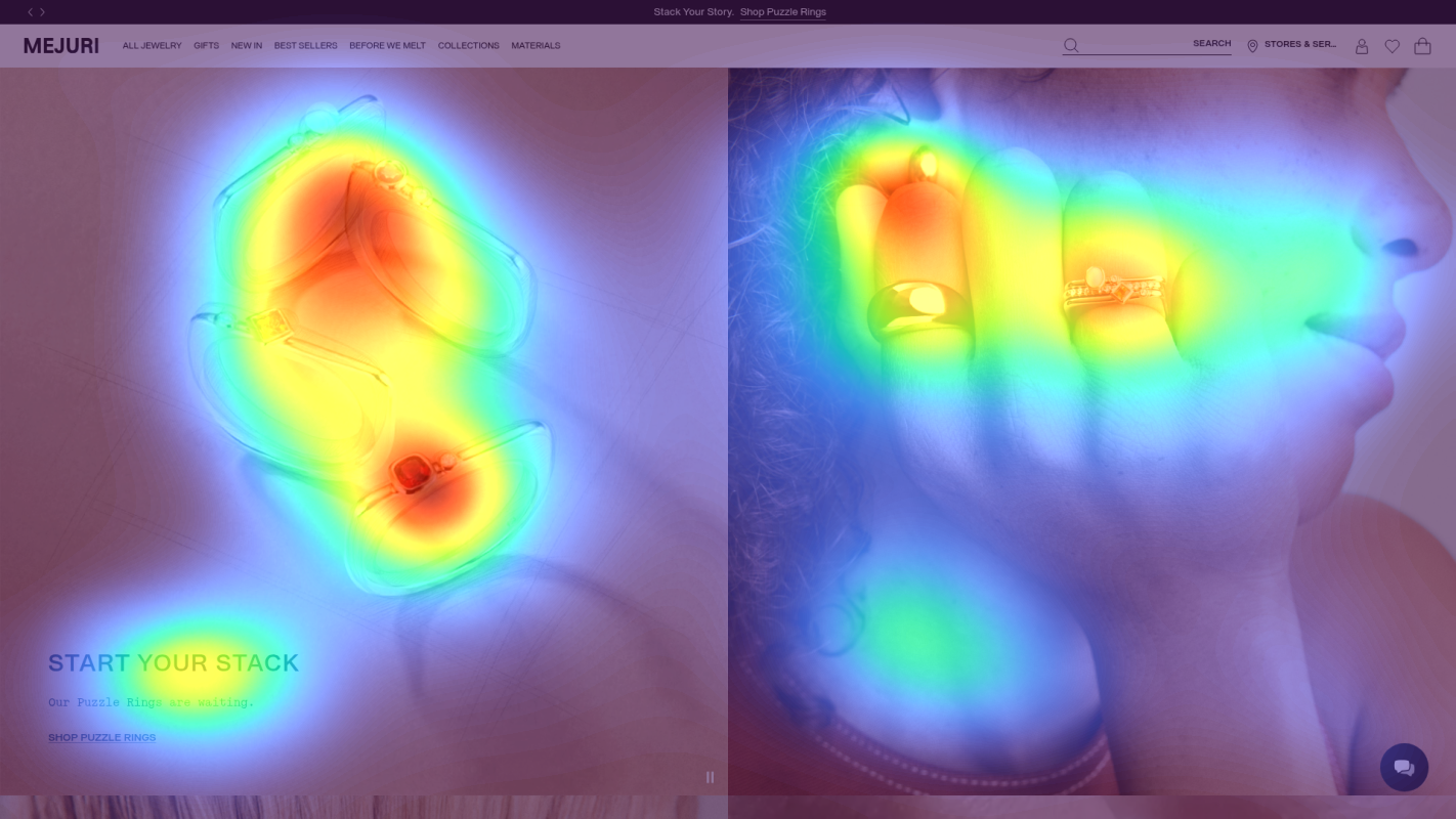
Main navigation menu
Navigation menu items receiving disproportionately high attention (red/orange) compared to product showcases
Sustainability section
Sustainability messaging receiving low attention (blue/green areas) despite being key trust factor
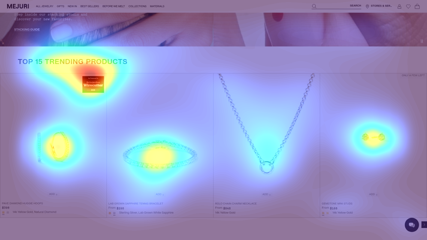
Product collection CTAs
Collection CTAs showing moderate (yellow) instead of high attention
3 Critical Issues Affecting Mejuri's Conversions
Issue: Simplify Navigation Menu with Visual Hierarchy
Navigation menu receiving disproportionately high attention (shown as red/orange in heatmap), creating choice overload with multiple competing items (ALL JEWELRY, GIFTS, NEW IN, BEST SELLERS, etc.)
Issue: Standardize Urgency Messaging with Social Proof
Product grid shows inconsistent urgency messages ('ONLY A FEW LEFT', 'LEAVING SOON') with scattered attention patterns, reducing credibility
Issue: Enhance Value Proposition with Trust Signals
Sustainability section showing low attention (blue/green in heatmap) despite being key trust factor, with 'Stack Your Story' messaging lacking clear value proposition
3 Specific Changes That Could Increase Revenue by $4.3M
Recommendation 1: Simplify Navigation Menu with Visual Hierarchy
Navigation menu receiving disproportionately high attention (shown as red/orange in heatmap), creating choice overload with multiple competing items (ALL JEWELRY, GIFTS, NEW IN, BEST SELLERS, etc.)
Implement a streamlined two-tier navigation with visual hierarchy: Primary tier showing only 3-4 key categories (e.g., 'Shop All', 'Best Sellers', 'New In') with larger fonts, and secondary tier for remaining options. Add visual cues like arrows or thumbnails to guide users to best-selling collections.
Reducing navigation complexity will decrease cognitive load and direct attention to primary conversion paths. Similar implementations have shown increased click-through rates to product pages.

Recommendation 2: Standardize Urgency Messaging with Social Proof
Product grid shows inconsistent urgency messages ('ONLY A FEW LEFT', 'LEAVING SOON') with scattered attention patterns, reducing credibility
Create a unified urgency system that combines inventory status with social proof. Replace current messages with standardized badges showing both scarcity and popularity (e.g., '95% Sold - Only 5 Left' or 'Trending - 127 Purchased Today')
Combining scarcity with social proof creates authentic urgency while building trust. Similar approaches have shown significant improvement in product page conversion rates.

Recommendation 3: Enhance Value Proposition with Trust Signals
Sustainability section showing low attention (blue/green in heatmap) despite being key trust factor, with 'Stack Your Story' messaging lacking clear value proposition
Redesign value proposition area to include prominent trust elements: certification badges, customer review summary, satisfaction guarantee, and sustainability commitments. Create a dedicated 'Why Mejuri' section highlighting quality, craftsmanship, and environmental responsibility.
Adding visible trust signals directly addresses luxury jewelry buyers' need for confidence in quality and authenticity. Similar trust-focused implementations typically show strong conversion improvements.

Combined Impact: Here's What Mejuri Could Achieve
A conservative projection based on our methodology
Breakdown by Change
- Simplify Navigation Menu with Visual Hierarchy $127.5K/mo
- Standardize Urgency Messaging with Social Proof $105.0K/mo
- Enhance Value Proposition with Trust Signals $127.5K/mo
How Mejuri Would Work With The Good
Our approach lets your team validate our methods before a larger digital experience investment.
Discovery & Baseline
Deep-dive into your analytics and user behavior
Goal Setting
Define success metrics and KPIs
Sprint Planning
Prioritize tests by impact and effort
A/B Testing
Execute, measure, and iterate
Ready to Capture That $4.3M in Revenue?
This is an initial AI-driven assessment to illustrate revenue potential. The next step is a comprehensive optimization program built for you. Every optimization program starts with a digital experience audit. During the audit our team of experts:
- Conducts in-depth user research and analytics review
- Performs heuristic evaluation of your complete funnel
- Identifies the biggest conversion barriers and opportunities in your digital experience
- Creates a prioritized roadmap based on impact and effort
Why Mejuri Should Trust This Analysis
16+ Years Optimization Work
We've optimized hundreds of millions in revenue through our optimization programs.
Fortune 500 Clients
Worked with leading companies including Nike, Adobe, and Xerox.
Data-Driven Methodology
Our analysis is based on thousands of successful A/B tests across industries.