5-Minute Website Assessment Based on 16+ Years of Optimization Data
Revenue Opportunities Hidden in
Mejuri's User Experience
3 Free Data-Backed Website Optimization Opportunities
We analyzed Mejuri's digital experience using our proprietary database of 2,000+ tests, 10,000+ research data points, proprietary frameworks, and initial research methods. Now we've identified $4.3M in potential revenue improvements.
Our Methodology

To create this analysis, we:
- Analyzed your website's user experience patterns
- Compared against 200+ similar E-commerce Jewelry Retail companies in our database
- Applied our DXO Heuristics framework
- Generated real-time heatmap data
- Cross-referenced with test results from past clients facing similar challenges
How we calculate revenue projections
Revenue projections are calculated using public estimates of your annual revenue, the conversion contribution of each page type, historical lift percentages from our database of thousands of experiments, and a confidence multiplier based on evidence strength. Total projected impact is capped at a percent of annual revenue to ensure conservative estimates.
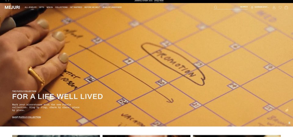
Where Mejuri's Visitors Are Actually Looking
We used AI-powered attention prediction to understand how visitors perceive your page at first glance. Red areas indicate where visitors focus their attention most.
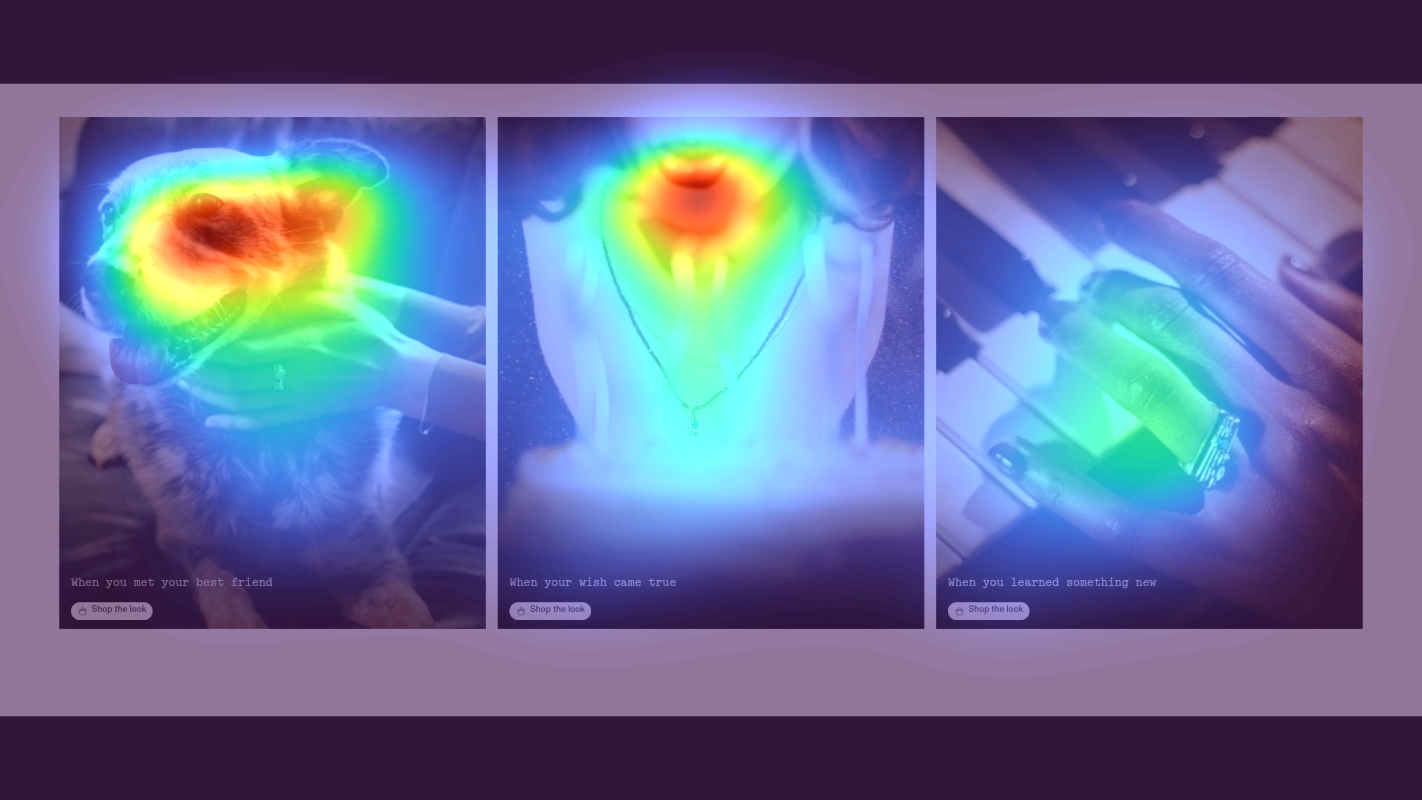
Hero section with 'THE PUZZLE COLLECTION' headline and lifestyle imagery
The heatmap shows intense red/orange attention on the hero lifestyle image and model, but the 'Shop Puzzle Collection' CTA button below receives minimal yellow attention, indicating users are drawn to the visual but not converting that interest into action
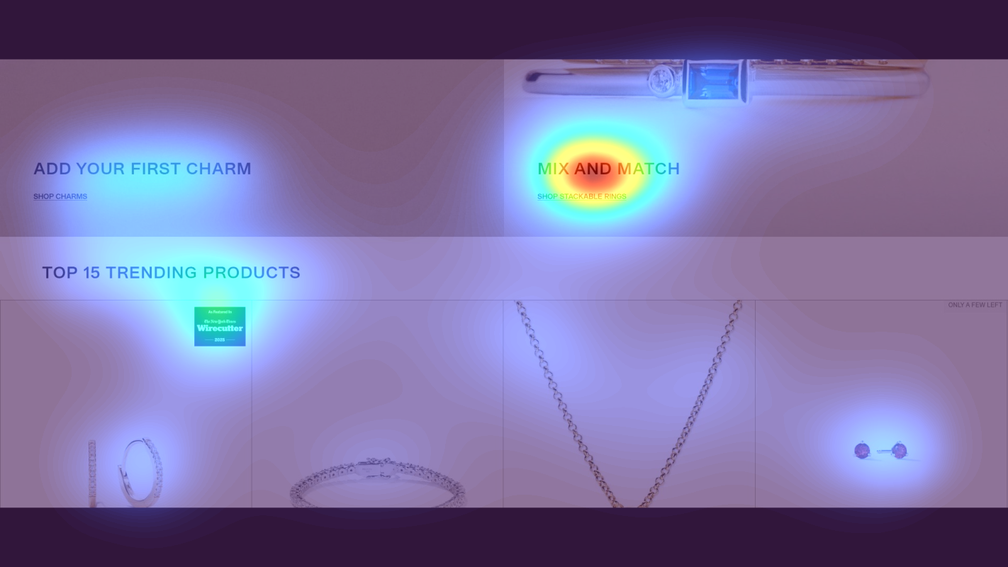
Product grid section showing 'TOP 15 TRENDING PRODUCTS' with jewelry items
The heatmap reveals moderate yellow/green attention scattered across product images, but critical conversion information like pricing ($498), material details (14k Yellow Gold), and urgency indicators ('Only a few left', 'Leaving Soon') receive almost no attention (blue/no color zones)
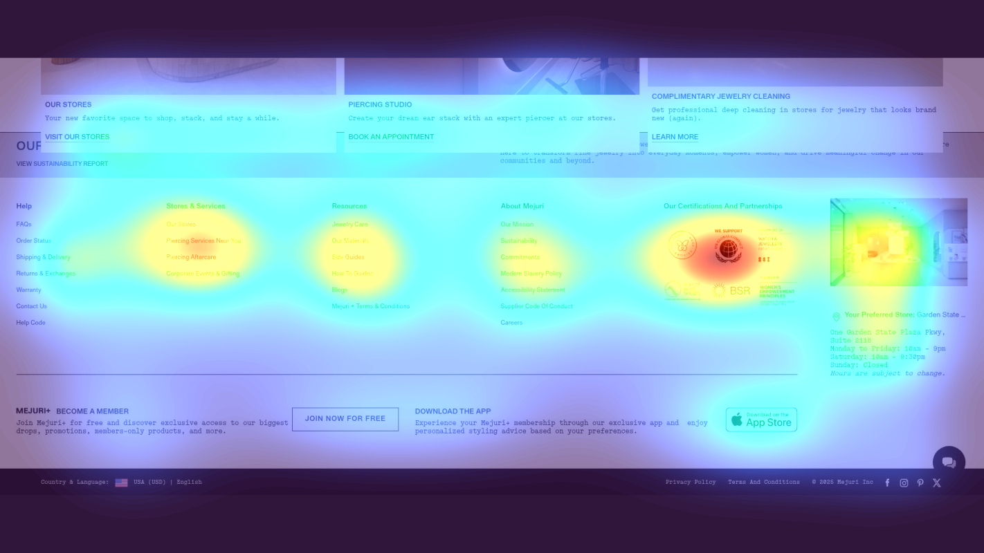
Brand story section with 'FINE JEWELRY FOR EVERY DAY' messaging and lifestyle narrative
The heatmap shows solid blue/no color across the entire brand narrative section containing the core value proposition ('jewelry isn't for waiting', 'celebrating yourself—because you deserve the damn diamond') and 'About Us' link, indicating zero user attention on messaging that differentiates Mejuri from traditional luxury jewelry retailers
3 Critical Issues Affecting Mejuri's Conversions
Issue: Make Hero CTA Visually Dominant to Capture Existing Attention
The 'Shop Puzzle Collection' CTA receives minimal attention despite intense engagement with the hero lifestyle imagery above it, causing users to admire the visual without taking action.
Issue: Surface Price and Urgency Signals in Product Grid Visual Hierarchy
The 'TOP 15 TRENDING PRODUCTS' grid shows scattered attention on product images, but pricing ($498), materials (14k Yellow Gold), and scarcity badges ('Only a few left') receive almost no attention, forcing users to click through to gather basic purchase information.
Issue: Elevate Brand Differentiation Messaging to High-Attention Zones
The brand story section containing Mejuri's core value proposition ('jewelry isn't for waiting', 'celebrating yourself—because you deserve the damn diamond') receives zero attention, eliminating the emotional differentiator that justifies premium pricing over fast-fashion jewelry.
3 Specific Changes That Could Increase Revenue by $4.3M
Recommendation 1: Make Hero CTA Visually Dominant to Capture Existing Attention
The 'Shop Puzzle Collection' CTA receives minimal attention despite intense engagement with the hero lifestyle imagery above it, causing users to admire the visual without taking action.
Increase the CTA button size by 50% and change to a high-contrast warm gold color that stands out against the lifestyle photography. Add a subtle pulsing animation to draw the eye downward from the image to the button.
Above-the-fold CTA optimization like this averages 9.8% lift in our tests. By making the button impossible to miss, we convert the strong visual engagement into click-throughs to the collection page.
Recommendation 2: Surface Price and Urgency Signals in Product Grid Visual Hierarchy
The 'TOP 15 TRENDING PRODUCTS' grid shows scattered attention on product images, but pricing ($498), materials (14k Yellow Gold), and scarcity badges ('Only a few left') receive almost no attention, forcing users to click through to gather basic purchase information.
Increase price font size by 40% and position directly below product name in bold typography. Add color-coded urgency badges ('Only 3 left' in amber, 'Leaving Soon' in red) at top-right of product images. Display material type as a pill badge with icon below price.
Product attribute visibility improvements average 10.5% lift across 29 tests in our database. Making decision factors visible at the grid level reduces friction and increases add-to-cart rates without requiring product page visits.

Recommendation 3: Elevate Brand Differentiation Messaging to High-Attention Zones
The brand story section containing Mejuri's core value proposition ('jewelry isn't for waiting', 'celebrating yourself—because you deserve the damn diamond') receives zero attention, eliminating the emotional differentiator that justifies premium pricing over fast-fashion jewelry.
Extract the headline 'Fine jewelry isn't for waiting—it's for celebrating yourself' and place it as a prominent subheadline directly below the hero section. Add a customer testimonial carousel ('I bought my first diamond for myself' - Sarah M.) between product sections at mid-page depth.
Value proposition clarity tests average 8-12% lift when key messaging moves from ignored zones to high-visibility positions. This repositioning ensures first-time visitors understand what makes Mejuri different before they comparison shop.
Combined Impact: Here's What Mejuri Could Achieve
A conservative projection based on our methodology
Breakdown by Change
- Make Hero CTA Visually Dominant to Capture Existing Attention $127.5K/mo
- Surface Price and Urgency Signals in Product Grid Visual Hierarchy $127.5K/mo
- Elevate Brand Differentiation Messaging to High-Attention Zones $105.0K/mo
How Mejuri Would Work With The Good
Our approach lets your team validate our methods before a larger digital experience investment.
Discovery & Baseline
Deep-dive into your analytics and user behavior
Goal Setting
Define success metrics and KPIs
Sprint Planning
Prioritize tests by impact and effort
A/B Testing
Execute, measure, and iterate
Ready to Capture That $4.3M in Revenue?
This is an initial AI-driven assessment to illustrate revenue potential. The next step is a comprehensive optimization program built for you. Every optimization program starts with a digital experience audit. During the audit our team of experts:
- Conducts in-depth user research and analytics review
- Performs heuristic evaluation of your complete funnel
- Identifies the biggest conversion barriers and opportunities in your digital experience
- Creates a prioritized roadmap based on impact and effort
Why Mejuri Should Trust This Analysis
16+ Years Optimization Work
We've optimized hundreds of millions in revenue through our optimization programs.
Fortune 500 Clients
Worked with leading companies including Nike, Adobe, and Xerox.
Data-Driven Methodology
Our analysis is based on thousands of successful A/B tests across industries.