5-Minute Website Assessment Based on 16+ Years of Optimization Data
Revenue Opportunities Hidden in
Mejuri's User Experience
3 Free Data-Backed Website Optimization Opportunities
We analyzed Mejuri's digital experience using our proprietary database of 2,000+ tests, 10,000+ research data points, proprietary frameworks, and initial research methods. Now we've identified $4.3M in potential revenue improvements.
Our Methodology

To create this analysis, we:
- Analyzed your website's user experience patterns
- Compared against 200+ similar E-commerce Retail - Fine Jewelry companies in our database
- Applied our DXO Heuristics framework
- Generated real-time heatmap data
- Cross-referenced with test results from past clients facing similar challenges
How we calculate revenue projections
Revenue projections are calculated using public estimates of your annual revenue, the conversion contribution of each page type, historical lift percentages from our database of thousands of experiments, and a confidence multiplier based on evidence strength. Total projected impact is capped at a percent of annual revenue to ensure conservative estimates.
Where Mejuri's Visitors Are Actually Looking
We used AI-powered attention prediction to understand how visitors perceive your page at first glance. Red areas indicate where visitors focus their attention most.
Hero section with 'The Puzzle Collection' lifestyle imagery and product showcase
The heatmap shows intense red/orange attention on the hero lifestyle imagery featuring jewelry worn by models, but the primary CTA button 'PIECE IT TOGETHER' receives noticeably less heat (yellow/green), indicating users are drawn to the visual but not converting that interest into action.

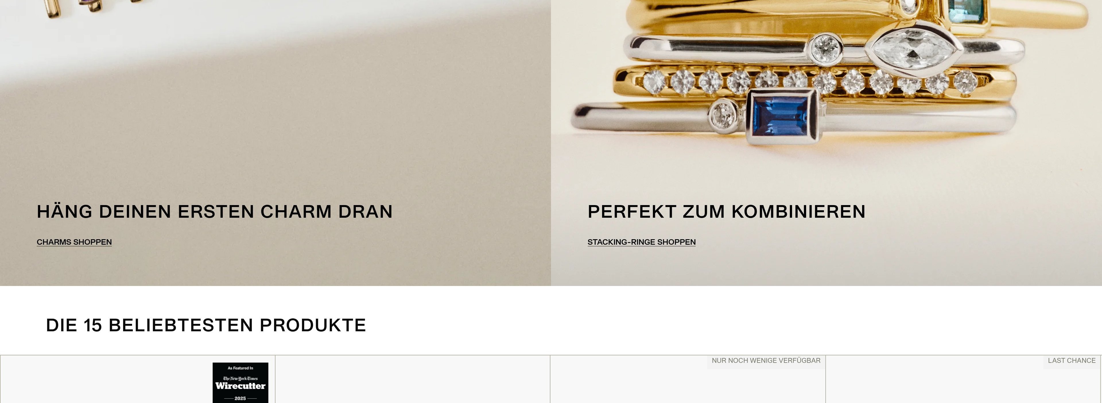
Product carousel showing 'TOP 15 TRENDING PRODUCTS' with jewelry items and pricing
The heatmap reveals moderate yellow/green attention scattered across product thumbnails, but critical conversion information like the 'Add' buttons and product titles receive minimal heat. The pricing shows slightly more attention (yellow), but the overall engagement is fragmented with no clear focal point on any single product.
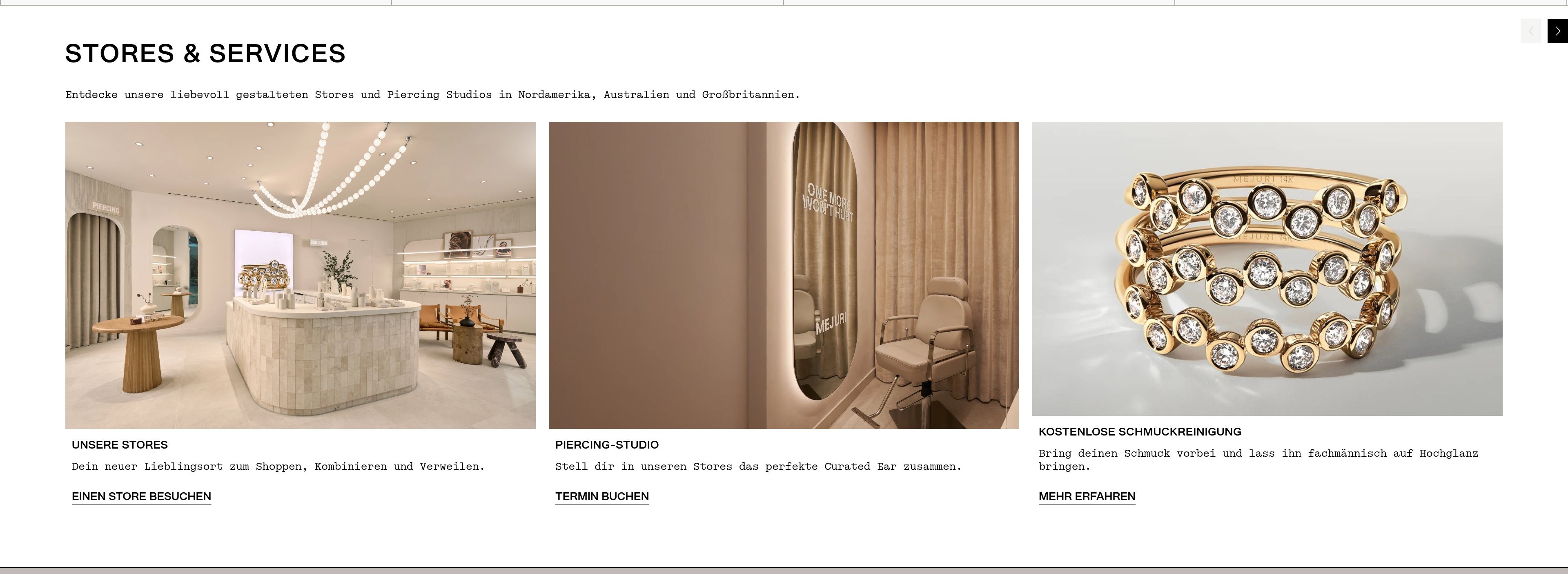
Store services section featuring 'Stores & Services', 'Piercing Studio', and 'Complimentary Jewelry Cleaning' with lifestyle imagery
The heatmap shows solid blue/no color across this entire section, indicating zero user attention reaches this valuable trust-building and service content. Users are abandoning before discovering the complimentary cleaning service, in-store piercing studios, and physical retail locations—all powerful trust signals that differentiate Mejuri from online-only competitors.
3 Critical Issues Affecting Mejuri's Conversions
Issue: Amplify Hero CTA Visibility to Convert Visual Interest into Clicks
The Puzzle Collection hero section captures strong attention with lifestyle imagery, but the 'PIECE IT TOGETHER' CTA receives significantly less engagement. Users are drawn to the jewelry visuals but aren't guided toward the next action, resulting in wasted attention and missed conversion opportunities.
Issue: Reduce Cognitive Load and Add Social Proof to Drive Product Engagement
The 'TOP 15 TRENDING PRODUCTS' carousel shows scattered, fragmented attention across thumbnails with minimal engagement on product titles or 'Add' buttons. Users are overwhelmed by too many simultaneous choices and lack compelling reasons to act now versus continuing to browse.
Issue: Surface Trust-Building Services Earlier to Reduce Purchase Anxiety
The stores and services section—featuring complimentary cleaning, piercing studios, and 100+ physical locations—receives zero attention because it's buried too deep on the page. Users abandon before discovering these powerful trust signals that differentiate Mejuri from online-only competitors and address common jewelry purchase anxieties.
3 Specific Changes That Could Increase Revenue by $4.3M
Recommendation 1: Amplify Hero CTA Visibility to Convert Visual Interest into Clicks
The Puzzle Collection hero section captures strong attention with lifestyle imagery, but the 'PIECE IT TOGETHER' CTA receives significantly less engagement. Users are drawn to the jewelry visuals but aren't guided toward the next action, resulting in wasted attention and missed conversion opportunities.
Increase the CTA button size by 50% and add a high-contrast background treatment (white halo or solid background box) to separate it from the imagery. Reposition the CTA directly below the 'FOR A LIFE WELL LIVED' headline rather than at the bottom of the hero, placing it in the natural eye path. Add a subtle downward-pointing arrow icon to the button to create directional momentum.
In our tests, CTA visibility improvements like this average 9.8% lift when optimizing above-the-fold content. By positioning the CTA where attention naturally flows and increasing its visual weight, we convert the strong interest in the imagery into actionable clicks, directly improving engagement with the Puzzle Collection.
Recommendation 2: Reduce Cognitive Load and Add Social Proof to Drive Product Engagement
The 'TOP 15 TRENDING PRODUCTS' carousel shows scattered, fragmented attention across thumbnails with minimal engagement on product titles or 'Add' buttons. Users are overwhelmed by too many simultaneous choices and lack compelling reasons to act now versus continuing to browse.
Reduce visible products from 4-5 to 2-3 larger product cards to decrease choice paralysis. Add star ratings and review counts directly below each product name (e.g., '4.8★ 234 reviews'). Replace the subtle 'Add' text with a prominent 'Quick Add' button in contrasting color. Include urgency badges on select items ('Only 3 left' or '127 sold today') to trigger immediate action.
In our tests, homepage content block optimizations like this average 9.5% lift, and trust signals add another 4.8% lift. By reducing cognitive load and adding social proof, we help users make confident, faster purchase decisions. The urgency indicators create FOMO that converts browsers into buyers.
Recommendation 3: Surface Trust-Building Services Earlier to Reduce Purchase Anxiety
The stores and services section—featuring complimentary cleaning, piercing studios, and 100+ physical locations—receives zero attention because it's buried too deep on the page. Users abandon before discovering these powerful trust signals that differentiate Mejuri from online-only competitors and address common jewelry purchase anxieties.
Create a condensed trust bar immediately below the hero section featuring three icons with micro-copy: '100+ Stores Nationwide | Free In-Store Piercing | Lifetime Cleaning'. Each icon should link to the full service pages. Add a floating 'Book Store Visit' button that appears after 3 seconds, sticky-positioned in the bottom-right corner. On product cards in the trending section, add a small 'Try in-store near you' badge with a location pin icon.
In our tests, trust signals and social proof improvements average 4.8% lift. By surfacing these differentiators earlier in the journey, we address purchase anxiety at the moment users are evaluating whether to buy. Physical store presence is a massive trust builder for jewelry purchases—users need to know they can see, touch, and return items in person.
Combined Impact: Here's What Mejuri Could Achieve
A conservative projection based on our methodology
Breakdown by Change
- Amplify Hero CTA Visibility to Convert Visual Interest into Clicks $127.5K/mo
- Reduce Cognitive Load and Add Social Proof to Drive Product Engagement $127.5K/mo
- Surface Trust-Building Services Earlier to Reduce Purchase Anxiety $105.0K/mo
How Mejuri Would Work With The Good
Our approach lets your team validate our methods before a larger digital experience investment.
Discovery & Baseline
Deep-dive into your analytics and user behavior
Goal Setting
Define success metrics and KPIs
Sprint Planning
Prioritize tests by impact and effort
A/B Testing
Execute, measure, and iterate
Ready to Capture That $4.3M in Revenue?
This is an initial AI-driven assessment to illustrate revenue potential. The next step is a comprehensive optimization program built for you. Every optimization program starts with a digital experience audit. During the audit our team of experts:
- Conducts in-depth user research and analytics review
- Performs heuristic evaluation of your complete funnel
- Identifies the biggest conversion barriers and opportunities in your digital experience
- Creates a prioritized roadmap based on impact and effort
Why Mejuri Should Trust This Analysis
16+ Years Optimization Work
We've optimized hundreds of millions in revenue through our optimization programs.
Fortune 500 Clients
Worked with leading companies including Nike, Adobe, and Xerox.
Data-Driven Methodology
Our analysis is based on thousands of successful A/B tests across industries.