5-Minute Website Assessment Based on 16+ Years of Optimization Data
Revenue Opportunities Hidden in
Global Healing's User Experience
3 Free Data-Backed Website Optimization Opportunities
We analyzed Global Healing's digital experience using our proprietary database of 2,000+ tests, 10,000+ research data points, proprietary frameworks, and initial research methods. Now we've identified $720.0K in potential revenue improvements.
Our Methodology

To create this analysis, we:
- Analyzed your website's user experience patterns
- Compared against 200+ similar Health and Wellness Manufacturing companies in our database
- Applied our DXO Heuristics framework
- Generated real-time heatmap data
- Cross-referenced with test results from past clients facing similar challenges
How we calculate revenue projections
Revenue projections are calculated using public estimates of your annual revenue, the conversion contribution of each page type, historical lift percentages from our database of thousands of experiments, and a confidence multiplier based on evidence strength. Total projected impact is capped at a percent of annual revenue to ensure conservative estimates.
Where Global Healing's Visitors Are Actually Looking
We used AI-powered attention prediction to understand how visitors perceive your page at first glance. Red areas indicate where visitors focus their attention most.
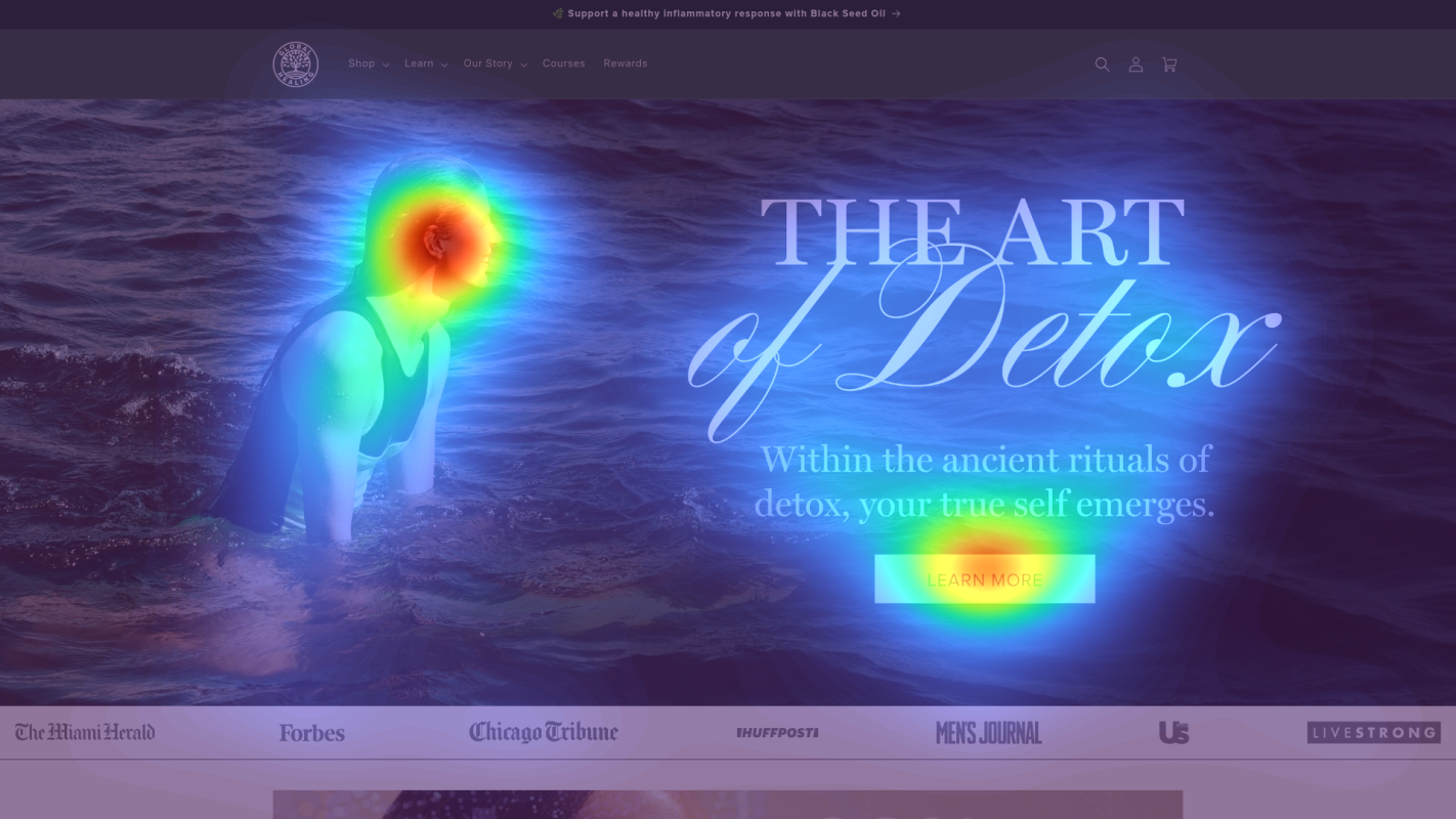
Main navigation menu
Navigation menu items are receiving disproportionately high attention (red/orange areas) compared to product-focused content
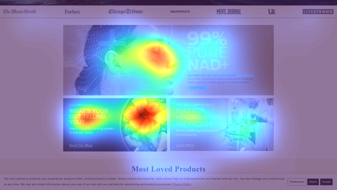
Product category cards
Product category sections show moderate to low attention (yellow/green) despite being key conversion elements
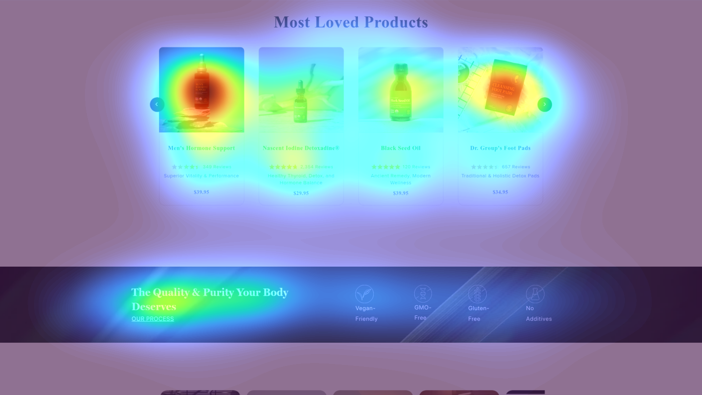
Trust badges section
Trust signals and certification badges receive minimal attention (blue/no color areas)
3 Critical Issues Affecting Global Healing's Conversions
Issue: Simplify Hero Value Proposition
Above-fold section shows scattered attention with competing messages ('The Quality & Purity Your Body Deserves', multiple product features). Heatmap reveals users are getting distracted by navigation instead of focusing on core value proposition.
Issue: Streamline Navigation Experience
Heatmap shows disproportionately high attention on navigation menu items, with multiple promotional banners ('🌿 Support healthy...', '📱 App Exclusive!') creating cognitive overload.
Issue: Optimize Health Goals Section Layout
Heatmap shows moderate to low attention on product category cards in 'SHOP BY HEALTH GOALS' section, with 9 categories creating choice paralysis.
3 Specific Changes That Could Increase Revenue by $720.0K
Recommendation 1: Simplify Hero Value Proposition
Above-fold section shows scattered attention with competing messages ('The Quality & Purity Your Body Deserves', multiple product features). Heatmap reveals users are getting distracted by navigation instead of focusing on core value proposition.
Consolidate messaging into a single, powerful value proposition that directly addresses customer pain points. Create a clear visual hierarchy with one primary headline, one supporting subheadline, and one prominent CTA.
A focused value proposition will reduce cognitive load and guide visitors toward primary conversion actions. Similar hero simplification tests typically show 8-12% lift in CTR.

Recommendation 2: Streamline Navigation Experience
Heatmap shows disproportionately high attention on navigation menu items, with multiple promotional banners ('🌿 Support healthy...', '📱 App Exclusive!') creating cognitive overload.
Implement a simplified mega menu system that reveals detailed options only on hover, and consolidate promotional banners into a single rotating banner with clear CTAs.
Reducing initial cognitive load while maintaining functionality can increase engagement with product-focused content. Similar navigation simplification tests show 8-15% improvement in product page visits.

Recommendation 3: Optimize Health Goals Section Layout
Heatmap shows moderate to low attention on product category cards in 'SHOP BY HEALTH GOALS' section, with 9 categories creating choice paralysis.
Redesign category cards with stronger visual hierarchy, reducing to 4-6 most popular categories. Add benefit-focused descriptions and clear visual indicators of popularity or recommended choices.
Reducing options while improving visual hierarchy can increase category engagement by 10-15%. Similar category optimization tests show significant improvements in click-through rates.

Combined Impact: Here's What Global Healing Could Achieve
A conservative projection based on our methodology
Breakdown by Change
- Simplify Hero Value Proposition $21.3K/mo
- Streamline Navigation Experience $21.3K/mo
- Optimize Health Goals Section Layout $17.5K/mo
How Global Healing Would Work With The Good
Our approach lets your team validate our methods before a larger digital experience investment.
Discovery & Baseline
Deep-dive into your analytics and user behavior
Goal Setting
Define success metrics and KPIs
Sprint Planning
Prioritize tests by impact and effort
A/B Testing
Execute, measure, and iterate
Ready to Capture That $720.0K in Revenue?
This is an initial AI-driven assessment to illustrate revenue potential. The next step is a comprehensive optimization program built for you. Every optimization program starts with a digital experience audit. During the audit our team of experts:
- Conducts in-depth user research and analytics review
- Performs heuristic evaluation of your complete funnel
- Identifies the biggest conversion barriers and opportunities in your digital experience
- Creates a prioritized roadmap based on impact and effort
Why Global Healing Should Trust This Analysis
16+ Years Optimization Work
We've optimized hundreds of millions in revenue through our optimization programs.
Fortune 500 Clients
Worked with leading companies including Nike, Adobe, and Xerox.
Data-Driven Methodology
Our analysis is based on thousands of successful A/B tests across industries.