5-Minute Website Assessment Based on 16+ Years of Optimization Data
Revenue Opportunities Hidden in
Global Healing's User Experience
3 Free Data-Backed Website Optimization Opportunities
We analyzed Global Healing's digital experience using our proprietary database of 2,000+ tests, 10,000+ research data points, proprietary frameworks, and initial research methods. Now we've identified $576.0K in potential revenue improvements.
Our Methodology

To create this analysis, we:
- Analyzed your website's user experience patterns
- Compared against 200+ similar Health & Wellness Manufacturing/Retail companies in our database
- Applied our DXO Heuristics framework
- Generated real-time heatmap data
- Cross-referenced with test results from past clients facing similar challenges
How we calculate revenue projections
Revenue projections are calculated using public estimates of your annual revenue, the conversion contribution of each page type, historical lift percentages from our database of thousands of experiments, and a confidence multiplier based on evidence strength. Total projected impact is capped at a percent of annual revenue to ensure conservative estimates.
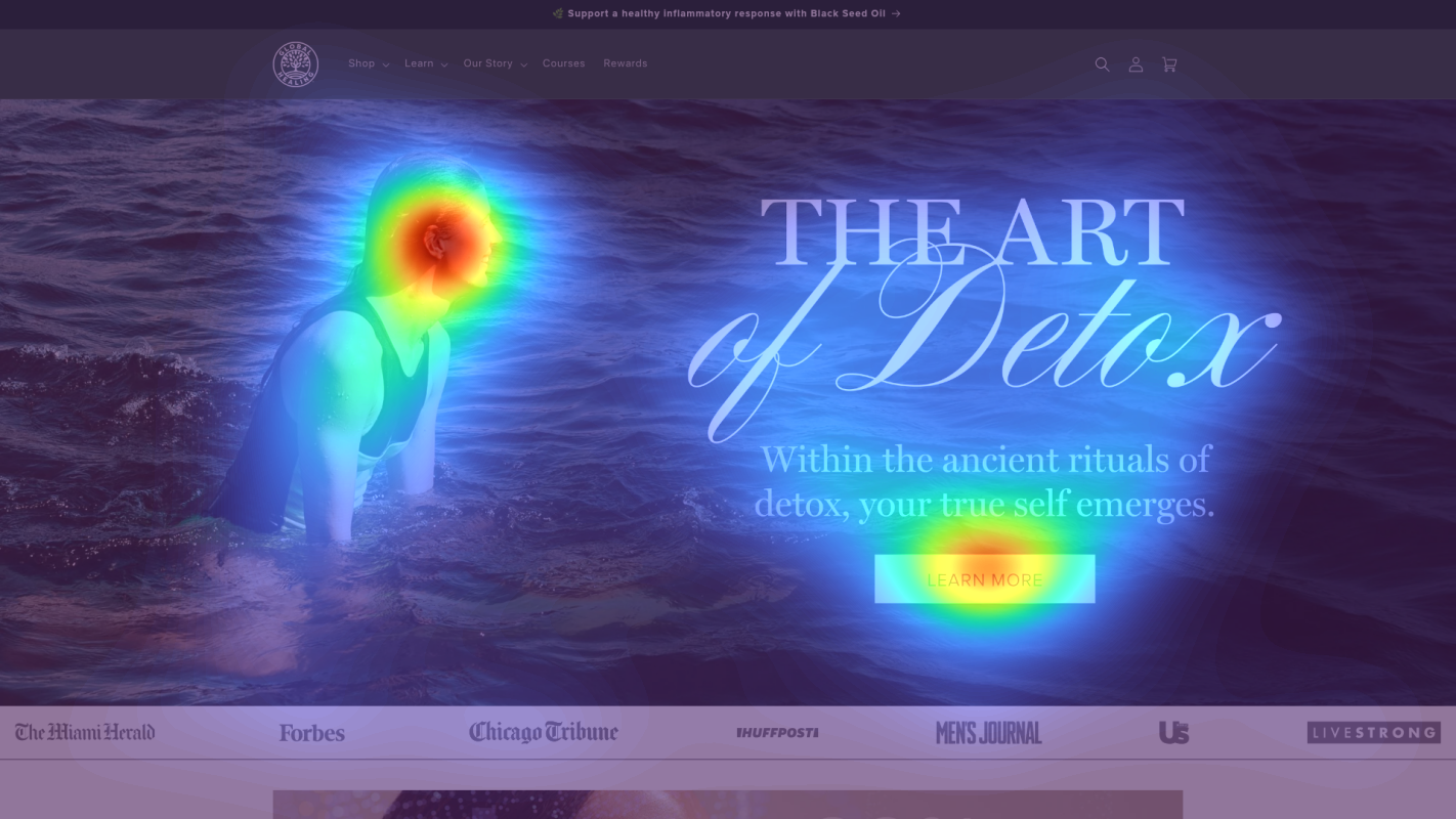
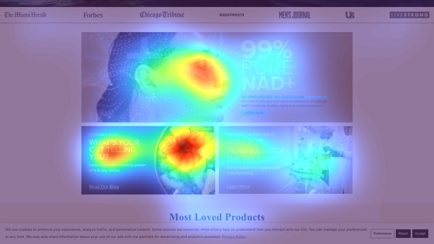
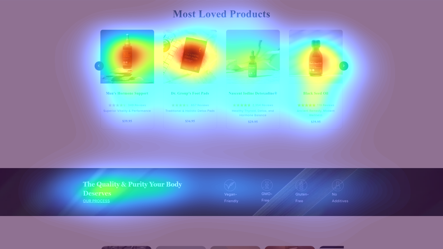
Where Global Healing's Visitors Are Actually Looking
We used AI-powered attention prediction to understand how visitors perceive your page at first glance. Red areas indicate where visitors focus their attention most.
Main Navigation Menu
The navigation menu is receiving disproportionately high attention (red/orange) compared to product-focused content below
Hero Section CTAs
The primary CTA buttons in the hero section show moderate (yellow) attention instead of high engagement
Trust Badges Section
Trust signals and certification badges are receiving minimal attention (blue/no color areas)
3 Critical Issues Affecting Global Healing's Conversions
Issue: Simplify Hero Section & Strengthen Primary CTA
The hero section shows scattered attention with moderate (yellow) engagement on CTAs, while multiple competing messages ('Quality & Purity', banner promotions, badges) dilute the main value proposition
Issue: Optimize Navigation Menu Structure
Heatmap shows disproportionately high attention (red/orange) on navigation menu, indicating users are struggling with the extensive health goals categories
Issue: Enhance Subscribe & Save with Trust Signals
Trust badges receive minimal attention (blue/no color areas) while subscription section lacks concrete benefits, reducing conversion potential
3 Specific Changes That Could Increase Revenue by $576.0K
Recommendation 1: Simplify Hero Section & Strengthen Primary CTA
The hero section shows scattered attention with moderate (yellow) engagement on CTAs, while multiple competing messages ('Quality & Purity', banner promotions, badges) dilute the main value proposition
Redesign hero section to focus on one primary message and CTA: 1) Move promotional banner to slide-in, 2) Create hierarchy with larger 'Quality & Purity' headline, 3) Increase CTA button size by 20% and add contrasting color (suggest deep green #2E7D32), 4) Add subtle pulse animation to CTA
Focusing attention on a single, clear value proposition and more prominent CTA will reduce decision paralysis and increase click-through rates

Recommendation 2: Optimize Navigation Menu Structure
Heatmap shows disproportionately high attention (red/orange) on navigation menu, indicating users are struggling with the extensive health goals categories
Simplify navigation by: 1) Consolidating 8+ health goals into 4 main categories with sub-menus, 2) Adding visual icons for each category, 3) Implementing mega-menu with featured products and benefits per category
Simplified navigation reduces cognitive load and helps users find relevant products faster, improving the path to purchase

Recommendation 3: Enhance Subscribe & Save with Trust Signals
Trust badges receive minimal attention (blue/no color areas) while subscription section lacks concrete benefits, reducing conversion potential
Redesign Subscribe & Save section to lead with specific savings amount and integrate trust signals: 1) Add '15% Off Every Order' as primary headline, 2) Include trust badges next to subscription CTA, 3) Add customer review carousel specific to subscription experience
Leading with concrete savings and adding social proof will increase subscription conversion rate by building trust and highlighting immediate value

Combined Impact: Here's What Global Healing Could Achieve
A conservative projection based on our methodology
Breakdown by Change
- Simplify Hero Section & Strengthen Primary CTA $17.0K/mo
- Optimize Navigation Menu Structure $14.0K/mo
- Enhance Subscribe & Save with Trust Signals $17.0K/mo
How Global Healing Would Work With The Good
Our approach lets your team validate our methods before a larger digital experience investment.
Discovery & Baseline
Deep-dive into your analytics and user behavior
Goal Setting
Define success metrics and KPIs
Sprint Planning
Prioritize tests by impact and effort
A/B Testing
Execute, measure, and iterate
Ready to Capture That $576.0K in Revenue?
This is an initial AI-driven assessment to illustrate revenue potential. The next step is a comprehensive optimization program built for you. Every optimization program starts with a digital experience audit. During the audit our team of experts:
- Conducts in-depth user research and analytics review
- Performs heuristic evaluation of your complete funnel
- Identifies the biggest conversion barriers and opportunities in your digital experience
- Creates a prioritized roadmap based on impact and effort
Why Global Healing Should Trust This Analysis
16+ Years Optimization Work
We've optimized hundreds of millions in revenue through our optimization programs.
Fortune 500 Clients
Worked with leading companies including Nike, Adobe, and Xerox.
Data-Driven Methodology
Our analysis is based on thousands of successful A/B tests across industries.