5-Minute Website Assessment Based on 16+ Years of Optimization Data
Revenue Opportunities Hidden in
Frøya Organics's User Experience
3 Free Data-Backed Website Optimization Opportunities
We analyzed Frøya Organics's digital experience using our proprietary database of 2,000+ tests, 10,000+ research data points, proprietary frameworks, and initial research methods. Now we've identified $432.0K in potential revenue improvements.
Our Methodology

To create this analysis, we:
- Analyzed your website's user experience patterns
- Compared against 200+ similar Beauty & Personal Care companies in our database
- Applied our DXO Heuristics framework
- Generated real-time heatmap data
- Cross-referenced with test results from past clients facing similar challenges
How we calculate revenue projections
Revenue projections are calculated using public estimates of your annual revenue, the conversion contribution of each page type, historical lift percentages from our database of thousands of experiments, and a confidence multiplier based on evidence strength. Total projected impact is capped at a percent of annual revenue to ensure conservative estimates.
Where Frøya Organics's Visitors Are Actually Looking
We used AI-powered attention prediction to understand how visitors perceive your page at first glance. Red areas indicate where visitors focus their attention most.
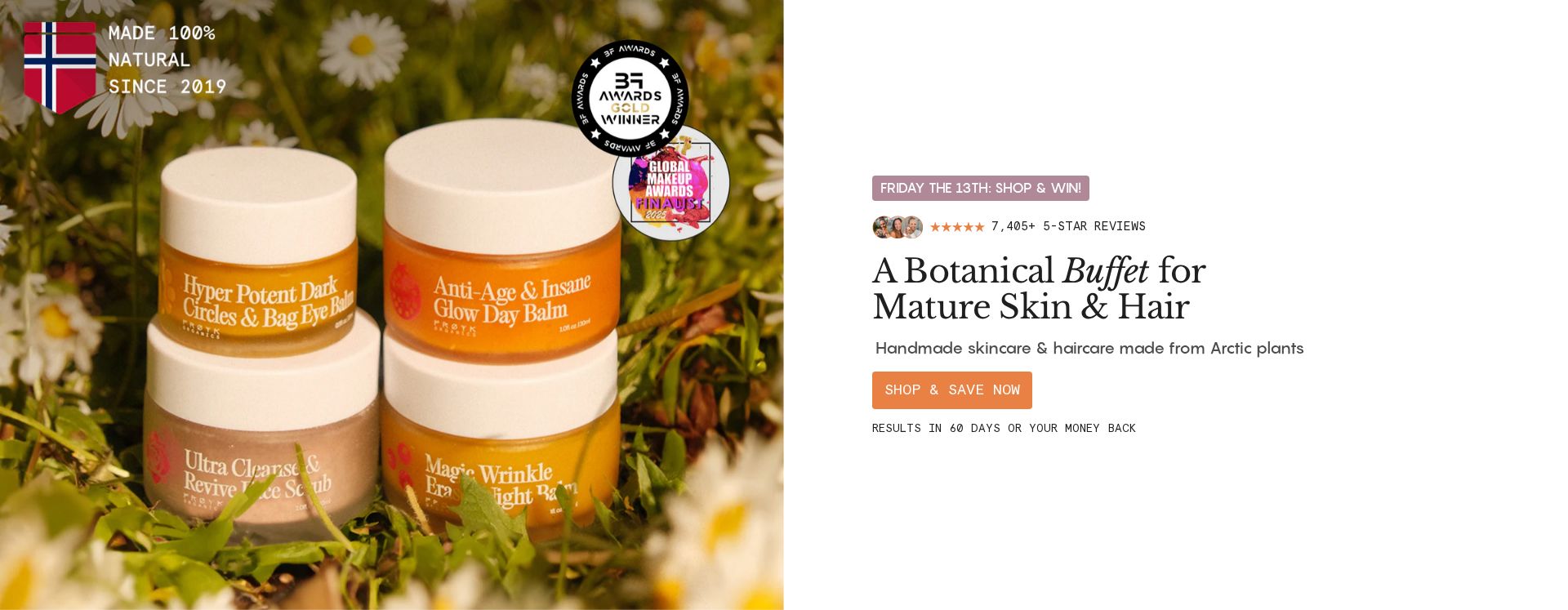
Hero headline and promotional banner
The promotional banner and main headline receive intense attention (red/orange heat), but the heat dissipates before reaching the primary CTA button
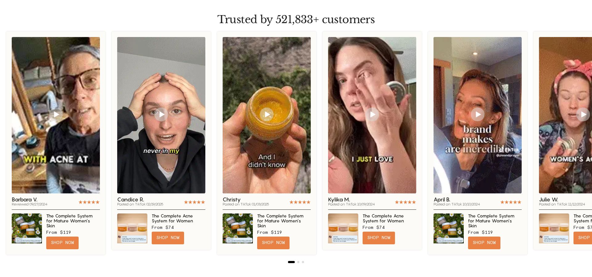
Product system cards with pricing
Product cards showing systems and pricing receive minimal attention (only slight yellow heat), despite being key conversion elements
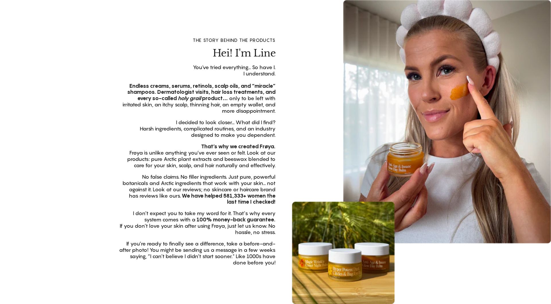
Founder story section
The founder story section shows virtually no attention (blue/no heat), indicating users rarely reach this trust-building content
3 Critical Issues Affecting Frøya Organics's Conversions
Issue: Optimize Hero Section Visual Hierarchy
The hero section's promotional banner and headline receive strong attention (red/orange heat) but fail to direct it toward conversion actions, as shown in the heatmap
Issue: Enhance Product System Card Visibility
Product system cards with pricing receive minimal attention (yellow heat only) despite being key conversion elements, as shown in heatmap data
Issue: Relocate Founder Story for Maximum Impact
The founder story section shows virtually no attention (blue/no heat) due to its position deep in the page
3 Specific Changes That Could Increase Revenue by $432.0K
Recommendation 1: Optimize Hero Section Visual Hierarchy
The hero section's promotional banner and headline receive strong attention (red/orange heat) but fail to direct it toward conversion actions, as shown in the heatmap
Restructure the hero section to create a clear visual path to action: 1) Move '7,405+ 5-star reviews' next to the CTA, 2) Add directional arrow graphics pointing to 'SHOP & SAVE NOW' button, 3) Increase button contrast and size, 4) Consolidate promotional messages into a single, clear value proposition
Creating a clear visual hierarchy will guide users' strong initial attention toward the primary conversion action, increasing click-through rates to product pages
Recommendation 2: Enhance Product System Card Visibility
Product system cards with pricing receive minimal attention (yellow heat only) despite being key conversion elements, as shown in heatmap data
Redesign product system cards to command more attention: 1) Add customer count badge '521,833+ customers trust this system', 2) Highlight pricing with larger font and savings callout, 3) Add animated scroll reveal effect, 4) Include mini review carousel
Enhanced visibility and social proof will increase engagement with product systems, improving add-to-cart rates
Recommendation 3: Relocate Founder Story for Maximum Impact
The founder story section shows virtually no attention (blue/no heat) due to its position deep in the page
Create a condensed founder story module higher in the page: 1) Extract key elements from 'Hei! I'm Line' section, 2) Create compact version with founder photo and brief story, 3) Position near product cards, 4) Add 'Read Full Story' link to full version
Making the founder story more accessible will build trust earlier in the user journey, increasing conversion likelihood
Combined Impact: Here's What Frøya Organics Could Achieve
A conservative projection based on our methodology
Breakdown by Change
- Optimize Hero Section Visual Hierarchy $12.8K/mo
- Enhance Product System Card Visibility $12.8K/mo
- Relocate Founder Story for Maximum Impact $10.5K/mo
How Frøya Organics Would Work With The Good
Our approach lets your team validate our methods before a larger digital experience investment.
Discovery & Baseline
Deep-dive into your analytics and user behavior
Goal Setting
Define success metrics and KPIs
Sprint Planning
Prioritize tests by impact and effort
A/B Testing
Execute, measure, and iterate
Ready to Capture That $432.0K in Revenue?
This is an initial AI-driven assessment to illustrate revenue potential. The next step is a comprehensive optimization program built for you. Every optimization program starts with a digital experience audit. During the audit our team of experts:
- Conducts in-depth user research and analytics review
- Performs heuristic evaluation of your complete funnel
- Identifies the biggest conversion barriers and opportunities in your digital experience
- Creates a prioritized roadmap based on impact and effort
Why Frøya Organics Should Trust This Analysis
16+ Years Optimization Work
We've optimized hundreds of millions in revenue through our optimization programs.
Fortune 500 Clients
Worked with leading companies including Nike, Adobe, and Xerox.
Data-Driven Methodology
Our analysis is based on thousands of successful A/B tests across industries.