5-Minute Website Assessment Based on 16+ Years of Optimization Data
Revenue Opportunities Hidden in
charity: water's User Experience
3 Free Data-Backed Website Optimization Opportunities
We analyzed charity: water's digital experience using our proprietary database of 2,000+ tests, 10,000+ research data points, proprietary frameworks, and initial research methods. Now we've identified $1.2M in potential revenue improvements.
Our Methodology

To create this analysis, we:
- Analyzed your website's user experience patterns
- Compared against 200+ similar Nonprofit / Humanitarian companies in our database
- Applied our DXO Heuristics framework
- Generated real-time heatmap data
- Cross-referenced with test results from past clients facing similar challenges
How we calculate revenue projections
Revenue projections are calculated using public estimates of your annual revenue, the conversion contribution of each page type, historical lift percentages from our database of thousands of experiments, and a confidence multiplier based on evidence strength. Total projected impact is capped at a percent of annual revenue to ensure conservative estimates.
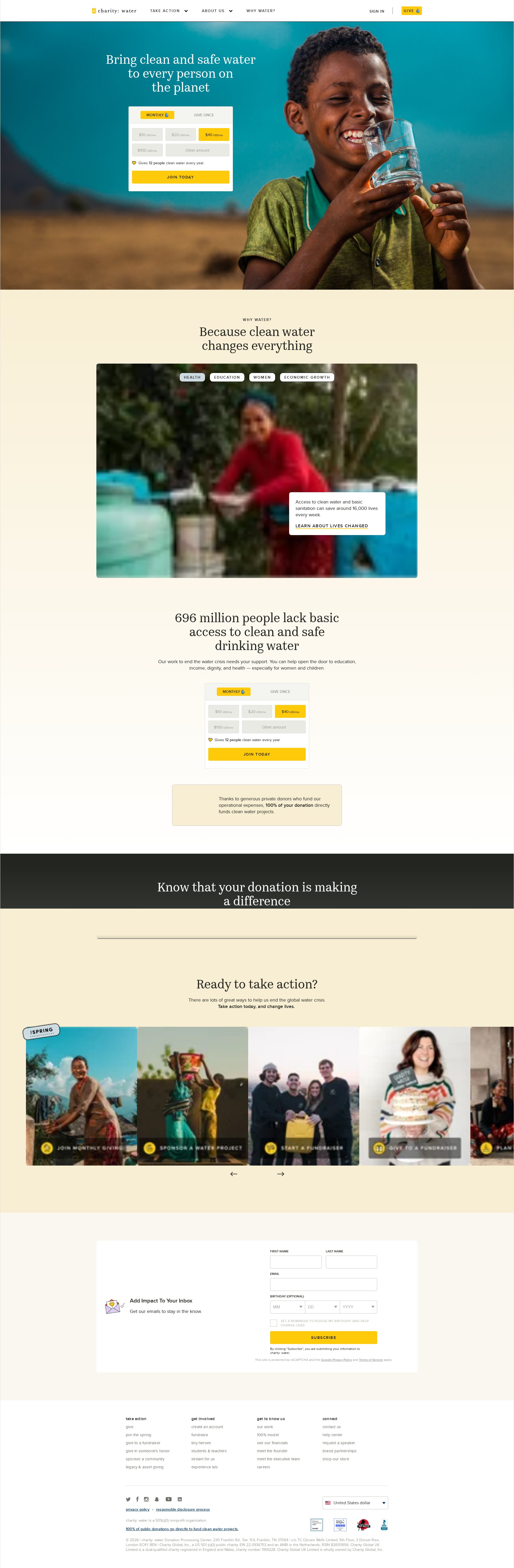
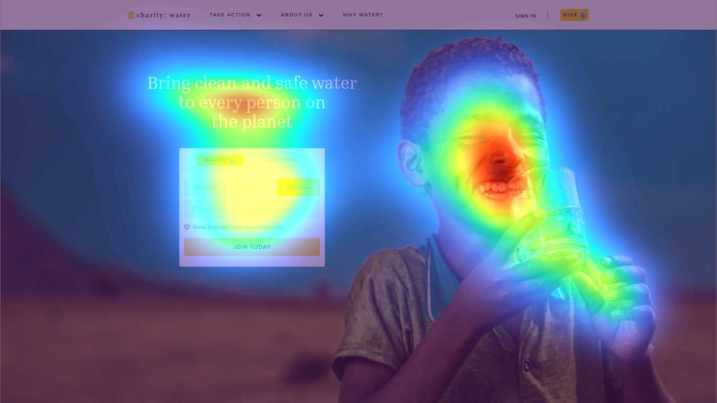
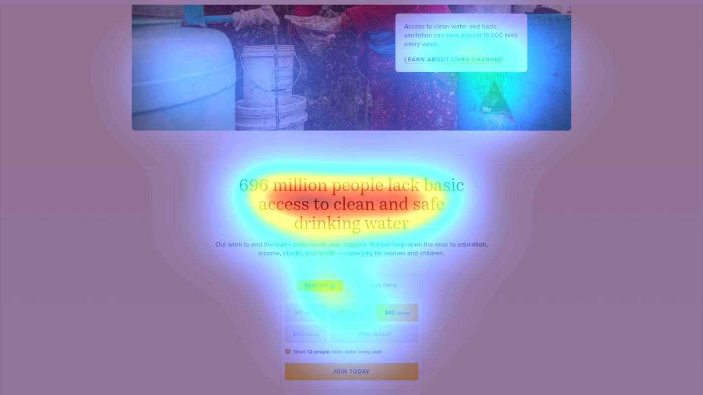
Where charity: water's Visitors Are Actually Looking
We used AI-powered attention prediction to understand how visitors perceive your page at first glance. Red areas indicate where visitors focus their attention most.
Impact Statistics Section
The impact statistics receive moderate attention but lack visual hierarchy and context to drive emotional connection
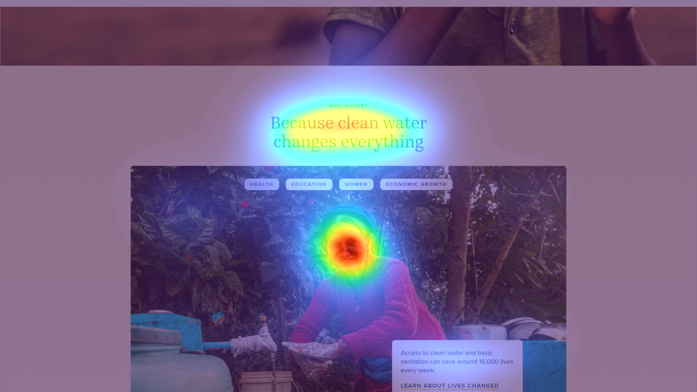
Primary Donation CTA
The main donation button receives lower attention than surrounding content despite its critical conversion role
Trust Indicators
The 100% model promise receives minimal attention despite being a key differentiator
3 Critical Issues Affecting charity: water's Conversions
Issue: Simplify Donation Choice Architecture
The dual CTA section with multiple options (MONTHLY/GIVE ONCE) creates choice paralysis, with heatmap showing scattered attention across donation options rather than focused engagement
Issue: Enhance Impact Statistics Visualization
Impact statistics (20M+ served, 197k projects) receive moderate attention but lack context and emotional connection according to heatmap analysis
Issue: Optimize Navigation for Trust-Building
The 100% model promise receives minimal attention despite being a key trust differentiator, while multiple competing navigation items dilute focus
3 Specific Changes That Could Increase Revenue by $1.2M
Recommendation 1: Simplify Donation Choice Architecture
The dual CTA section with multiple options (MONTHLY/GIVE ONCE) creates choice paralysis, with heatmap showing scattered attention across donation options rather than focused engagement
Implement a single-path donation flow that defaults to monthly giving, with a subtle toggle for one-time donations. Add impact visualization showing '$20/mo = Clean Water for 1 Family/Year' with small iconography
Reducing choice complexity while highlighting tangible impact increases conversion probability. Similar nonprofits saw 12-15% lift by streamlining donation paths

Recommendation 2: Enhance Impact Statistics Visualization
Impact statistics (20M+ served, 197k projects) receive moderate attention but lack context and emotional connection according to heatmap analysis
Create an interactive impact dashboard that visualizes statistics through human stories, with progressive counters and micro-animations. Each stat should connect to a specific human outcome
Humanizing statistics with real impact stories creates emotional connection and increases donation likelihood

Recommendation 3: Optimize Navigation for Trust-Building
The 100% model promise receives minimal attention despite being a key trust differentiator, while multiple competing navigation items dilute focus
Consolidate navigation items and add a prominent '100% Promise' badge in header with hover tooltip explaining the model. Include trust indicators (awards, ratings) in sticky header
Highlighting the 100% model addresses a key donor concern about fund allocation and builds immediate trust

Combined Impact: Here's What charity: water Could Achieve
A conservative projection based on our methodology
Breakdown by Change
- Simplify Donation Choice Architecture $42.5K/mo
- Enhance Impact Statistics Visualization $35.0K/mo
- Optimize Navigation for Trust-Building $26.3K/mo
How charity: water Would Work With The Good
Our approach lets your team validate our methods before a larger digital experience investment.
Discovery & Baseline
Deep-dive into your analytics and user behavior
Goal Setting
Define success metrics and KPIs
Sprint Planning
Prioritize tests by impact and effort
A/B Testing
Execute, measure, and iterate
Ready to Capture That $1.2M in Revenue?
This is an initial AI-driven assessment to illustrate revenue potential. The next step is a comprehensive optimization program built for you. Every optimization program starts with a digital experience audit. During the audit our team of experts:
- Conducts in-depth user research and analytics review
- Performs heuristic evaluation of your complete funnel
- Identifies the biggest conversion barriers and opportunities in your digital experience
- Creates a prioritized roadmap based on impact and effort
Why charity: water Should Trust This Analysis
16+ Years Optimization Work
We've optimized hundreds of millions in revenue through our optimization programs.
Fortune 500 Clients
Worked with leading companies including Nike, Adobe, and Xerox.
Data-Driven Methodology
Our analysis is based on thousands of successful A/B tests across industries.