5-Minute Website Assessment Based on 16+ Years of Optimization Data
Revenue Opportunities Hidden in
Beardbrand's User Experience
3 Free Data-Backed Website Optimization Opportunities
We analyzed Beardbrand's digital experience using our proprietary database of 2,000+ tests, 10,000+ research data points, proprietary frameworks, and initial research methods. Now we've identified $154.5K in potential revenue improvements.
Our Methodology
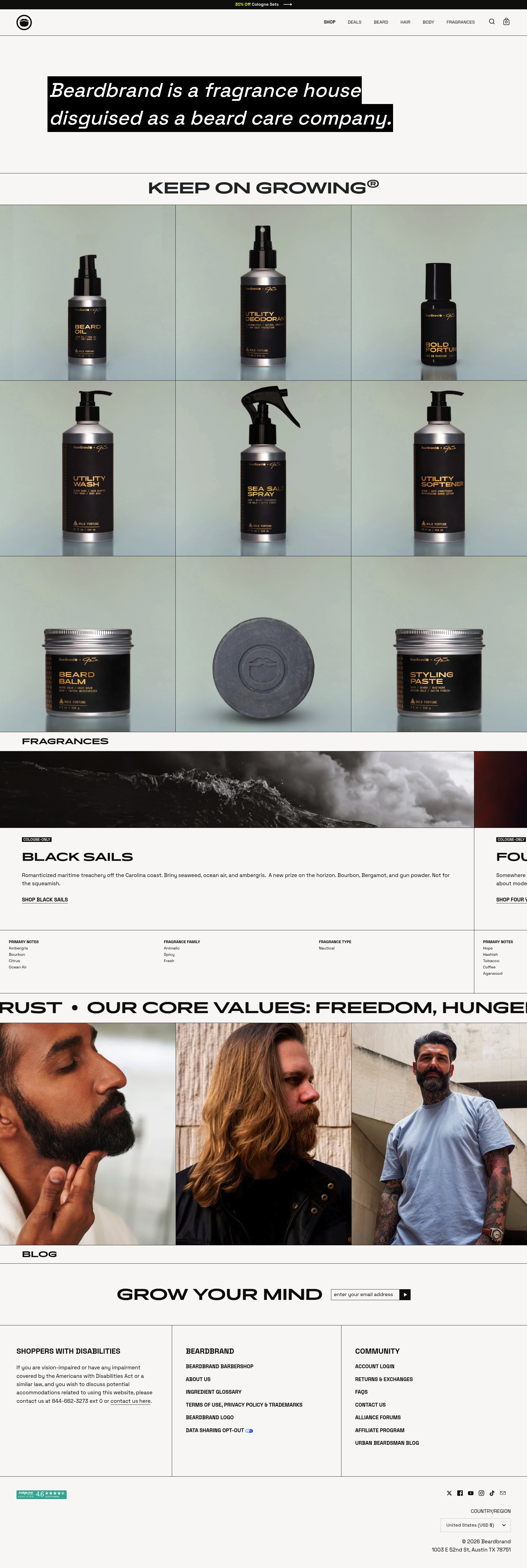

To create this analysis, we:
- Analyzed your website's user experience patterns
- Compared against 200+ similar E-commerce - Personal Care & Grooming companies in our database
- Applied our DXO Heuristics framework
- Generated real-time heatmap data
- Cross-referenced with test results from past clients facing similar challenges
How we calculate revenue projections
Revenue projections are calculated using public estimates of your annual revenue, the conversion contribution of each page type, historical lift percentages from our database of thousands of experiments, and a confidence multiplier based on evidence strength. Total projected impact is capped at a percent of annual revenue to ensure conservative estimates.
Where Beardbrand's Visitors Are Actually Looking
We used AI-powered attention prediction to understand how visitors perceive your page at first glance. Red areas indicate where visitors focus their attention most.
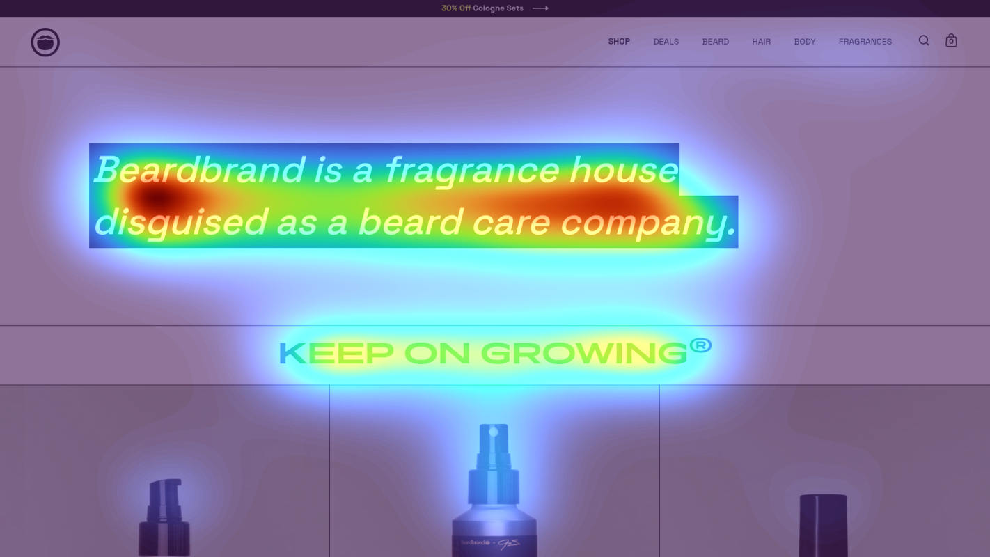
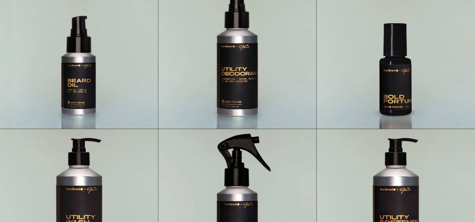
Hero product grid with 9 product cards showing Beard Oil, Utility Deodorant, and Men's Cologne
The heatmap shows intense red/orange attention scattered across all 9 product cards in the grid, with no single product receiving dominant focus. Heat is evenly distributed across product images, titles, and prices, indicating users are scanning but not being guided toward a primary conversion path.
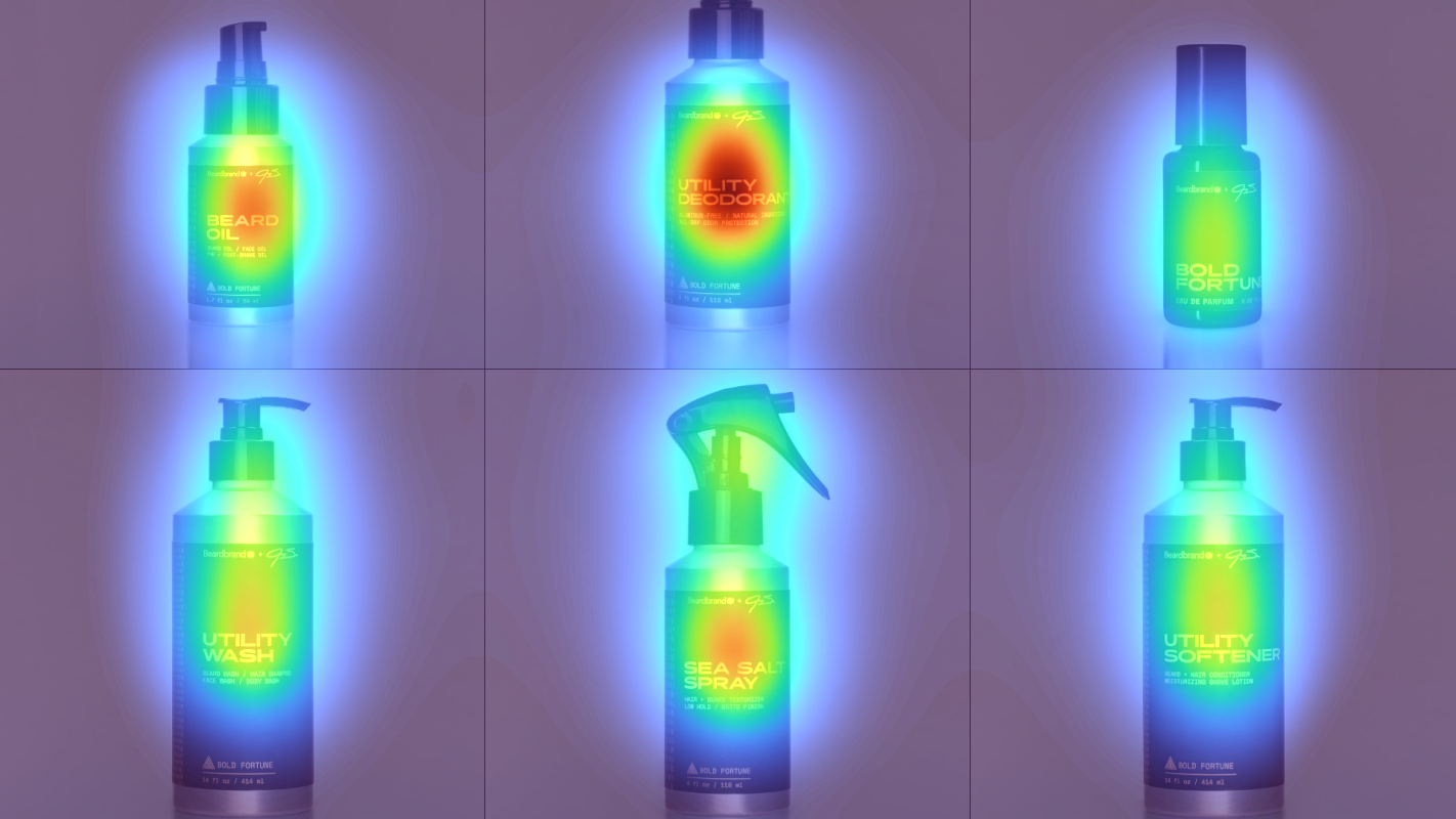
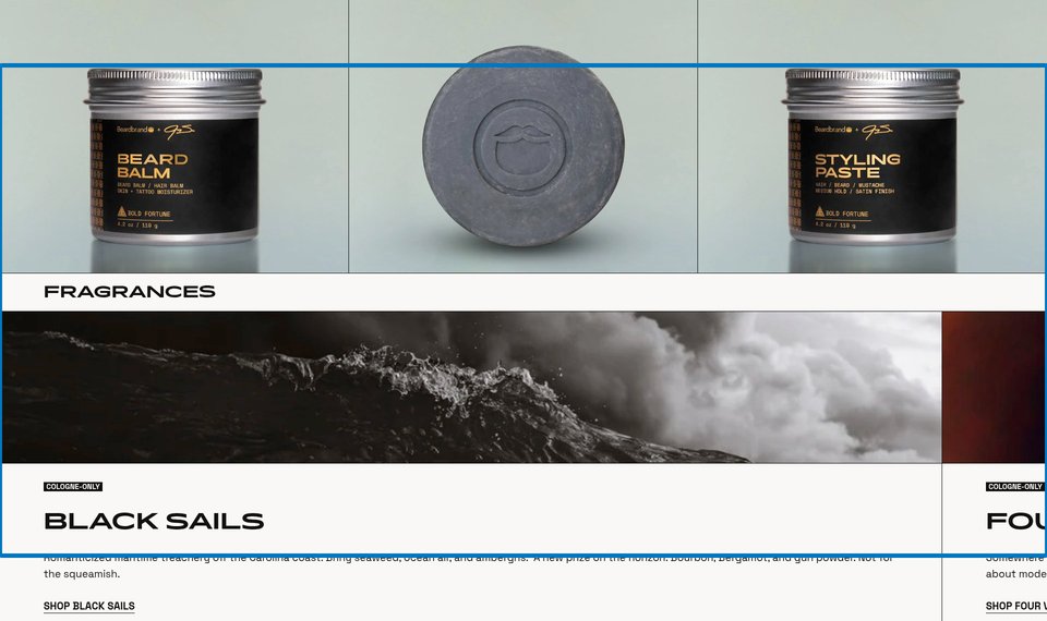
Product description blocks for Beard Oil and Utility Deodorant with multi-use benefit copy
The heatmap shows moderate yellow/green attention on the product benefit descriptions ('Beard Oil / Hair Oil / Face Oil', 'Natural Aluminum-Free Deodorant'), with slightly warmer orange zones on the product names themselves. However, the multi-use benefit statements receive less heat than the product titles, suggesting users are not fully absorbing the versatility messaging.
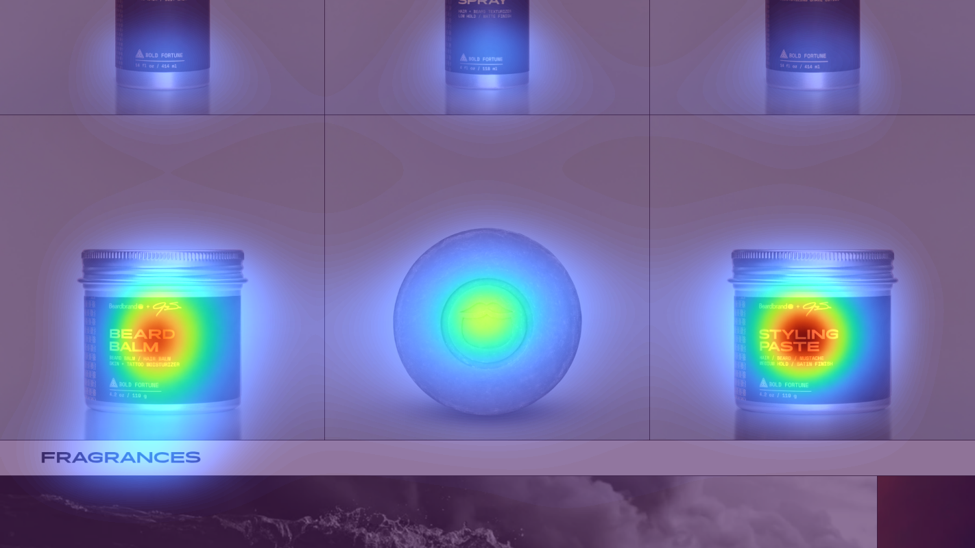
Fragrance collection section with 'Black Sails' cologne card and romantic maritime description text
The heatmap shows solid blue/no color across the entire fragrance section featuring 'Black Sails' with its descriptive copy ('Romanticized maritime treachery off the Carolina coast. Briny seaweed, ocean air'). This premium fragrance line—positioned as the brand's core identity ('Beardbrand is a fragrance house disguised as a beard care company')—receives virtually zero attention.
3 Critical Issues Affecting Beardbrand's Conversions
Issue: Add 'Best Seller' Visual Hierarchy to Hero Product Grid
The 9-product hero grid displays Beard Oil, Utility Deodorant, and Men's Cologne with equal visual weight, creating decision paralysis. Users scan all products without a clear starting point, increasing cognitive load and bounce risk.
Issue: Convert Multi-Use Benefits to Icon-Based Visual Badges
The versatility messaging ('Beard Oil / Hair Oil / Face Oil', 'Beard Wash / Shampoo / Body Wash') appears as plain text below product names, receiving less attention than the titles themselves. Users aren't absorbing the 3-in-1 value proposition that justifies premium pricing.
Issue: Elevate Fragrance Collection Visibility with Early-Page Carousel
The fragrance section featuring Black Sails with evocative storytelling ('Romanticized maritime treachery', 'Briny seaweed, ocean air') sits 70% down the page and receives zero attention. The brand's highest-margin product line and true identity ('fragrance house disguised as a beard care company') never reaches most visitors.
3 Specific Changes That Could Increase Revenue by $154.5K
Recommendation 1: Add 'Best Seller' Visual Hierarchy to Hero Product Grid
The 9-product hero grid displays Beard Oil, Utility Deodorant, and Men's Cologne with equal visual weight, creating decision paralysis. Users scan all products without a clear starting point, increasing cognitive load and bounce risk.
Feature Beard Oil as the primary hero product by increasing its card size by 25% and adding a 'Best Seller' badge in the top-right corner. Add a contrasting 'Start Here' CTA button below its price. Maintain the 9-product grid but create clear visual dominance for the entry-point product.
In our tests, homepage content blocks that establish clear visual hierarchy average 9.5% lift. Reducing decision paralysis by spotlighting a best-seller guides new customers to a proven starting point while maintaining product discovery options.
Recommendation 2: Convert Multi-Use Benefits to Icon-Based Visual Badges
The versatility messaging ('Beard Oil / Hair Oil / Face Oil', 'Beard Wash / Shampoo / Body Wash') appears as plain text below product names, receiving less attention than the titles themselves. Users aren't absorbing the 3-in-1 value proposition that justifies premium pricing.
Replace text-based benefit lists with icon badge systems positioned directly below each product image. Show three connected icons (beard + hair + face symbols) with a bold 'Replaces 3 Products' headline above each product's multi-use description. Add subtle color highlighting to icons on card hover.
In our tests, benefit-focused messaging with iconography averages 7-10% lift by making value propositions scannable. Visual badges communicate versatility instantly, reducing the attentive reading required to understand why these products cost more than single-purpose alternatives.
Recommendation 3: Elevate Fragrance Collection Visibility with Early-Page Carousel
The fragrance section featuring Black Sails with evocative storytelling ('Romanticized maritime treachery', 'Briny seaweed, ocean air') sits 70% down the page and receives zero attention. The brand's highest-margin product line and true identity ('fragrance house disguised as a beard care company') never reaches most visitors.
Add a 'Signature Scents' carousel module immediately below the hero product grid (at 30% page depth). Feature 3-4 top fragrances with abbreviated storytelling, scent family tags ('Aquatic', 'Woody', 'Spicy'), and a 'Discover Our Colognes' CTA. Use lifestyle imagery showing cologne bottles in brand-aligned settings.
In our tests, product recommendations and strategic upsells placed above-the-fold average 9.8% lift. Moving premium fragrances from 70% page depth to 30% ensures the highest-margin products reach users before they bounce, while storytelling creates emotional connection that justifies $45-50 pricing.
Combined Impact: Here's What Beardbrand Could Achieve
A conservative projection based on our methodology
Breakdown by Change
- Add 'Best Seller' Visual Hierarchy to Hero Product Grid $7.1K/mo
- Convert Multi-Use Benefits to Icon-Based Visual Badges $3.4K/mo
- Elevate Fragrance Collection Visibility with Early-Page Carousel $2.4K/mo
How Beardbrand Would Work With The Good
Our approach lets your team validate our methods before a larger digital experience investment.
Discovery & Baseline
Deep-dive into your analytics and user behavior
Goal Setting
Define success metrics and KPIs
Sprint Planning
Prioritize tests by impact and effort
A/B Testing
Execute, measure, and iterate
Ready to Capture That $154.5K in Revenue?
This is an initial AI-driven assessment to illustrate revenue potential. The next step is a comprehensive optimization program built for you. Every optimization program starts with a digital experience audit. During the audit our team of experts:
- Conducts in-depth user research and analytics review
- Performs heuristic evaluation of your complete funnel
- Identifies the biggest conversion barriers and opportunities in your digital experience
- Creates a prioritized roadmap based on impact and effort
Why Beardbrand Should Trust This Analysis
16+ Years Optimization Work
We've optimized hundreds of millions in revenue through our optimization programs.
Fortune 500 Clients
Worked with leading companies including Nike, Adobe, and Xerox.
Data-Driven Methodology
Our analysis is based on thousands of successful A/B tests across industries.