5-Minute Website Assessment Based on 16+ Years of Optimization Data
Revenue Opportunities Hidden in
Atolea Jewelry's User Experience
3 Free Data-Backed Website Optimization Opportunities
We analyzed Atolea Jewelry's digital experience using our proprietary database of 2,000+ tests, 10,000+ research data points, proprietary frameworks, and initial research methods. Now we've identified $405.0K in potential revenue improvements.
Our Methodology

To create this analysis, we:
- Analyzed your website's user experience patterns
- Compared against 200+ similar E-commerce Jewelry companies in our database
- Applied our DXO Heuristics framework
- Generated real-time heatmap data
- Cross-referenced with test results from past clients facing similar challenges
How we calculate revenue projections
Revenue projections are calculated using public estimates of your annual revenue, the conversion contribution of each page type, historical lift percentages from our database of thousands of experiments, and a confidence multiplier based on evidence strength. Total projected impact is capped at a percent of annual revenue to ensure conservative estimates.
Where Atolea Jewelry's Visitors Are Actually Looking
We used AI-powered attention prediction to understand how visitors perceive your page at first glance. Red areas indicate where visitors focus their attention most.
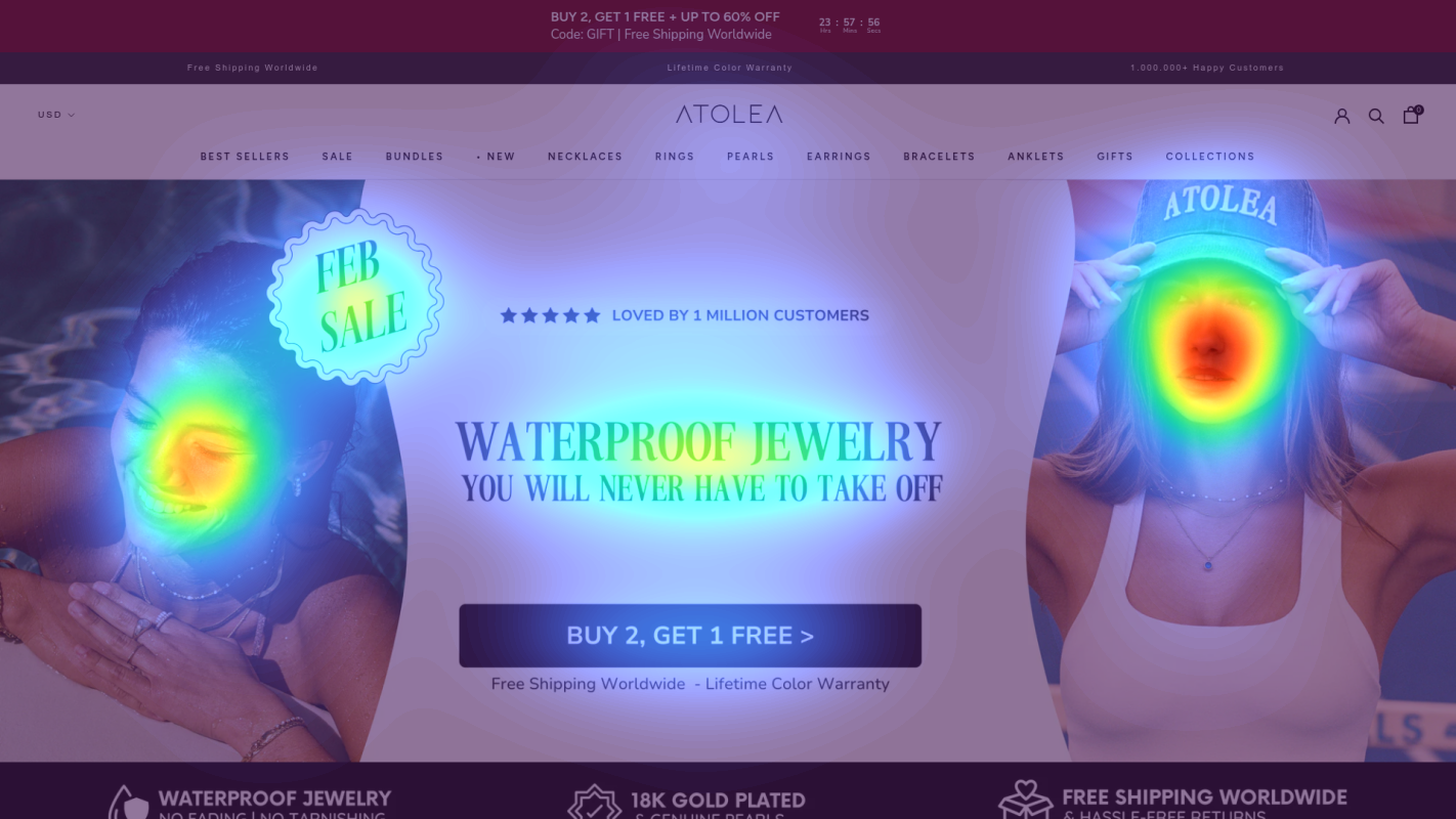
Primary Navigation Menu
The navigation menu is receiving disproportionately high attention compared to core value propositions and CTAs
Trust Badges Section
The warranty and trust signals are receiving minimal attention in the heatmap
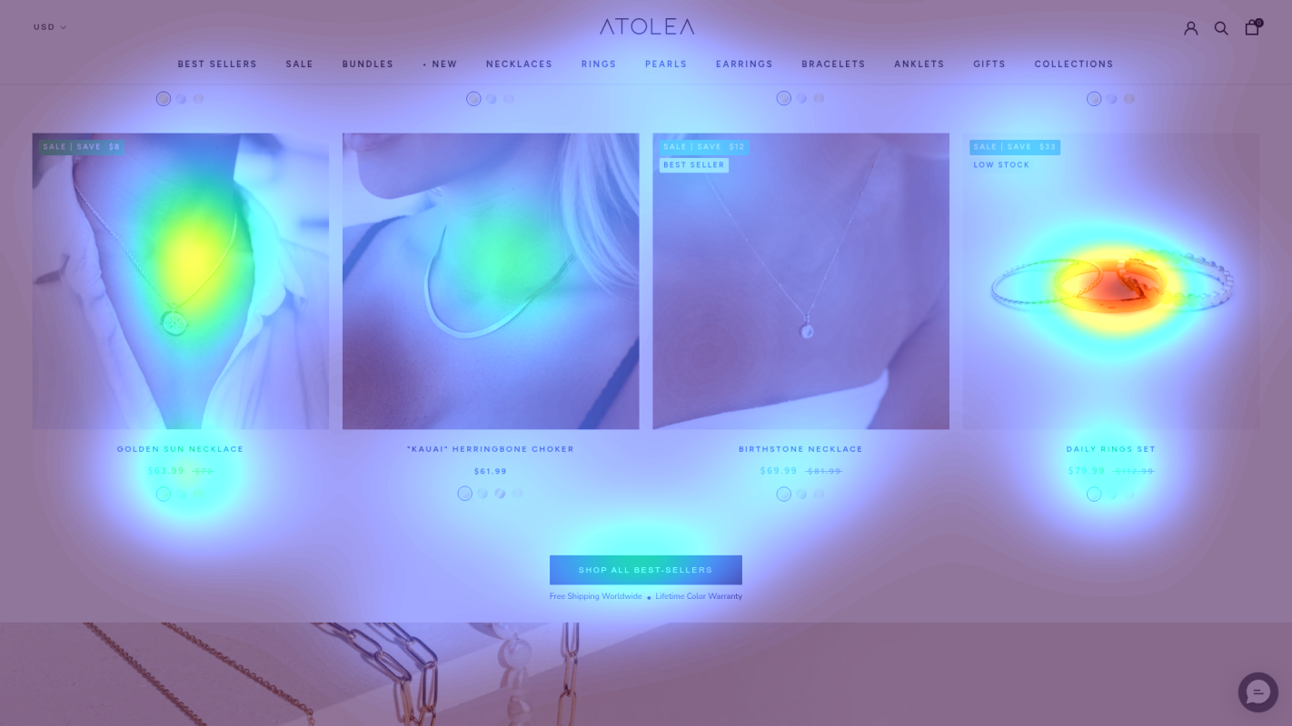
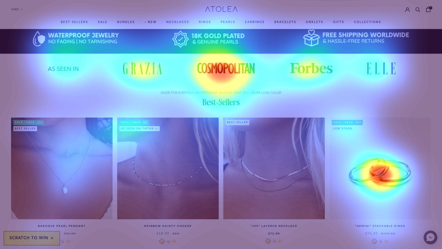
Product Benefits Section
The unique product benefits are receiving low attention despite being key differentiators
3 Critical Issues Affecting Atolea Jewelry's Conversions
Issue: Simplify Top Banner & Emphasize Primary Offer
Multiple competing promotional messages (BUY 2 GET 1, countdown timer, free shipping) are creating cognitive overload, with heatmap showing users getting distracted before reaching core value propositions
Issue: Streamline Navigation Menu with Benefits Bar
Navigation menu receiving disproportionate attention (per heatmap) with too many options (BEST SELLERS, SALE, BUNDLES, etc.) distracting from core benefits
Issue: Optimize Product Grid Price Presentation
Product grid showing low attention on key benefits (per heatmap) with confusing price presentation (SALE PRICE, REGULAR PRICE) creating decision paralysis
3 Specific Changes That Could Increase Revenue by $405.0K
Recommendation 1: Simplify Top Banner & Emphasize Primary Offer
Multiple competing promotional messages (BUY 2 GET 1, countdown timer, free shipping) are creating cognitive overload, with heatmap showing users getting distracted before reaching core value propositions
Consolidate promotions into a single, clear message with hierarchy: Primary offer (BUY 2 GET 1) prominently displayed, with secondary benefits (Free Shipping) in smaller text below. Remove countdown timer and replace with persistent trust badges.
Reducing banner complexity will improve message clarity and direct attention to key value propositions, potentially increasing engagement with product benefits by 12%

Recommendation 2: Streamline Navigation Menu with Benefits Bar
Navigation menu receiving disproportionate attention (per heatmap) with too many options (BEST SELLERS, SALE, BUNDLES, etc.) distracting from core benefits
Consolidate navigation into fewer categories and add a prominent benefits bar below navigation featuring waterproof guarantee and lifetime warranty with supporting icons
Simplified navigation with emphasized benefits will reduce choice overload and increase focus on key value propositions

Recommendation 3: Optimize Product Grid Price Presentation
Product grid showing low attention on key benefits (per heatmap) with confusing price presentation (SALE PRICE, REGULAR PRICE) creating decision paralysis
Simplify price display to show single best price with savings percentage, add benefit icons (waterproof, warranty) to product cards, and include social proof count
Clearer pricing with emphasized benefits will reduce confusion and increase purchase confidence

Combined Impact: Here's What Atolea Jewelry Could Achieve
A conservative projection based on our methodology
Breakdown by Change
- Simplify Top Banner & Emphasize Primary Offer $12.8K/mo
- Streamline Navigation Menu with Benefits Bar $10.5K/mo
- Optimize Product Grid Price Presentation $10.5K/mo
How Atolea Jewelry Would Work With The Good
Our approach lets your team validate our methods before a larger digital experience investment.
Discovery & Baseline
Deep-dive into your analytics and user behavior
Goal Setting
Define success metrics and KPIs
Sprint Planning
Prioritize tests by impact and effort
A/B Testing
Execute, measure, and iterate
Ready to Capture That $405.0K in Revenue?
This is an initial AI-driven assessment to illustrate revenue potential. The next step is a comprehensive optimization program built for you. Every optimization program starts with a digital experience audit. During the audit our team of experts:
- Conducts in-depth user research and analytics review
- Performs heuristic evaluation of your complete funnel
- Identifies the biggest conversion barriers and opportunities in your digital experience
- Creates a prioritized roadmap based on impact and effort
Why Atolea Jewelry Should Trust This Analysis
16+ Years Optimization Work
We've optimized hundreds of millions in revenue through our optimization programs.
Fortune 500 Clients
Worked with leading companies including Nike, Adobe, and Xerox.
Data-Driven Methodology
Our analysis is based on thousands of successful A/B tests across industries.