8 Strategies That Will Help You Reduce Cart Abandonment
Many customers get 90% of the way to completing their purchase, only to rush away at the last minute. How frustrating! Fortunately, we've got tactics to help you reduce your cart abandonment rate.
Imagine walking through the grocery store, filling your shopping cart, wheeling up to the checkout line—and then casually strolling out the door, leaving your cart behind, full of products.
That would be pretty unusual. Yet when it comes to online shopping, the same behavior – referred to as “cart abandonment” – is all too common.
In fact, cart abandonment rates usually hover between 68 and 82%. That means there are more website visitors who browse your store and leave without buying than those who actually complete their purchase.
That’s a lot of money left on the table!
There are a number of reasons why someone might abandon their cart:
- They get lost or confused during the checkout process
- They are experiencing sticker shock
- They leave to find an alternative or a better deal
- They get distracted by other items (Ex: Your Instagram feed)
- They don’t have the time to complete a long checkout process
As you can see, there are a variety of innocent mis-steps that can end up making the difference between, “I’ll pass,” and “Let’s do this!” That’s why a close examination of your product pages and checkout process is a valuable use of your time.
Here’s the good news: Each of these sticking points are fixable, and with the right tactics, you can drastically reduce cart abandonment, improve your conversion rate, and accelerate your revenue growth.
Let’s walk through eight of our favorite cart abandonment optimization tactics…
1. Make It Clear the Cart Has Been Updated
It’s the golden rule of interface design: for every user action, there must be a clear and immediate reaction. In other words, if a shopper clicks “Add to cart,” they should instantly receive visual confirmation their product has been added to their shopping cart.
Let’s imagine that you went to Costco’s website and added this dehumidifier to your shopping cart. Here is what your screen would look like after you clicked the “Add to Cart” button.
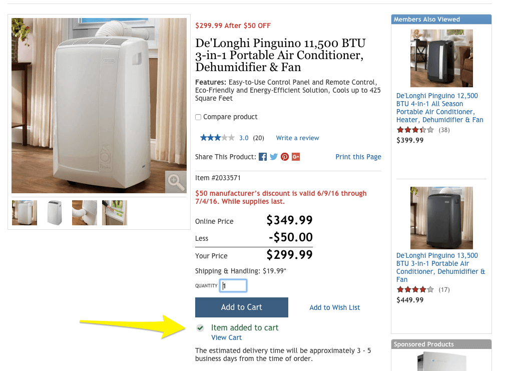
If we hadn’t provided the yellow arrow, do you think you would have felt confident that this product was actually added to your cart?
Probably not, since the confirmation message is small, indistinctive, and buried among other elements. As a result, certain customers probably grow frustrated and leave before completing their purchase.
As a stark contrast, Bellroy makes it quite apparent that the wallet we want to purchase has been added to our cart and the total cart value has been updated. Well done!

2. Strategically Display the “Apply Coupon” Field To Reduce Cart Abandonment
Some retailers put the coupon code field on the first page of the checkout process. Others, like Gap, make customers wait until right before they click “Confirm Purchase” to apply their discounts.
Which approach is more effective? It depends on your pricing and promotion strategy.
If you frequently offer coupon codes— and your prices make it difficult for consumers to calculate the discounts in their minds —follow Gap’s lead and place the coupon code at the very end of the process.
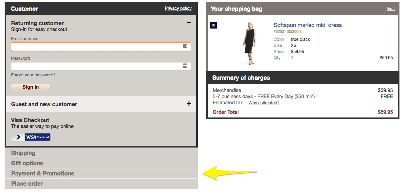
Delaying the coupon application gives people a reason to continue clicking through and entering their information: they’re curious to see how much that $37.99 shirt will actually cost once they’ve entered the 35% coupon code.
TV networks use the same technique to incentivize viewers to stick around through ad breaks—they create a feeling of suspense and anticipation right before they cut to commercial, so that their watchers will sit through the advertisements to find out what happens to their beloved characters.
But if you rarely offer coupon codes, it wouldn’t be wise to design your entire checkout flow around them. After all, you should optimize for the most common use cases, not the edge cases.
If you’re in this bucket, place the coupon code at the very beginning of your checkout process. This choice comes with its own benefits: immediately seeing the redemption box creates less anxiety than searching for it.
3. Provide Coupon Codes On-Site To Reduce Cart Abandonment
When you’re about to buy something, and you see the “apply coupon” field, what’s your first reaction? This field triggers most consumers to open up a new tab and search “[your business name] + coupon.”
Some of them will come back happy, with a discount code in their proverbial pocket. But many will struggle to find an active discount code and never return. The mere presence of the empty field for the discount code makes them believe its out there, somewhere, but they just can’t find it. This leaves them feeling frustrated and annoyed, which diminished your brand reputation and ramps up your cart abandonment rate.
At first glance, this may seem trivial, but the amount of money you’re losing from these incomplete transactions can quickly add up; for example, Sears loses an estimated $16.5 million per month this way.
To avoid having shoppers sucked up by the black hole of Google, consider embedding an option for finding coupons near the promo box.
Macy’s pioneered this strategy. Kent Armstrong, the company’s president of ecommerce, said it successfully kept consumers on the site—and even better, the impact on sales was “far larger than we thought it was going to be.”

Special Note: The Discount Code field is a default setting for most ecommerce platforms. If you don’t run many discounts, we strongly encourage you to hide this field to avoid losing sales to misguided bargain hunting.
4. Enhance Your Reviews
According to an iPerceptions study, 63% of people are more likely to buy from a site with user reviews. But most retailers already recognize the importance of product feedback from real consumers. If you already use reviews to boost sales, it’s time to take things one step further by adding additional context. That includes relevant details about the reviewer—like their age, gender, and other demographic data—along with annotated reviews or verification badges.
“Reviewer details let users find reviews that are pertinent to their situation or use, and review summaries help users wade through large numbers of reviews to see what common issues or strengths the product has,” explains Amy Schade, a director at Nielsen Norman Group.
Lululemon’s review section is a fantastic example. Shoppers can gauge the relevance of a specific comment by factoring in the commentator’s location, exercise preferences, age, and body type.
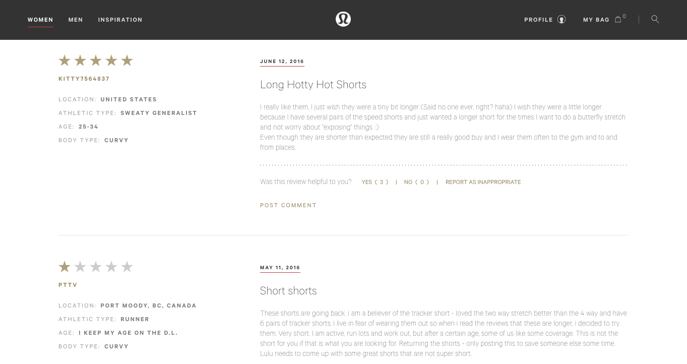
The key learning point here is that customers are much more likely to follow through with their purchase if they are able to see verified reviews from people who share similar characteristics or are in similar situations and had a positive experience with your product.
Enjoying this article?
Subscribe to our newsletter, Good Question, to get insights like this sent straight to your inbox every week.
5. Offer Free Shipping
What is one of the most rewarding elements of shopping in-person? Instant gratification. You get to go home with your product right away, with no waiting period or additional expense.
Amazon is good, but even they haven’t figured out how to provide instant delivery to online shoppers, so while you can’t replicate that aspect of the retail experience, you can overcome the price objection by offering free shipping.
If you’re not convinced, try this on for size: 77% of consumers say free shipping is the most important factor in their purchasing decision. In addition, more than half will purchase additional items to meet the threshold that qualifies them for free shipping.
This isn’t just hearsay, A study from Usability Sciences found customers who received free shipping spent, on average, 20.8% more. So, even though subsidizing shipping costs will eat into your margins, the reduction in cart abandonments and the increase in total revenue will likely make up for it.
6. Make Your Shipping Costs Explicit
Whether or not you choose to offer free shipping, be extremely clear about your shipping rates, timelines, and policies. A staggering 56% of consumers bail on purchases when presented with unexpected costs.
Did you catch that important qualifier? Unexpected costs.
If you have a standard shipping rate for all orders, consider displaying it on a banner across the top of your site or placing it front and center on your product pages.
If you have flexible shipping rates based on things like the number of items in the order, the target arrival time, or the purchase date, you should list all of the available options, their cost, and their terms prominently on your checkout page, like Anthropologie does here…

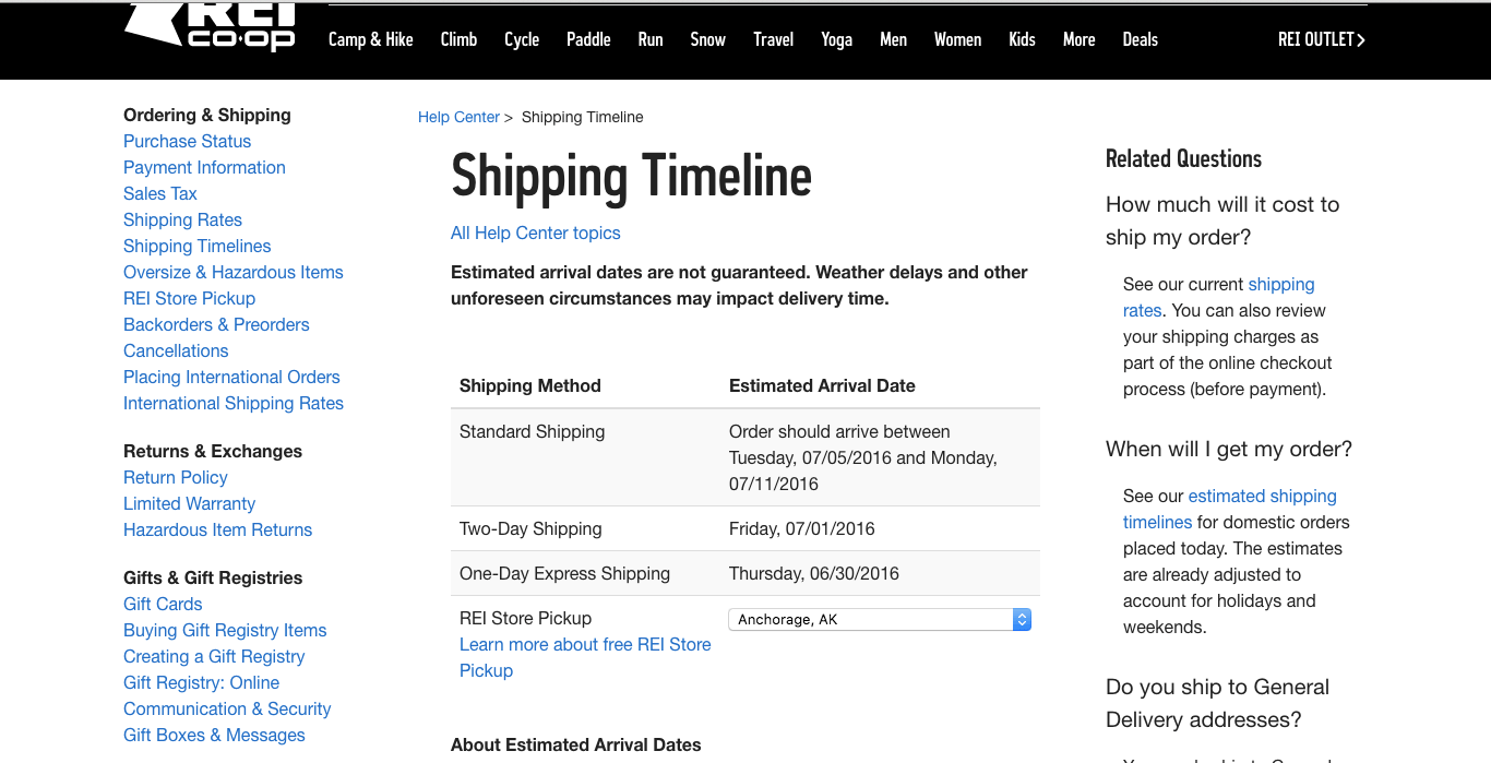
Or follow REI’s lead, and create an entire page for shipping-related information. Just make sure you keep it up to date as rates, timelines, or other aspects change!
7. Provide Guest Checkout
In theory, accounts are good for both customers and retailers…
Customers get personalized experiences, special discounts and offers, easy access to order statuses, a detailed history of their past purchases, and a more convenient checkout experience.
Merchants get more customer data, lower customer support volume, a more direct relationships with their customers, and usually a higher customer lifetime value.
But the people have spoken, and they despise brands that force them to register for a new customer account in order to complete their purchase. In fact, letting people buy without registering can improve your conversions by 45%. ASOS did slightly better: the company cut its abandonment rate in half by offering guest checkout.
Because registration is such a turn-off, 70% of the top 100 retailers have stopped making it a requirement to purchase.
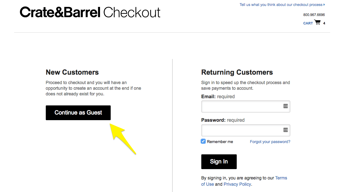
And if you’re worried that providing a “guest checkout” option will tank your customer sign-up rate, don’t be. After consumers complete their order as a guest, you can still ask if they’d like to save their information for future purchases by creating a customer account – you just ensure that you close the sale first.
8. Make the Shipping and Billing Addresses the Same To Reduce Cart Abandonment
Most ecommerce platforms have an off-the-shelf checkout experience that includes everything but the kitchen sink…
- Recipient Name
- Street Name
- Apartment/Suite Number
- City
- State
- Zip Code
Now, can you fill all of that in for the billing address, too?
Oh, and we’re also going to need your credit card number, expiration date, and authorization code, too.
Would you like expedited shipping?
What about one of these complementary products we offer? You’re going to love it!
Okay, fine, but can we interest your in our email newsletter with new product information and discounts?
You can probably see why this experience gets tiresome for your customers, especially when you consider that the average consumer makes one-third of all their purchases on their phones.
Filling out checkout forms is already tedious, and on a small touch screen, it can be almost impossible if it’s not properly designed.
To optimize your conversion rate, consider making their billing address the same as their shipping address by default, or including a simple checkbox that says “Use Shipping Address for Billing” that takes care of half of the checkout process for them.
You should also consider incorporating expedited checkout options like Google Pay, Apple Pay, or Shop Pay, which leverage stored payment and shipping details to reduce the checkout process to just one or two clicks.
Customers can always edit their information if necessary—and some will—but this design choice will save the vast majority from typing or even auto-filling the same content twice.
The Compounding Effect When You Reduce Cart Abandonment
Let’s face it, there are way more people visiting your site and not buying anything than there are people making purchases. You’ll never be able to convert 100% of your prospects into customers.
However, getting someone to the point where they actively place something in their cart and decide to leave your site instead of completing their purchase is something you can influence, and it’s definitely worth addressing.
We’ve given you a playbook with eight strategies you can implement to reduce cart abandonment. I hope that you carve out time in the next week or so to try at least one of them, but the real power is in checking all of these boxes so that you’re presenting your prospects with a “best in class” checkout experience.
These changes are powerful in isolation, but when you combine them you experience a compounding effect that can dramatically improve your sales performance. If you make it a priority to dial in your purchasing experience, you’ll see a significant reduction in your abandoned cart rate, which means your “Order Confirmation” page will be showing up on far more screens than before.
Enjoying this article?
Subscribe to our newsletter, Good Question, to get insights like this sent straight to your inbox every week.

About the Author
Jon MacDonald
Jon MacDonald is founder and President of The Good, a digital experience optimization firm that has achieved results for some of the largest companies including Adobe, Nike, Xerox, Verizon, Intel and more. Jon regularly contributes to publications like Entrepreneur and Inc.