
5 Strategies for Improving Mobile Menu Design From Our Pattern Library
Mobile menu design is not a one-size-fits-all approach. Here are winning strategies from our own pattern library to help you get started.
How many apps do you have on your phone? And how many of them do you use to buy something?
It’s no secret that, in this digital era, mobile devices have become an integral part of our daily lives. More than half of all website visits come from a mobile device. In fact, Oberlo shares that a whopping 56.86% of traffic comes from mobile users. That’s three times the number it was ten years ago.
With smartphones continuously improving and evolving, optimizing the mobile user experience should be a top priority for ecommerce brands. One crucial aspect of mobile design that significantly impacts the customer journey is the mobile menu. An intuitive mobile menu design can enhance navigation, streamline user interactions, and ultimately lead to higher conversion rates.
However, designing an effective mobile menu is not a one-size-fits-all approach. It requires careful consideration of customer behavior and emerging design trends. In this article, we’re sharing winning mobile design strategies from our proprietary pattern library to help inspire designing better browsing experiences for users.
Understanding Mobile Navigation Patterns
Mobile navigation plays a significant role in helping users find what they’re looking for.
However, careful consideration is needed when choosing how to create a mobile menu design for your ecommerce website, as navigation can take up what little space is available on the screen–space that could be necessary for other relevant content.
So, the biggest challenge in selecting a mobile menu design is finding a balance between content and accessible navigation. Fortunately, there are different mobile navigation menu designs to choose from. Here are three of them.
The Hamburger Menu
The hamburger menu is one of the most popular types of mobile menu. In fact, you’ve probably seen it on your favorite websites. It’s made up of three parallel lines stacked on top of each other and lurking on the top left or right corner of a page. Tapping on the menu expands it to reveal more navigation options.
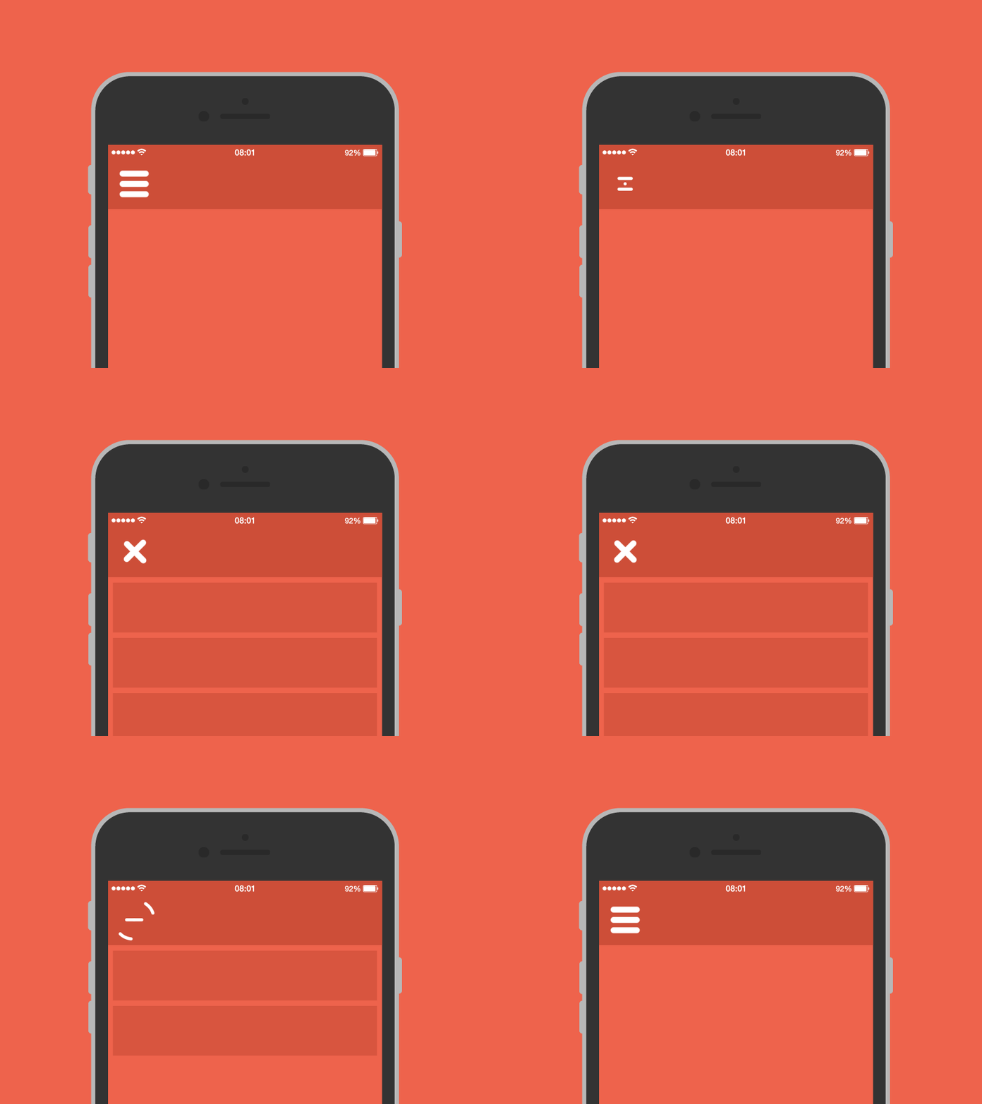
What we like about it:
The hamburger menu not only preserves screen real estate, it can also accommodate a long list of menu items.
What are the challenges:
Some have argued that the hidden panel of the hamburger menu negatively affects discoverability, hindering potential customers from further exploring more categories or features.
The Tab Bar or Navigation Bar
The tab bar or the navigation bar is reflective of traditional site design. It presents a set of clickable tabs, usually found at the bottom of the screen. These tabs represent a different section or category of the website, and the corresponding information is displayed when a user selects one.
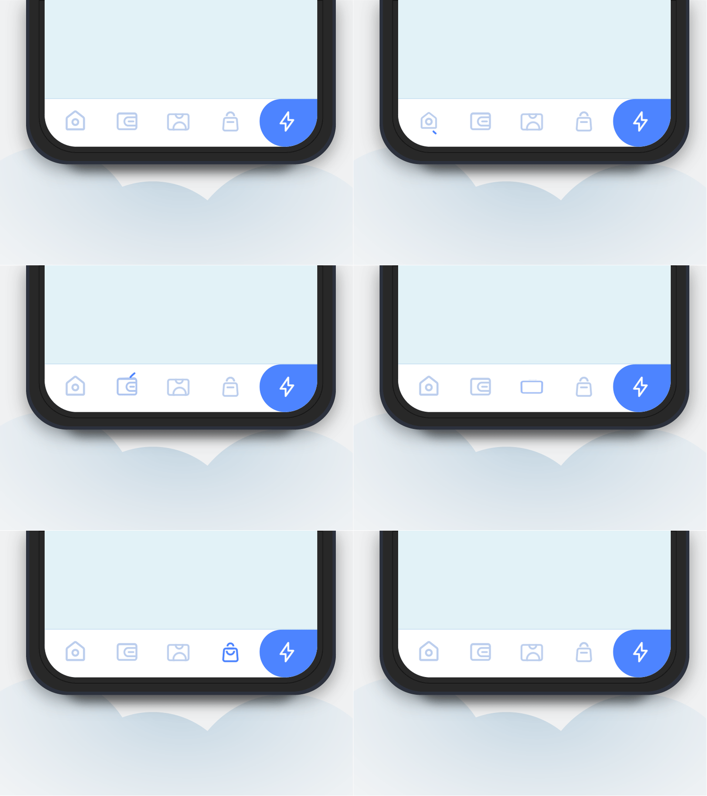
What we like about it:
The tabs remain visible even when one section or category is selected, allowing users to switch quickly between pages. This also enables users to see where they are at a glance.
What are the challenges:
Navigation options should be limited to (at most) five categories or tabs. Anything more than that might affect the readability of the labels or the icons on the navigation bar. If you do choose this navigation pattern, make sure to maintain the proper touchpoint size.
The Navigation Hub
The navigation hub is a mobile menu design that utilizes a whole page to present navigation options and content. When used, the menu replaces the current content page, allowing users to select their next destination.
More often than not, the navigation hub and the homepage are the same. Task-orientated apps often make use of this menu design as they are less concerned with the browsing and consumption of other content and more focused on helping accomplish a particular activity.
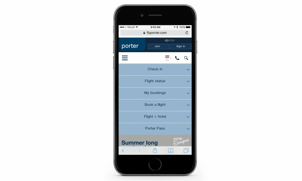
What we like about it:
The navigation hub can enhance usability by eliminating distractions and offering a clear visual hierarchy of the available options.
What are the challenges:
Customers will have to click back to the navigation hub every time they want to go somewhere else, making the customer journey longer and more complicated.
5 Specific Strategies For Improving Mobile Menu Design
Our team of expert strategists is constantly looking for patterns in the digital world. When an optimization strategy wins for a number of clients, they add that tactic to our proprietary library of ideas. It might not win for every brand, but it gives us insight into the user journey and patterns across business types.
The library is now a wealth of winning strategies that have helped us achieve success for our clients time and time again. Let’s look at some tips for making your mobile menu design user-friendly.
1. Improve the Visual Hierarchy of the Mobile Menu
Many websites have a poor content hierarchy, particularly in mobile navigation. Users can suffer from indecision without the guidance of a well-organized and directional menu.
Separating shopping-focused links from other kinds of content in the navigation can increase directional guidance and decrease distraction for would-be shoppers.
Here’s an example from our pattern library for inspiration. TedxPortland center-aligned menus on mobile to make it easier for users to read and navigate.
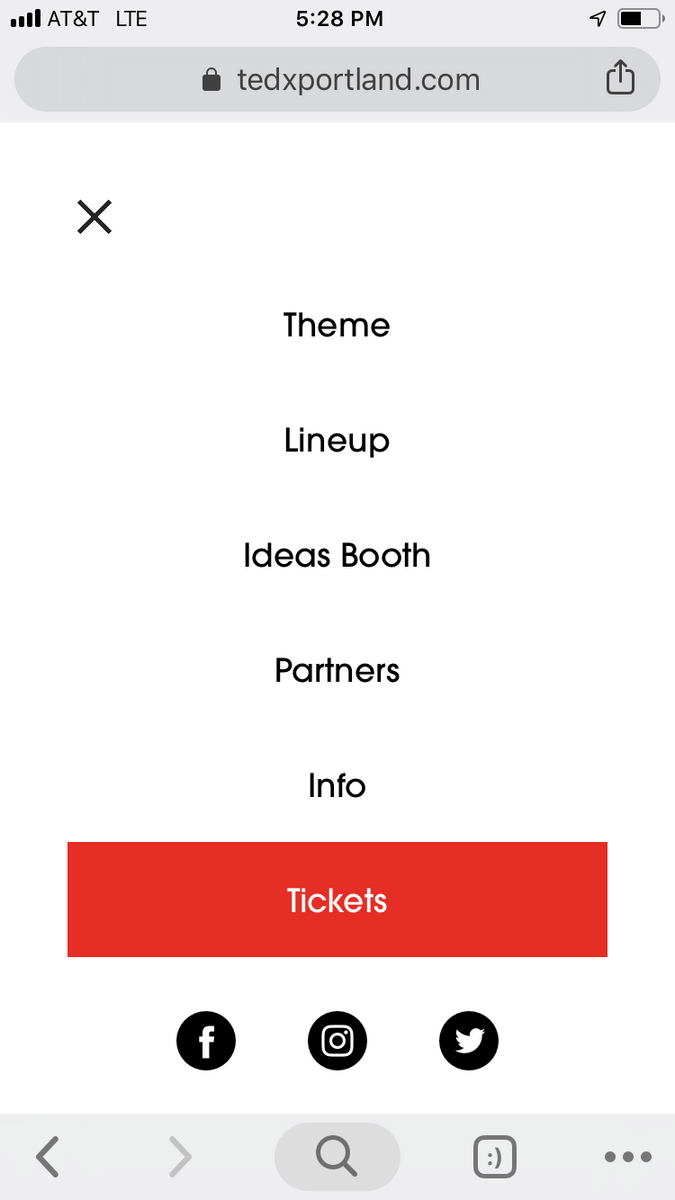
2. Add Search to the Mobile Menu
A user can easily miss the search tools on mobile due to their small size and placement at the top of the page. But, we found that those who use the search function are generally more likely to convert.
Adding search to the mobile navigation menu can promote intentional browsing, improve directional guidance, and emphasize a shopping focus.
Here’s an example from Apple, who adds a search bar to its mobile menu to provide directional guidance to users.
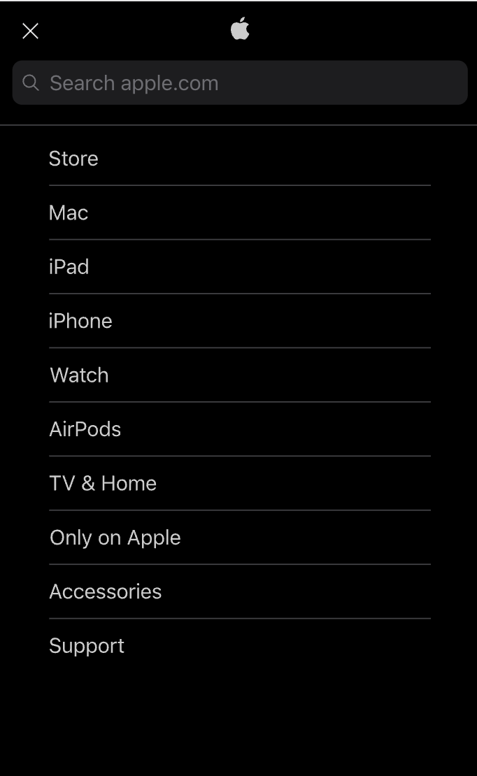
Adding a search bar to the mobile menu is excellent for brands with steady mobile traffic and/or sites with search-forward navigation.
3. Expose the Search Bar in the Mobile Menu
Mobile users tend to miss out on the mobile search bar when it is tucked away, limiting its benefits.
Exposing the search bar in mobile menus can increase the use of search, facilitate product discovery, and improve directness for high-intent users.
WheelerShip exposes its search bar in the mobile header to provide directional guidance to users.

Exposing the search bar is great for brands with a sizable portion of site traffic from mobile users or brands with a vast array of products.
4. Add a CTA to Sitewide Navigation
Users may experience content fatigue or need more directional guidance on sites with several competing offers and CTAs.
Featuring a clear, bold CTA in the sitewide navigation will encourage conversions and improve directional guidance.
The Whitney has a dynamic CTA in their navigation to promote tickets for their current showcase creating an easy pathway for users on the site to purchase tickets.
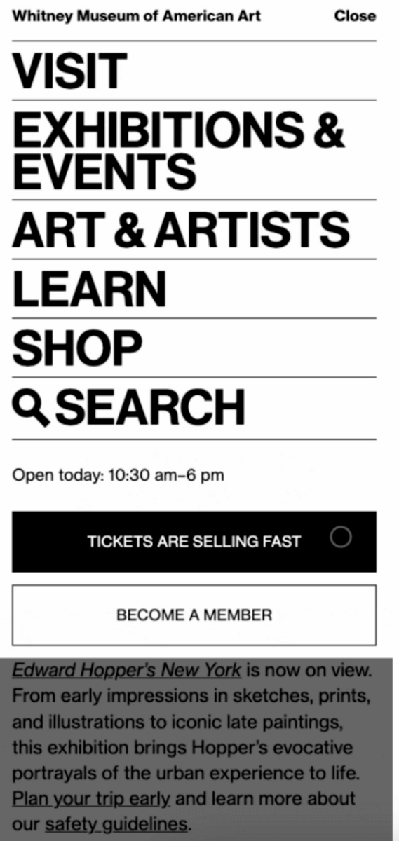
This strategy is best for sites with relatively few SKUs or are focused on tickets, donations, or subscriptions.
5. Expose Subcategories in the Menu
Brands with 2+ categorization levels can use subcategories in the menu to show the breadth of their products and help users find relevant shopping opportunities.
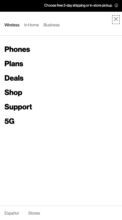
Exposing sub-categories in the menu can increase the visibility of product offerings, support users in wayfinding to products of interest, and improve product engagement and exploration.
The mobile menus clearly separate the utility items from the shopping navigation, reducing cognitive overload.
Other Considerations for Improving Mobile Menu Design
Good mobile design greases the chute to make the path from visitor to buyer frictionless. Let’s look at some ways to make that happen.
Focus on Visibility
Draw the visitor’s attention to your most important information. Don’t try and get too creative with things like menu placement. Stick with what people know.
Make it clear that your menu options are meant to be clicked. Use contrasting colors so your links pop visually.
Communicate the User’s Location
Good mobile menu design keeps the user from ever feeling like they are lost within the navigation.
Utilize visual cues to show what page the user is on and the path they took to get there.
Link Menu Design Choices to User Tasks
There is no one “right” menu design when it comes to user experience. It all depends on the function of the site or app.
Do you have an information-heavy site? Consider a navigational menu that lets the user scan lower-level content. Don’t get cute with your menu labels. Convey accurate information that helps the user complete their reason for visiting.
Make the Touch Easy to Navigate
There is a Goldilocks zone for all touchpoints within your menu design. Your menu links must be big enough to click but not too big that it clutters the screen. The same goes for your drop-down menus.
Consider using a sticky menu if you have content-heavy pages. This gives the user a quick way to get back to the menu rather than scrolling back to the top—every second matters when it comes to the mobile user experience.
Mobile Menu Design FAQs
There are lots of factors to consider when it comes to mobile menu design. In case you want to learn, we rounded up some frequently asked questions that people have about mobile navigation.
What is a mobile menu?
A mobile menu is an element commonly used to provide users with a compact and organized way to navigate through different sections or pages of an app or website, especially when limited screen space is available on mobile devices.
What is the best placement for a mobile menu?
The most commonly used placement for a mobile menu is in the top-left or top-right corner of the screen, utilizing the “hamburger” icon. This placement is familiar to users and provides easy access without obstructing content. However, depending on the context, bottom-centered menus or floating action buttons can also be effective alternatives.
How many items should be included in a mobile menu?
It’s best to keep the number of items in a mobile menu concise and focused. Limiting the menu to 4-7 items helps users quickly scan and make choices without feeling overwhelmed. If you have more items, consider categorizing them into submenus or implementing a search function for easier navigation.
How can I make my mobile menu more discoverable?
To enhance menu discoverability, consider using visual cues such as subtle animations, contrasting colors, or subtle drop shadows. Providing a clear indication, like a highlighted state when the menu is open, helps users understand its functionality. Additionally, offering a persistent “sticky” menu that remains visible during scrolling ensures easy access to navigation options.
Improving mobile menu design improves conversion rate
Our client work has shown us that a more tactical approach to mobile menu design can increase your conversion rate.
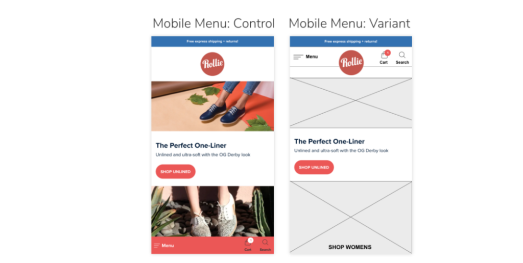
For Rollie Nation, an Australian footwear brand, our initial analysis found they were getting two-thirds of their traffic from mobile but converting at a rate three times less than desktop.
We ran several experiments, the most effective of which was moving the menu from the top to the bottom of the page and making the color contrasts WCAG-compliant. This resulted in a 69% improvement in clicks and a 6% increase in site-wide conversion rate.
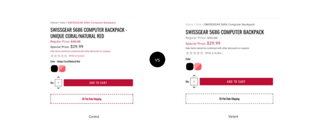
For SwissGear, a luxury travel gear brand, we analyzed their heat map data and determined users preferred a mobile menu to navigate. Unfortunately, the menu was complex, making it easy to make mistakes like selecting the wrong item.
To counteract that, we experimented with various iterations of the mobile menu, finally landing on a more straightforward menu-driven interface on the homepage. This decreased the mobile bounce rate by 8% and increased time on site by 84%.
As you can see from our examples, small changes can yield big results. The secret is a commitment to researching your users’ wants and validating your ideas to find what works.
Improving mobile menu design is crucial to an engaging and seamless user experience. And with the tactics we shared as a starting point, you’re on your way to making your website (and the internet in general) a better place.
If you want to achieve similar results and unlock the full potential of your mobile menu, contact us.
Enjoying this article?
Subscribe to our newsletter, Good Question, to get insights like this sent straight to your inbox every week.

About the Author
Caroline Appert
Caroline Appert is the Director of Marketing at The Good. She has proven success in crafting marketing strategies and executing revenue-boosting campaigns for companies in a diverse set of industries.