
The Good, the Bad, and the Questionable – August 2020
In this Insight series we look at some of the best (and worst) online experiences our team has encountered.

For this month’s installment of The Good, The Bad and The Questionable, we’ll be analyzing a new group of DTC websites that our strategists selected over the last month.
This series takes a critical look at some of the best and worst direct-to-consumer (DTC) website experiences, as well as several questionable design elements that may or may not be worth testing on your own ecommerce site.
In case you missed it, you can check out last month’s installment here.
Disclaimer: This is by no means a way for our team to bash unsuspecting ecommerce websites. It’s simply an outlet for us to recognize great UX design when we see it, as well as provide helpful feedback for sites that may have missed the mark. That’s all!
Now let’s dive in…
The Good Experiences
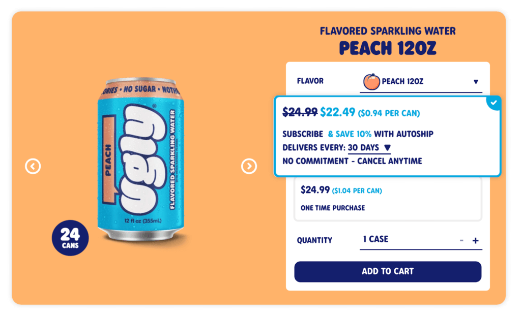
Ugly Drinks’ subscription options
Over the last few years it seems like every DTC brand has made an attempt to launch a subscription-based product or service. It’s predicted that by 2023, 75 percent of organizations selling DTC will be offering some form of subscription service.
A trend that’s been showing up more frequently on ecommerce websites is the “subscribe and save” approach to selling products. Why buy a single unit when you could subscribe and have it delivered to your front door once a month at a discounted price?
Ugly Drinks – a DTC sparkling water brand – has a great approach to selling their products on a subscription plan. Visitors are able to customize the frequency and quantity of their subscription plan directly on the product page. They also add that there’s “no commitment” and customers can cancel anytime without a hidden fee. This is setting the customer up for a positive buying experience by:
- Notifying the customer that they’re saving money with a subscription
- Providing options to customize their plan
- Reassuring the customer that they can cancel at any time
Billie’s product page
The design of a product detail page can often make or break a sale. While it’s true that each point along the customer journey is important, the product page is where visitors will most often convert into customers, so it’s a critical spot on any website.
Every product page must be able to do three things well:
- Give detailed, benefit-focused information about the product in question
- Offer an easy and obvious way for buyers to take the next step towards ownership
- Provide a way for shoppers to be presented with alternative suggestions
Billie – a DTC brand that sells women’s beauty products – has one of the best approaches to highlighting product details on a PDP that I’ve seen in a while. Billie’s target audience is health-conscious women who are mindful of the ingredients being used in their haircare and skincare products. This product page makes it easy for visitors to quickly read the product description and understand more about the ingredients being used to create the product.
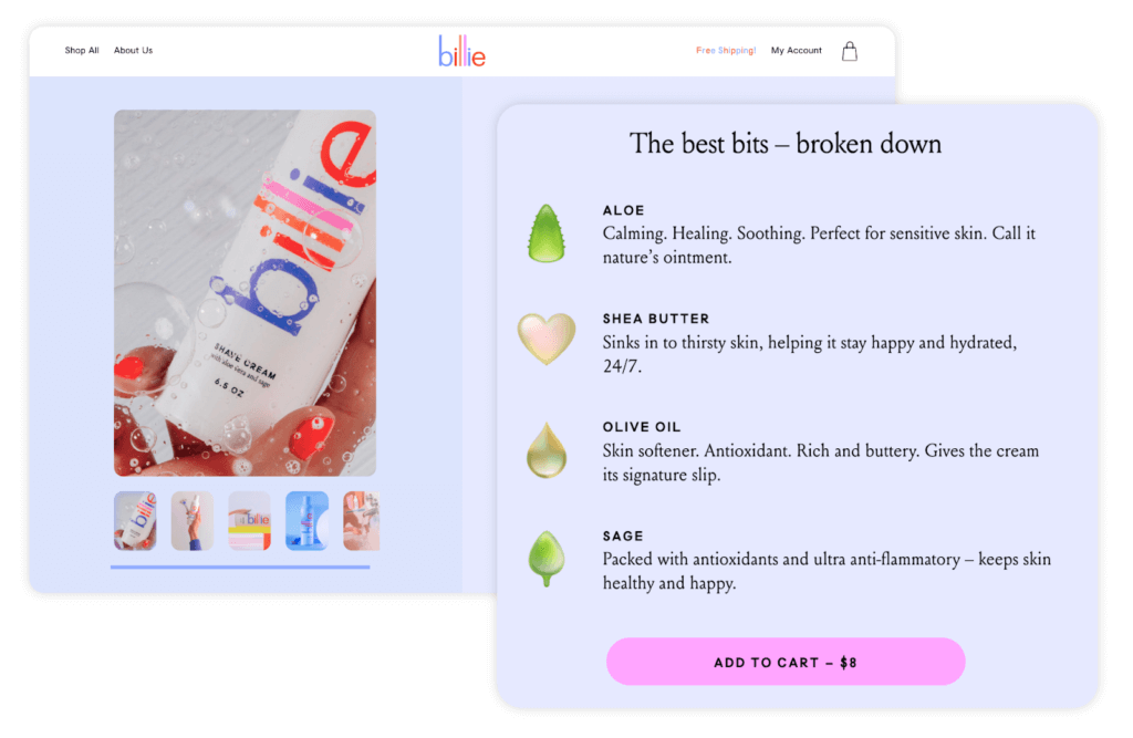
They use visual aids to draw attention to the product ingredients, and have an ‘Add-to-Cart’ CTA directly located beneath the ingredients list to encourage visitors to checkout.
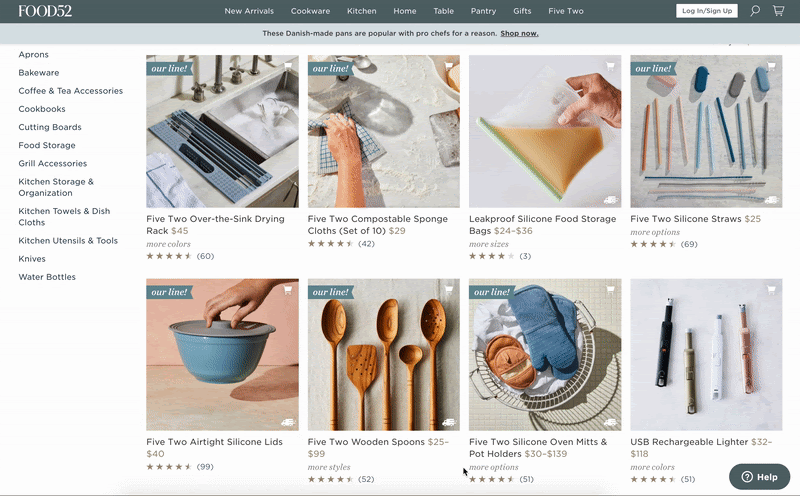
Food52’s category pages
The job of the category page is to display products that fit the narrowness (or broadness) of the product category, and provide additional information that’s necessary to entice visitors to click-through to the product page.
The category page must be both obvious and humble:
- Obvious, in that the choices it provides must stand out and be easily recognizable (this isn’t a page for obscurity)
- Humble, in that it must never draw attention to itself; rather, it must point clearly to the product categories it displays
Enjoying this article?
Subscribe to our newsletter, Good Question, to get insights like this sent straight to your inbox every week.
Food52 – an ecommerce cookware retailer – has a great product category page unlike anything I’ve seen before. They use GIFs as product images to highlight the functionality of specific products that may be difficult to understand based solely on the product name. This is an excellent design choice that could easily be implemented on other ecommerce sites selling specialized products.
The Bad Experiences
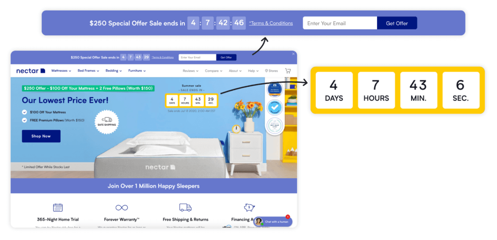
Nectar Sleep’s homepage
Creating urgency on an ecommerce website without detracting from the user experience is a difficult task. It requires a clear understanding of what motivates your audience to purchase, then using that information to carefully build urgency throughout the customer journey.
From my experience, countdown timers are almost always going to hurt the user-experience of a website rather than help it. Depending on how it’s used, a countdown timer can damage the credibility and trustworthiness of your website, and create a convoluted purchasing experience that’s sure to hinder sales.
Nectar Sleep – a DTC mattress brand – greets users with two countdown timers on their homepage. Not only does this provide for a frustrating browsing experience, but it positions Nectar Sleep as a discount brand. And as if the two countdown timers weren’t enough, first-time visitors are also struck with a pop-up advertising their current promotion.
Enjoying this article?
Subscribe to our newsletter, Good Question, to get insights like this sent straight to your inbox every week.
This is three separate website elements competing for the user at the same time.
It’s highly likely that if you looked at this website’s homepage analytics, they’d have a very high bounce rate. Pushing too many offers in the face of prospective customers at the start of the customer journey creates a frustrating user experience that will only work against you.
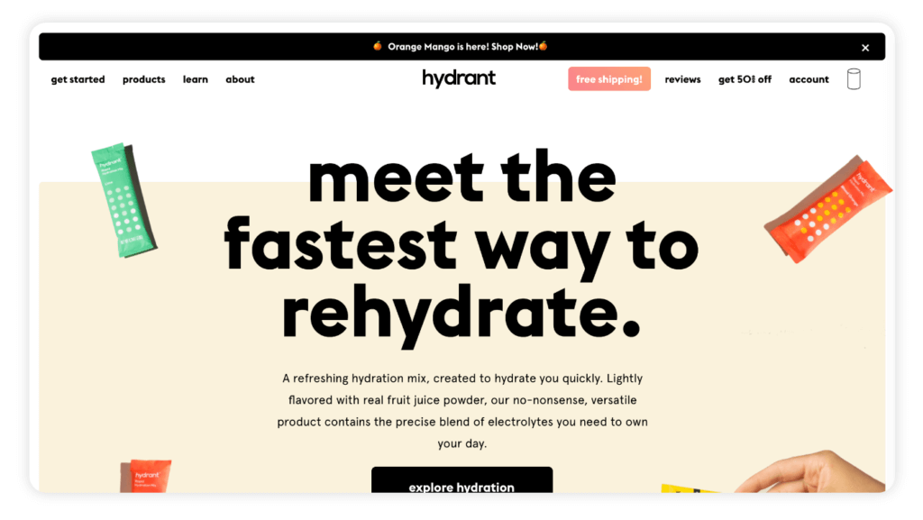
Hydrant’s convoluted navigation menu
Website navigation can make or break your visitors’ browsing experience. Attempting to navigate a website without a logical, well-defined structure is like being dropped in the middle of a complex maze with no map and no frame of reference. It’s overwhelming, frustrating, and all-around unpleasant – not exactly the user experience you’re hoping for.
A good navigation menu should serve the purpose of helping visitors navigate to the product they’re seeking as quickly and efficiently as possible.
Hydrant – a DTC brand that sells electrolyte-enriched drink mixes – is a great example of a brand that throws too much information at their visitors in the navigation menu. Including eight buttons in your navigation bar is fine if they’re all necessary to the buying experience. Including things like Reviews, Get 50% Off, and Free Shipping in your menu distracts users from completing their original goal of researching your product, and purchasing. That information should be positioned somewhere in the footer, not in the main nav bar.
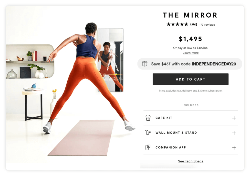
Mirror’s product page
If there’s one thing we preach at The Good, it’s that discounting is not a sustainable approach to growing your business. All too often, we see companies leaning on discounting to help drive sales, and while it’s true that offering sales and discounts can provide a temporary lift in revenue, it’s ultimately not a sustainable growth strategy and will only provide you with short-term success.
Perpetual discounting is inadvertently training customers to expect a discount whenever they purchase from your website. If you launch a new product, your target audience likely won’t buy it until they can find a discount code to use.
Mirror makes the mistake of positioning a discount code directly above the main ‘Add-to-Cart’ CTA on their product page. Is this helping or hurting conversions for them? While it may provide an initial uptick in sales, the damage its doing to their brand will be felt in the long-term.
The Questionable Experiences
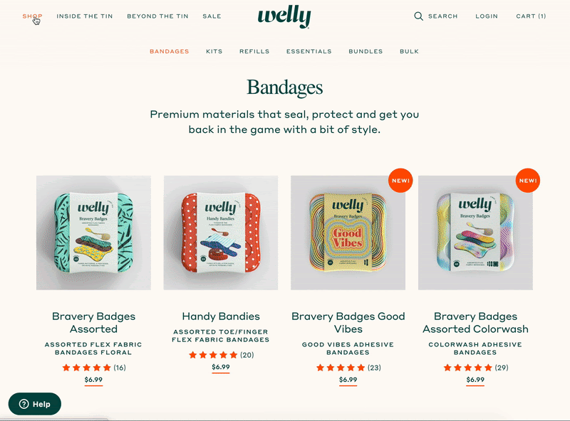
Welly’s shoppable navigation menu
Welly – a DTC brand selling first-aid essentials – has a unique approach to designing their navigation menu. Visitors can quickly navigate through a series of drop-down menus to identify what item they need and add it to their cart without having to move to a dedicated product page.
This is a creative approach to shortening the customer journey to just a few short clicks. Visitors can land on the homepage, add the products they need to their cart, and check out in less than a few minutes. This style of navigation menu won’t work for brands selling higher-priced products, but for ecommerce businesses selling “essentials” like Welly, this approach works great.
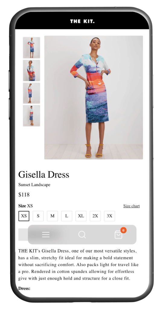
The Kit’s mobile navigation menu
The Kit – a DTC apparel brand – has an interesting approach to designing their mobile menu. Rather than opting to use a nav bar at the top of the screen, they have a transparent hovering menu that gives users the option to search for other products, or jump straight to their cart.
What was the intention behind this design choice? One possibility is that the company is driving lots of paid traffic to their product pages and they don’t want prospective customers navigating to other parts of the site on mobile. There’s no way to tell for sure if this is helping their conversion rate, but it’s certainly a fresh approach to UX design that’s worth experimenting with on other ecommerce sites.
Start Testing on Your Website
The goal of this Insight is to help inspire ecommerce business owners to start testing on their websites. A key piece to developing expertise in conversion optimization involves observing what other businesses are doing on their sites and keeping up with the ever-changing trends of UX design.
Interested in receiving personalized feedback on your website from a CRO expert? Sign-up for a free landing page teardown and we’ll take a close look at your website and identify the key friction points that might be hindering your site’s conversion rate
About the Author
Jon MacDonald
Jon MacDonald is founder and President of The Good, a digital experience optimization firm that has achieved results for some of the largest companies including Adobe, Nike, Xerox, Verizon, Intel and more. Jon regularly contributes to publications like Entrepreneur and Inc.