
Why Are Free Users Churning? A Growth Leader’s 5-Step Guide To Auditing The Free User Experience
A five-step framework that SaaS product and growth leaders can use to audit their free experience and reduce churn.

“My free users aren’t converting, where do I start?”
If you’re asking this question, you’re already ahead of most product leaders. You recognize the problem. But here’s what many miss: conversion is a symptom, not the root cause of the problem.
SaaS churn often happens before users ever consider paying.
It’s common for users to hit friction points you didn’t know existed. They encounter gates that make no sense in context. They drop off at moments when just a bit more clarity could have kept them engaged.
The good news? You can fix this. But not by guessing. Not by copying what Dropbox or Notion does. And usually not by adding more features.
What you need is a systematic audit of your free or anonymous user experience. One that reveals exactly where users hit walls, why they bounce, and what you can do to keep them engaged long enough to see value.
This article walks through a five-step framework that SaaS product and growth leaders can use to audit their free experience and reduce churn. It’s the same approach we use with clients, adapted so you can run it internally. Fair warning: this takes work. But if you’re serious about improving SaaS user retention, it’s worth every hour.
Why your free experience impacts your retention rate
Before we get into the framework, let’s be clear about what we mean by “free experience.”
This includes any interaction where users engage with your product without paying. That could be a free trial, a freemium tier, anonymous tool usage, or limited feature access. It’s the first impression, the test drive, the “try before you buy” phase.
And it matters more than you think.
Most SaaS companies obsess over free-to-paid conversion rates. But conversion is a lagging indicator. By the time a user decides not to convert, the damage is already done. They disengaged days or weeks ago. They just didn’t tell you.
The real opportunity sits upstream. If you can identify and remove friction in the free experience, you don’t just improve conversion rates. You improve activation rates, engagement, time-to-value, and long-term retention. You build a user base that actually wants to pay because they’ve already seen the value.
Here’s how to find those friction points.
Step 1: Review your data for drop-off points
Start with what’s already happening in your product. Before you talk to anyone or look at competitors, you need to know exactly where users are getting stuck.
Dig into your product analytics. You’re looking for three things:
Activation drop-offs: Where do users abandon the onboarding flow? Which steps have the highest exit rates? If 60% of users drop off when asked to invite teammates, that’s a signal.
Feature engagement patterns: Which features do free users actually use? Which ones do they try once and never touch again? Are there features you’ve gated that users don’t even attempt to access?
Time-to-value analysis: How long does it take users to complete their first valuable action? And what percentage of users never get there? If your median time-to-value is three days, but 70% of users churn within 48 hours, you have a problem.
Set up a dashboard that tracks these metrics by cohort. New signups this week versus last month. Users from different acquisition channels. Free trial versus freemium. The patterns that emerge will guide your optimization priorities.
Layer on session recordings and heatmaps to see exactly what’s happening at key drop-off points. Numbers tell you where the problem is. Qualitative data tells you why.
Watch 20-30 sessions of users who churned in their first week. What did they try to do? Where did they get stuck? What confusion or frustration is evident in their behavior?
This isn’t just a data review. It’s detective work. You’re building a picture of where your free experience breaks down.
Step 2: Talk to users (both active and churned)
Now that you’ve identified drop-off points in your analytics, it’s time to understand the human story behind those numbers. Conduct 10-15 interviews, split between two groups:
Active free users (people still using your product but haven’t upgraded): Why are they still here? What value are they getting? What would make them pay? What’s holding them back?
Churned users (people who tried your product and left): What were they trying to accomplish? Where did they get stuck? What made them give up? What would have kept them engaged?
Keep these conversations short (15-20 minutes) and focused. You’re not selling. You’re learning.
Sample questions for active free users:
- What problem were you trying to solve when you first signed up?
- Walk me through how you use [product] today.
- What features do you wish you had access to?
- What would need to change for you to consider upgrading?
- If we removed [specific free feature], would you still use the product?
Sample questions for churned users:
- What were you hoping to accomplish with [product]?
- Where did you get stuck?
- Was there a specific moment when you decided it wasn’t for you?
- Did you consider other tools? What made you choose them instead?
Record these conversations (with permission) and transcribe them. The exact language users employ to describe their experience reveals friction points you’d never spot in analytics alone.
Pay special attention when users mention alternatives they considered or are currently using. This context becomes critical in the next step.
Step 3: Map what your users are being offered in the market
You now understand what’s happening in your product and why users make the decisions they do. The next question is: what are they comparing you against?
Your users don’t evaluate your free experience in a vacuum. They’re weighing it against every other tool they’ve tried, every competitor they’re considering, and every product they wish yours worked more like.
This step isn’t about copying competitors. It’s about understanding the full landscape of options your users are navigating.
Create a comprehensive inventory of how other products in your space (and adjacent to it) handle their free experiences. Document what your users are seeing elsewhere.
Here’s what to capture in a Figma or Notion file.
Set up a page with one row per product. For each one, document:
- What features are available without registration
- What requires an email address but remains free
- Where the hard paywalls sit
- How they communicate limits (countdown timers, credit displays, etc.)
- Placement and messaging of upgrade prompts
- Onboarding flows and activation sequences
Don’t limit yourself to direct competitors. Look at the tools your users mentioned in interviews. If they’re comparing your productivity tool to Notion, your design tool to Figma, or your automation platform to Zapier, study how those products handle free users.
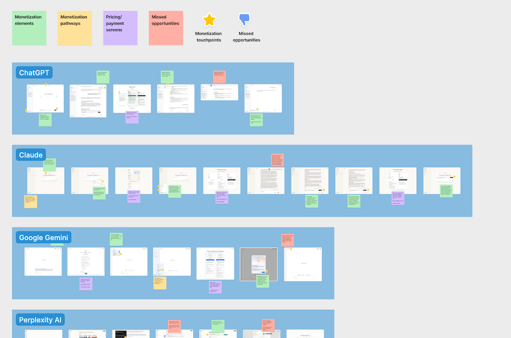
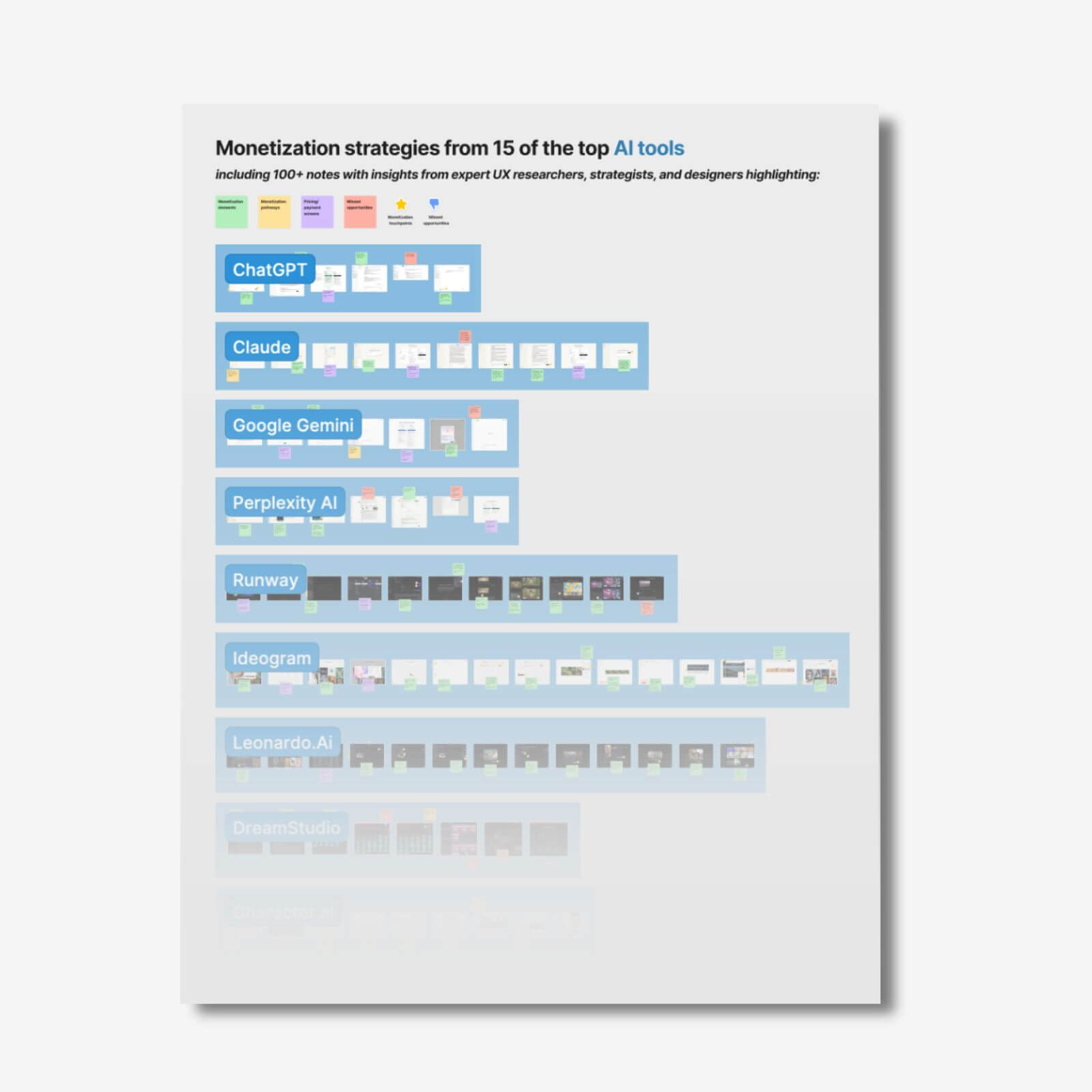
Pro tip: Screenshot everything. Your database should include visual documentation of every monetization touchpoint, limit notification, and upgrade CTA. These screenshots become invaluable references when you’re making decisions about your own experience.
This exercise typically takes 8-12 hours for a thorough analysis of five to seven products. You’ll surface approaches you hadn’t considered and identify industry patterns that users have come to expect.
The goal here is context. When a user hits a limit in your product, they’re mentally comparing that experience to how Dropbox handles storage limits, how Canva displays upgrade options, or how Grammarly shows premium features. Understanding those reference points helps you design a free experience that meets or exceeds market expectations.
Step 4: Run a verb scoring exercise
With data, user insights, and market context in hand, it’s time to systematically evaluate your own product’s free experience. This is where verb scoring comes in.
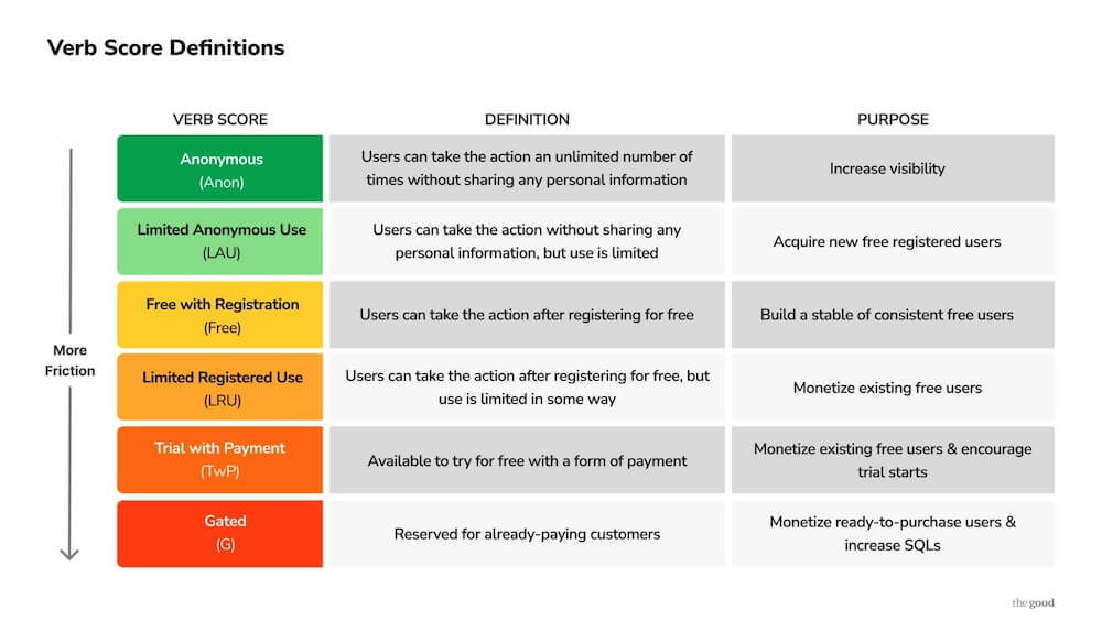
Verb scoring evaluates the discrete actions users can take in your product and assigns each one a “score” based on the level of friction required. The six verb scores are:
- Anonymous – Users can take this action without providing any information
- Limited Anonymous Use – Users can take this action without registration, but only a limited number of times
- Free with Registration – Users must register (email + basic info), but can take this action unlimited times for free
- Limited Registered Use – Registered users can take this action, but with caps or restrictions
- Trial with Payment – Users must provide payment information to access this action (even if they’re not charged immediately)
- Gated – Only paying customers can take this action
List every meaningful action users can take in your product. Not features, but actions. “Create a document” is a verb. “Edit collaboratively” is a verb. “Export to PDF” is a verb. “Share via link” is a verb.
Then score each one. Where does it fall on the spectrum from Anonymous to Gated?
This exercise reveals your actual monetization strategy, not the one you think you have. You’ll often find that verbs are gated inconsistently, or that you’re giving away too much (or too little) at critical moments.
For a detailed walkthrough of verb scoring, including decision trees and examples, see our guide on verb scoring for product strategy.
Create a verb scoring matrix that maps all your verbs against these six scores. This becomes your baseline. It shows exactly where friction exists in your free experience, allowing you to compare it directly to what you documented in Step 3.
Step 5: Connect the dots between data, users, market context, and verb scoring
This is where the audit comes together. You now have four layers of insight:
- Quantitative and qualitative data: Where users drop off and what they’re doing (or not doing)
- User feedback: Why they drop off and what they’re thinking
- Market context: What alternatives they’re comparing you against
- Verb scoring matrix: Where friction exists in your own product
Lay them side by side. Look for patterns.
Here’s what you’re hunting for:
Friction without reason
Look out for verb scores that create unnecessary barriers relative to market norms. For example, if your data shows 40% of users bounce before registering, user interviews reveal confusion about what your product does, and your market analysis shows that competitors allow anonymous exploration, you’re likely losing users before they experience value. Your verb scoring can reveal that you’re gating too early.
Value leaks
Check for free features that users love but don’t move them toward conversion. If your most-used free features have no connection to paid capabilities, and users in interviews can’t articulate why they’d upgrade, you’re building a user base that will never pay. Your verb scoring might show you’re giving away too many “Free with Registration” verbs without strategic “Limited Registered Use” prompts.
Invisible gates
Paywalls that users hit without understanding why. Your data shows sudden drop-offs at specific upgrade prompts. User interviews reveal confusion about value or poor timing. Market analysis shows competitors explain premium benefits more clearly. Your verb scoring identifies which verbs are gated, but not whether those gates make sense to users.
Poorly timed friction
Limits or gates that appear before users have experienced enough value. Data shows high bounce rates at the first upgrade prompt. User interviews reveal frustration: “I hadn’t even figured out the basics yet.” Market analysis shows that similar tools delay friction until after activation. Your verb scoring might reveal that you’re using “Limited Anonymous Use” or “Trial with Payment” too early in the journey.
Market misalignment
Patterns where your verb scoring differs significantly from market norms, and your churn data supports that this matters. For instance, if every competitor allows free PDF exports but you gate this behind payment, your churned user interviews will likely mention this as a dealbreaker.
Create a prioritized list of friction points based on:
- Impact (how many users are affected, based on your data?)
- Confidence (do your user interviews confirm this is a problem?)
- Effort (how hard is this to fix?)
- Market expectation (is this friction standard, or are you an outlier?)
This becomes your retention optimization roadmap.
Why this framework works
This five-step audit framework delivers three specific outcomes that improve SaaS user retention:
Get a clear path to higher retention rates: No more guessing. You’ll have a prioritized list of friction points ranked by impact and effort. Fix the top three and you’ll see measurable improvement in activation, engagement, and conversion.
Make data-driven decisions: Create a culture of user-centered decisions rather than those based on the highest-paid person’s opinion, historical choices, or a gut feeling. When you combine quantitative data, qualitative research, market context, and systematic verb scoring, arguments become easy to settle.
Prevent feature flop: Validate changes before implementation. You’ll know which gates to remove, which features to add to your free tier, and which upgrade prompts to reposition, all before you waste valuable development resources.
Teams that run this audit consistently report two things: first, they’re surprised by what they find. Assumptions they’d held for months or years turn out to be wrong. Second, the fixes are often simpler than expected. Sometimes all it takes is moving an upgrade prompt, clarifying messaging, or ungating a single feature.
Running this audit takes time (and that’s the point)
Let’s be honest: this framework requires a meaningful investment. Between data analysis, user interviews, market research, and verb scoring, you’re looking at 40-60 hours of work.
That’s assuming you have the right tools, know how to set up proper analytics, can recruit and interview users effectively, and have experience interpreting qualitative data.
For many SaaS teams, that’s exactly the problem. You know you need to audit your free experience. You know churn is killing growth. But your product team is building features, your growth team is running acquisition campaigns, and nobody has the bandwidth or expertise to run a proper retention audit.
That’s where The Good’s Digital Experience Optimization Program™ comes in.
We’ve run this exact process dozens of times for SaaS companies between product-market fit and scale. Companies like yours with $1M-$30M ARR and pressure to accelerate growth while battling churn.
Our team conducts the full audit, including data review, user research, market analysis, and verb scoring, and delivers a prioritized roadmap of friction points with specific recommendations. Then we help you implement, test, and optimize the changes.
The result? Clients typically see measurable improvements in activation and retention within 60-90 days. More importantly, they build an optimization discipline that compounds over time.
Want to see where your free experience is bleeding users? Schedule an introductory call to discuss how we can help you reduce churn and improve SaaS user retention.
How Top AI Tools Turn Free Users Into Paying Customers
About the Author
Jon MacDonald
Jon MacDonald is founder and President of The Good, a digital experience optimization firm that has achieved results for some of the largest companies including Adobe, Nike, Xerox, Verizon, Intel and more. Jon regularly contributes to publications like Entrepreneur and Inc.