
How to Use Comparative Reviews to Inspire Experiment Ideas
It’s not always wise to copy others, but you can develop good test ideas through comparison. Here’s how to get started with effective comparative reviews.

Recently, one of our clients asked us, “What makes a great SaaS (software as a service) website?”
That’s a question we hear in one form or another on a regular basis. While conversion optimization is a method that’s most widely applied in ecommerce, we also use comparative reviews to help lead generation and SaaS brands optimize their websites.
So What Is a Comparative Review?
Comparative reviews entail critiquing the design techniques other successful companies use in order to help you generate ideas of your own. Comparative reviews are inexpensive, often enlightening aids to the conversion optimization process.
During a review, our team walks you through the critique process to help you (and new team members) learn to develop a critical eye for site design
Now, because it’s not strictly data-driven, you won’t know whether you’re basing your views on what’s working or not. That’s why we recommend using this method strictly to help you develop better test ideas and design opinions, and to avoid making sweeping changes based on the results of your comparative reviews.
The Comparative Review Process
The case study approach we use in this article shows you the kinds of things our team looks for when we perform comparative reviews for clients. We’ll use multiple examples from industry-leading SaaS sites to keep the process simple, but this method can be applied just as easily to an ecommerce website.
If you want to learn more about how to perform your own comparative reviews, you’ll find plenty of inspiration and direction here.
First, we’ll list some of the primary factors our teams at The Good look for when reviewing a website. Then, we’ll use them to briefly analyze a selection of SaaS sites.
Comparative reviews can be a quick, cost-efficient aid to conversion rate optimization (#CRO). Share on XSetting the foundation for the critique
Like ecommerce websites, there are two things SaaS websites should do well:
- Help prospects research solutions to their problem.
- Help prospects convert into a subscriber, lead, or customer.
Elements on the page should support those two goals. Within a few seconds of viewing your landing page, prospects should be interested enough to stay and either learn more or take an action.
The primary guidelines we’re going to use to evaluate these sites include the following:
- Focus each page around one CTA. Keep it simple by giving each page one purpose.
- Position a clear and powerful value proposition above the fold to let your prospects know why you’re the best choice.
- Include clear pictures of the product. Let your prospects see what they’re getting.
Include a video. Help them understand the benefits of your tool with a quick two-minute walk through. - Include a demo. Help your prospects imagine themselves using it.
- Include a free trial. Let your prospects test drive your products to really engage them.
- Include the tech essentials. Tell prospects about the security, speed, IT, service, and team details for your product.
- Make it easy for prospects to contact you. Provide easy-to-find contact information.
- Show your competence with pages that load quickly (three seconds or less), immediately identify your company and its products or services, and offer easy-to-follow navigation.
In addition, our own experience has also shown us some practices that hurt conversions. Here’s a short list of those:
- Industry jargon can impress your competitors but lose your customers.
- Pop-ups and forceful selling techniques can send visitors packing.
- A focus on you instead of them will make them quickly lose interest.
We’ll illustrate both the good and the bad in the following comparative review examples.
Comparative Review Case Studies
Xero
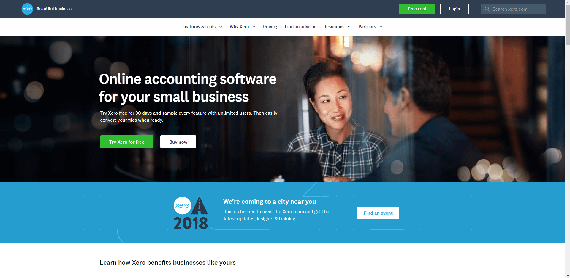
What they’re doing well: Clean header navigation
What needs to be fixed: Lack of a value proposition
Discussion: Visitors to your website should never feel overwhelmed by content. They should immediately know where they are and what the site offers. Xero keeps it clean and simple. Color coordination helps with navigation, though providing multiple CTAs (calls to action) is potentially distracting.
On the downside, while Xero is clear about what they do (online accounting software for small businesses), they don’t tell visitors why they’re a better choice than any of the numerous other SaaS sites in their niche.
The tagline at the top left reads “Beautiful business.” In most cases, the last thing someone seeking an online accounting solution cares about is whether or not the product is “beautiful.” In most cases, an easy to use and well-supported website is much more valuable than one that looks good but doesn’t perform.
Active Network
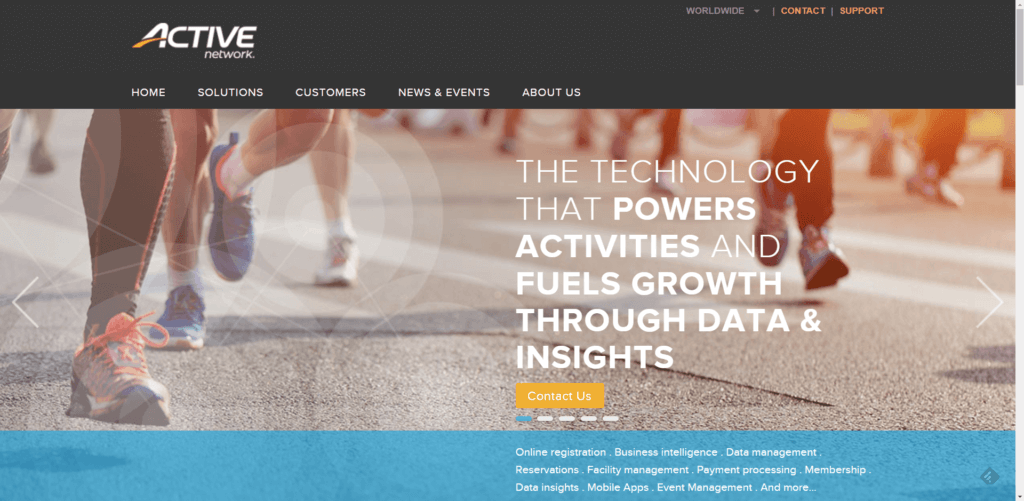
What they’re doing well: One CTA stands out on the page
What needs to be fixed: Jargon for a value proposition
Discussion: We love landing pages that present one clear and unmistakable call to action. Active Network does that with one short “Contact Us” suggestion inside a button that stands out plainly from the rest of the page.
Unfortunately, visitors aren’t provided a clear picture of exactly what Active Network does. The abundance of jargon fails to focus on the prospect. Which activities get powered? Are they a data processing company? The track shoes and “Active” give us a strong clue this company focuses on sports or fitness, but that’s still a big category. Do they work with ecommerce websites that sell athletic shoes? Do they work with college athletic departments?
If visitors are unsure about whether the site is right for them at first glance, many will leave to find a provider that knows the customer and the customer’s needs.
Beyond that, the homepage photo and message are on a slider. It moves approximately every eight seconds, but all the slides are as unclear as the first.
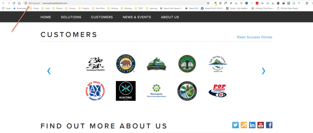
On the positive side, Active does a good job of providing social proof icons that highlight their customers, a link to “read success stories,” and social media connection icons (see the screenshot above).
BambooHR
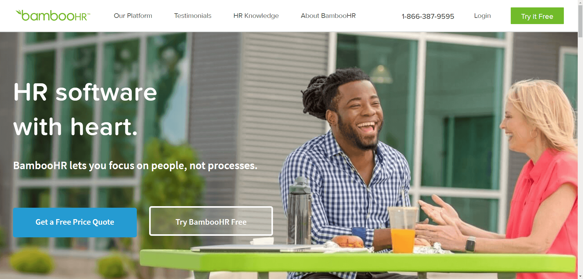
What they’re doing well: The copy focuses on the prospect, not on the company. Clear benefit statement.
What needs to be fixed: Split CTA could cause confusion
Discussion: This site provides an excellent example of how to let prospects self-identify. If you’re in human resources and you’re tired of focusing on processes instead of people, BambooHR has a solution for you. Instead of saying “Our software focuses on people …” the copywriting here gets personal and “lets you focus on people, not processes.”
The illustration suits the topic, and the page is clear and uncluttered. Our only suggestion is to present visitors with just one CTA. Offer them a free quote or provide a free trial; both are fine, but don’t shoot for two. Give visitors one choice. In this case, it may be better to provide a CTA to “Find out more”—then offer a quote or a free trial after the prospect knows more about the product.
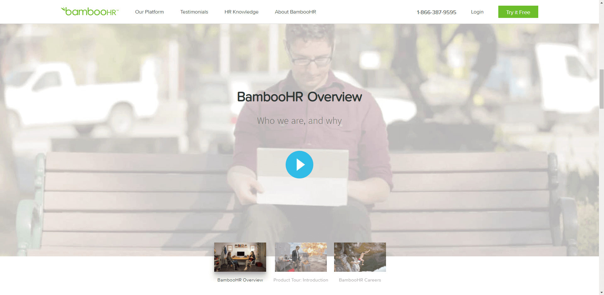
Scroll down to see the BambooHR Overview (see the screenshot above). It’s an attractive series of videos about the company, its products, and its career opportunities. Farther down, you’ll find a list of “Bamboo Awards.”
NOTE: Choose how you’re going to present your company name and stick to it. This company uses “bambooHR” on navigation tabs, but “BambooHR” elsewhere. That can only serve to confuse visitors and make the company appear inconsistent.
Dropbox Business

What they’re doing well: Simple and clear
What needs to be fixed: Double CTAs
Discussion: We’re not completely sold on the primary benefit statement, “Work better, safer, together,” because all three terms are generic and non-specific. However, we like the explanation that Dropbox “simplifies your work, with a central place to access and share files.” The lack of clutter and to-the-point copy makes this site stand out.
Here again, the two CTAs present a problem. Each page should lead the prospect naturally from one step to the next along the path to purchase. Each time you make them stop and think, you’re giving them a reason to come back when they have more time to consider the idea—and that could be a long way down the road.
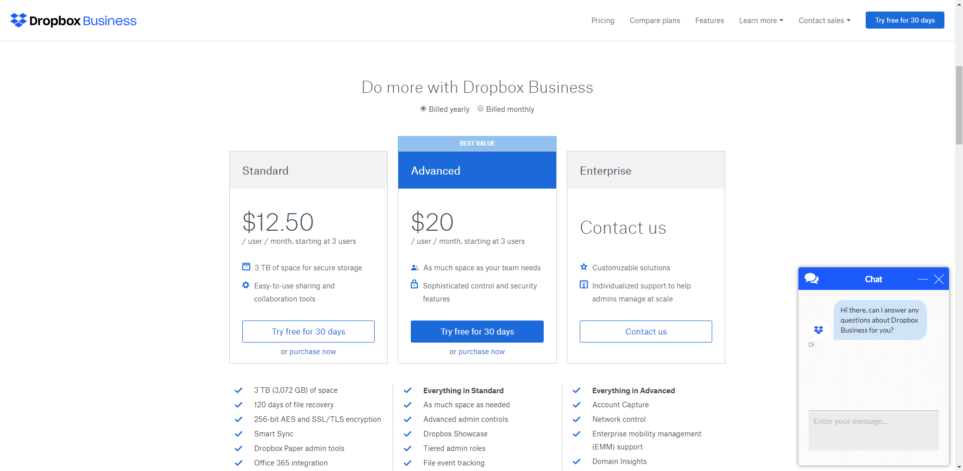
Scrolling down on the Dropbox Business homepage, you get pricing and a list of features. Dropbox uses the classic sales technique of providing three choices and highlighting the one providing the “best value.” Great idea.
After a few seconds, a chat box will pop up (see the screenshot above).
Keep scrolling to find customer testimonials and icons of teams using Dropbox Business. At the bottom of the page is a list of FAQs.
At the bottom of the homepage, Dropbox claims to be “The best sharing and storage solution for your business.” That’s a fairly broad and unsubstantiated claim. It’s best to stay believable and factual with your sales copy. If you can’t prove it, don’t say it.
Flow Project Management
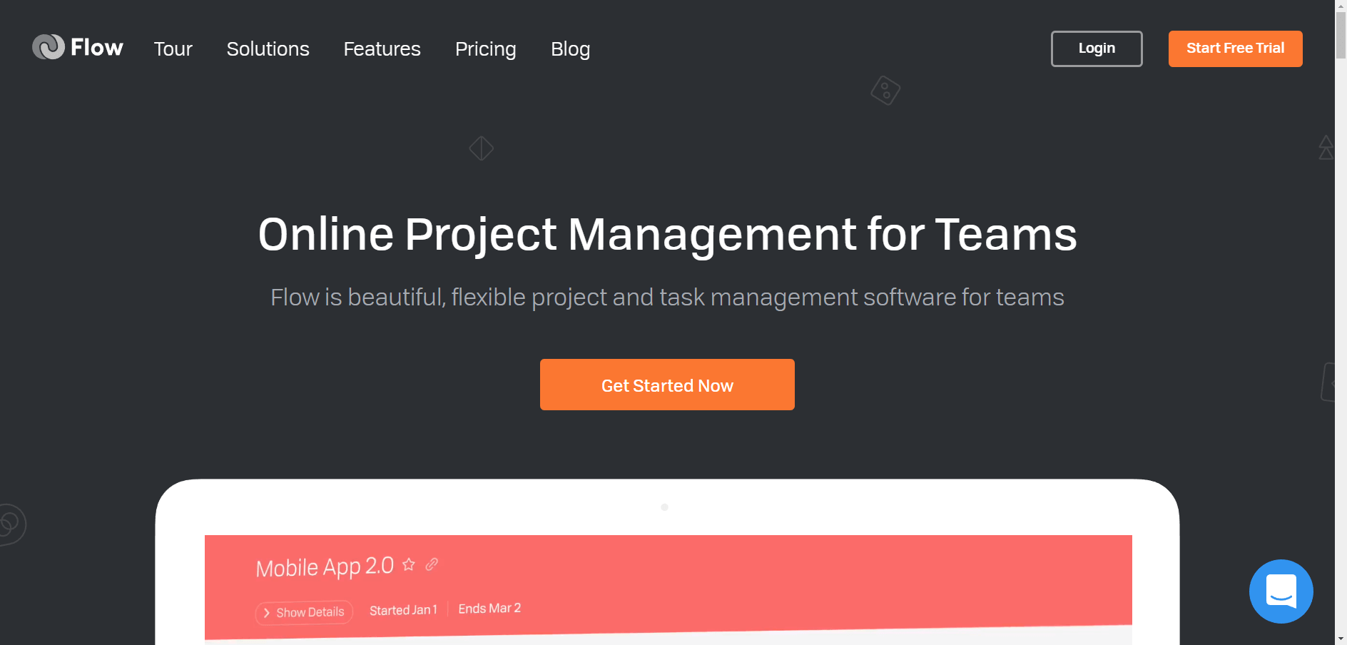
What they’re doing well: One CTA
What needs to be fixed: Potential for confusion about product
Discussion: Flow provides one clear and concise “Get Started Now” CTA button at page center. However, this button links to the same page as the “Start Free Trial” button in the header. Best practice would be to get rid of the header button or use the same CTA copy on both.
Another potential confusion point is the illustration, which is an animation of the Flow dashboard. However, starting out with the “Mobile App 2.0” image could cause visitors to assume Flow is a mobile app only.
Ecommerce page design best practice is to avoid confusion completely. Scour your site for places that could create doubt in your prospect’s mind and address the issues immediately.
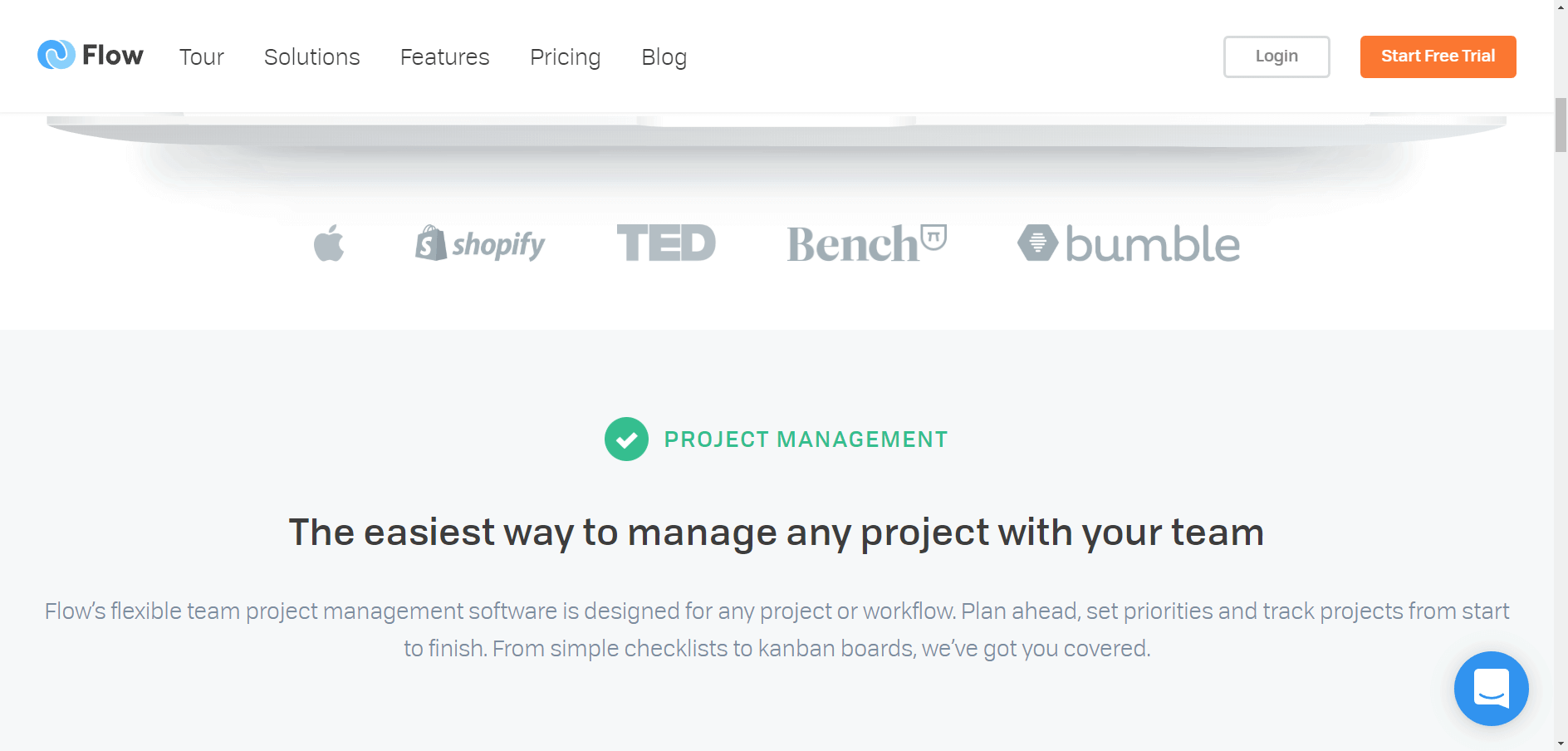
Scrolling down on the Flow homepage, you’ll see social proof icons (see the screenshot above). Because there is no copy to provide context for these icons, It’s not clear whether those companies actually use Flow or not. If they do use Flow, why not brag about it?
The assertion that Flow is “The easiest way to manage any project …” fails the believability test. There are plenty of other good project management options. It would be tough to prove that Flow is the easiest.
However, the copy below that offers a much better selling point: “From simple checklists to kanban boards, we’ve got you covered.” Simple checklists and kanban boards are real-life examples of tools many project management prospects are seeking.
We’ll give the same advice to Flow that we gave to Dropbox Business: Dispense with the hype. Use copy that visitors will perceive as realistic and desirable.
Mailchimp
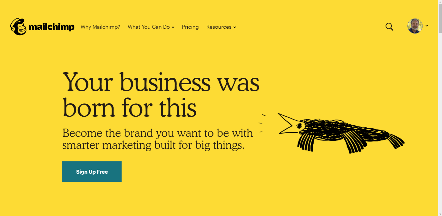
What they’re doing well: Short, succinct, targeted copy
What needs to be fixed: The “What You Can Do” drop-down menu is confusing
Discussion: We love the Mailchimp homepage. The bird moves and changes to catch the eye. the copy is short and engaging, and there’s just one call to action.
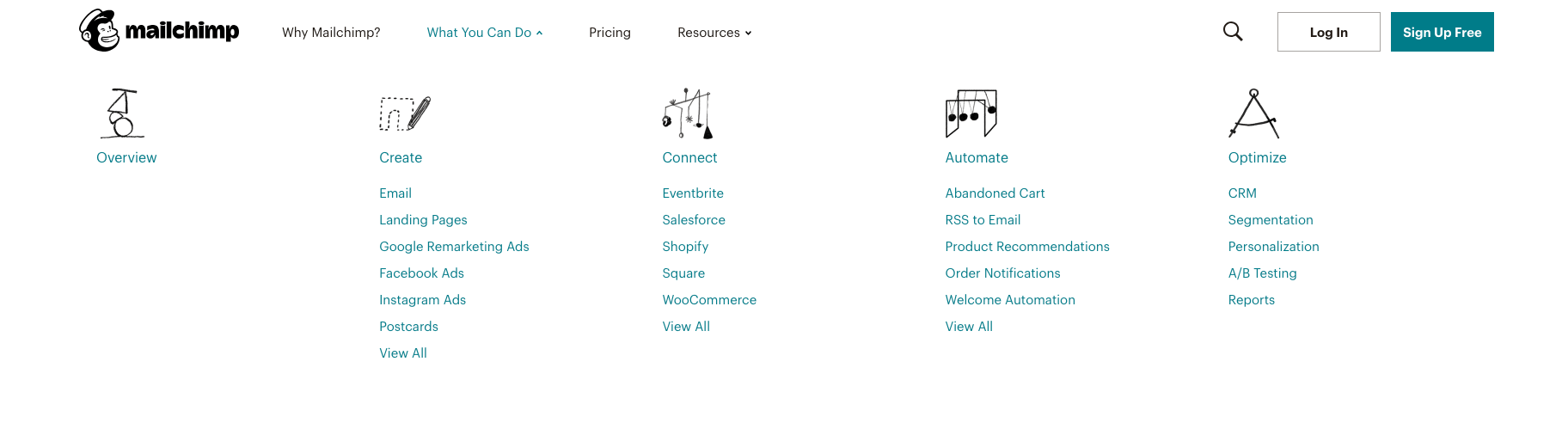
The only negative here is that the “What You Can Do” drop-down menu in the header (shown above) opens up a slew of choices that counteracts the simplicity of the page and could confuse the visitor.
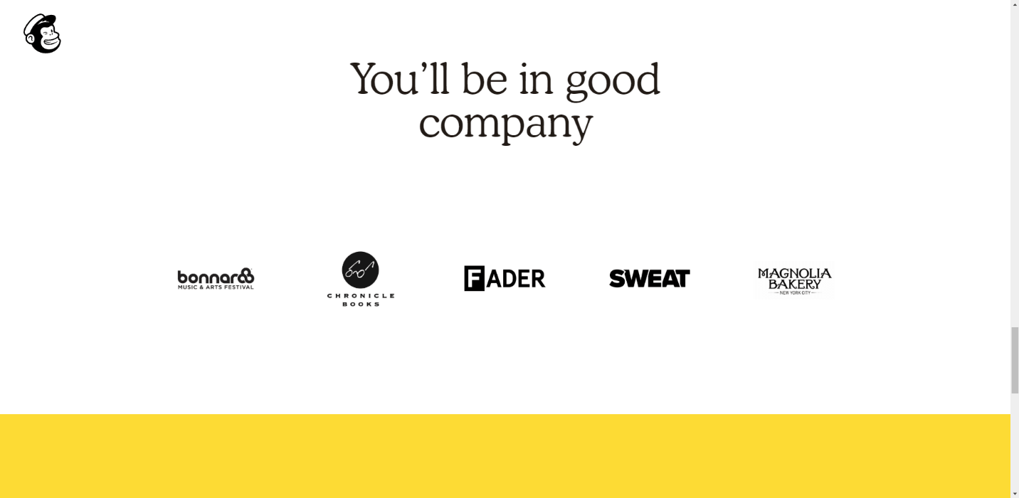
Scrolling takes you to a condensed version of “What You Can Do,” and then to a testimonial, some informative links, social proof (above), and another CTA.
We’d probably back off on the length of the scroll and stay focused on getting sign-ups. All told, though, Mailchimp provides an excellent example of simple, to-the-point digital marketing.
InVision
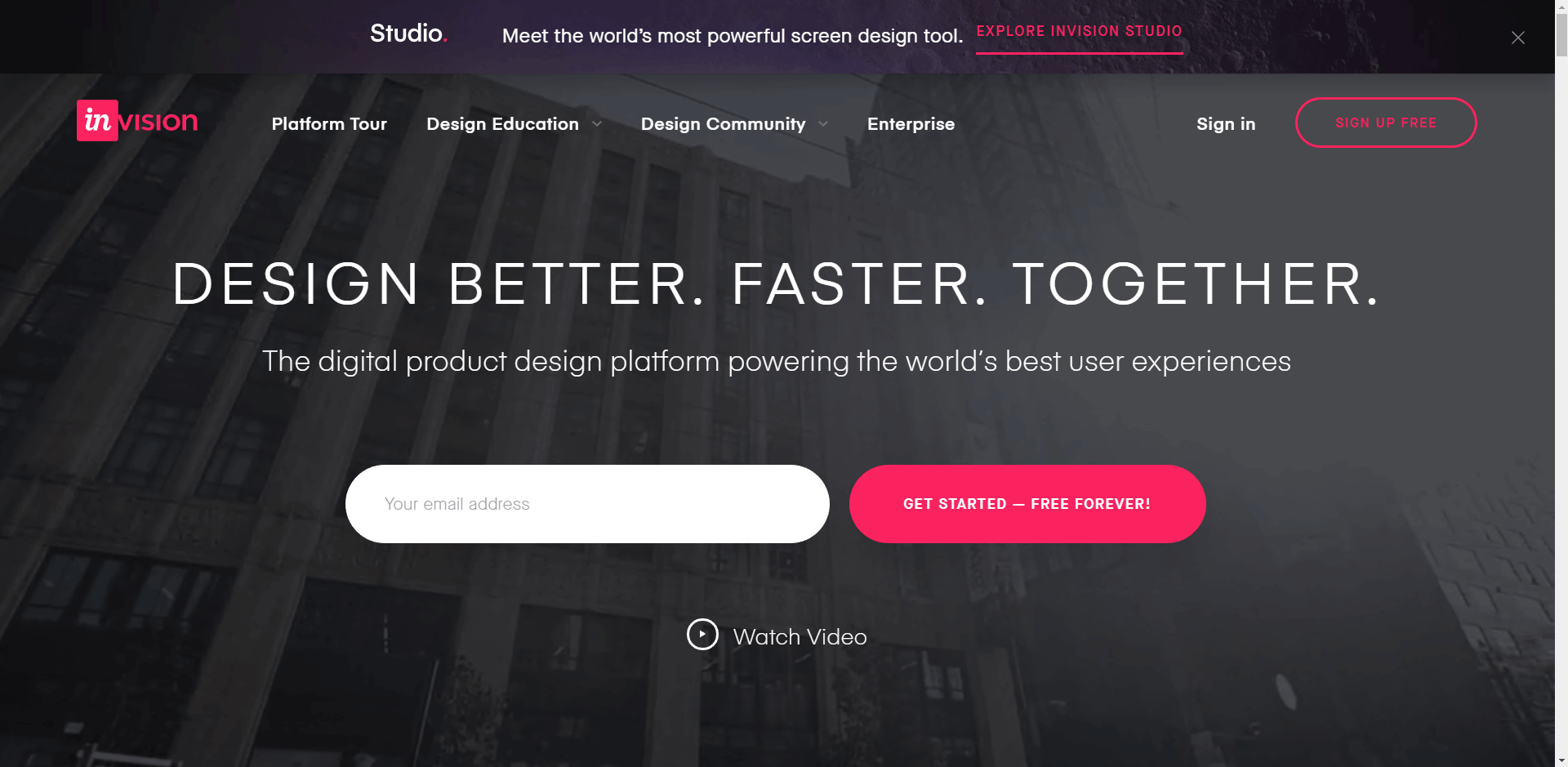
What they’re doing well: Offers a separate entry point for Enterprise visitors in navigation
What needs to be fixed: Long page scroll
Discussion: InVision offers one CTA, but complicates the appearance by providing an email address entry box next to the button. We would want to test this approach against collecting the email address after the button click.
The delineation between free users and enterprise customers is helpful. However, the descriptive copy may be too long and too extravagant; “world’s best” and “world’s most powerful” are subjective at best and may be received as over-the-top hype. We’d test those for user experience effect.
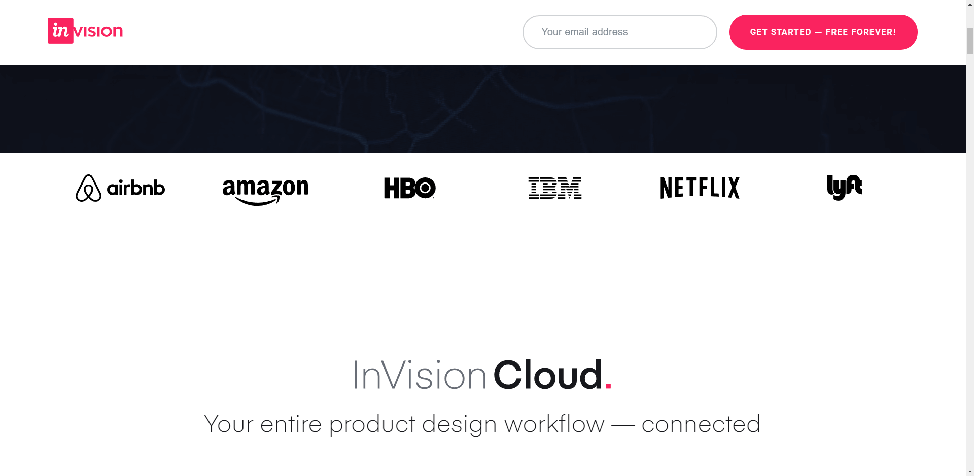
Scrolling down, InVision does an excellent job with citing social proof (see the screenshot above). It’s initially unclear if they are clients, but if you keep scrolling, you see testimonials from individuals.
In the footer, you’ll find detailed content options that speak to engaged visitors. Just above that is a final CTA to get started.
Slack
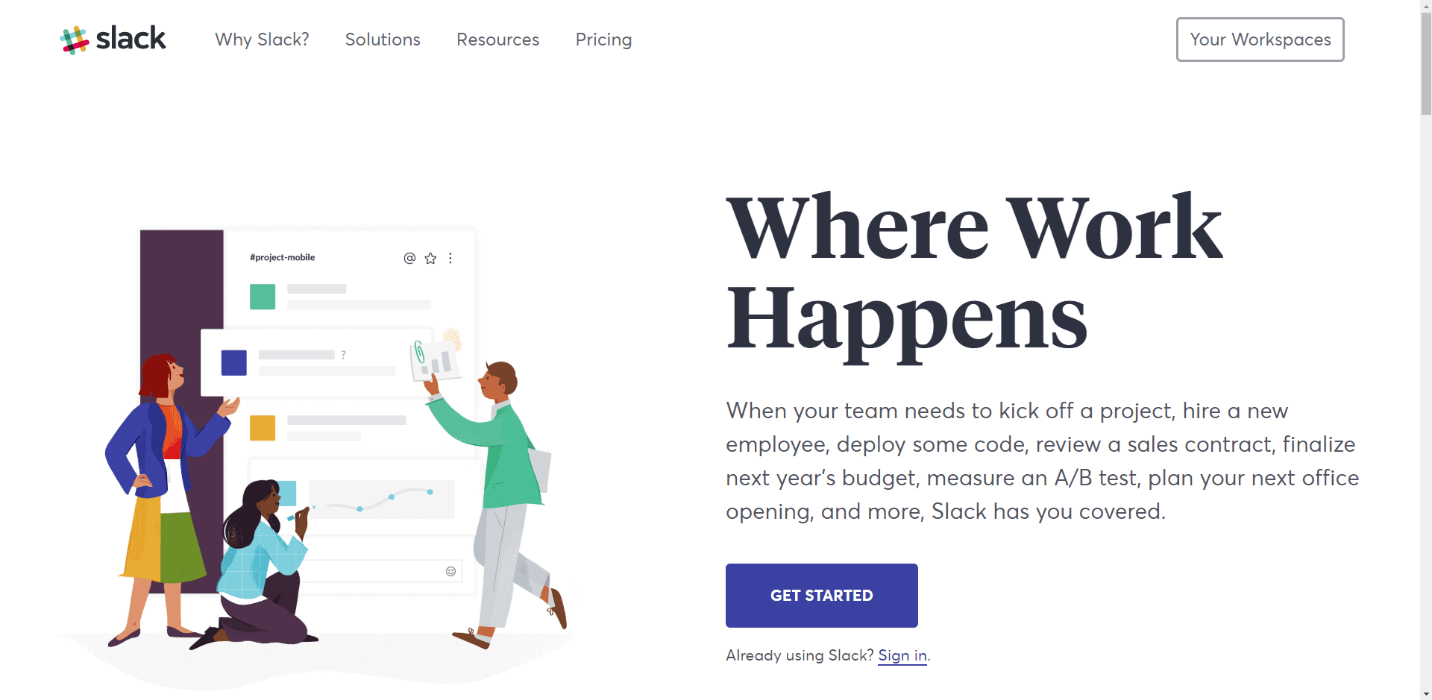
What they’re doing well: Simple messaging speaks directly to prospects
What needs to be fixed: The illustration tends to move eyes the wrong way
Discussion: It’s tough to fault Slack. If you’re looking for a pattern to learn from, this site is among our top ten recommendations. We do note, though, that the full-page view has the man in the green jacket pulling eyes away from the CTA. Best practice is to make every part of the page direct focus to the call-to-action button.
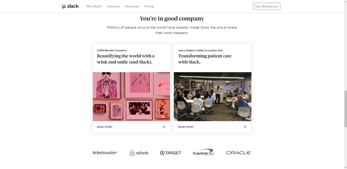
Scroll down to learn more about Slack and how it can work for each department, from Sales to HR. Following that, you’ll see an excellent testimonial/social proof section (see the screenshot above) with links to case studies.
One call to action on the homepage, an easy option for current members to sign in to their workspaces, and a clear header menu with nothing but the essentials—Slack is darn near the poster child for website design.
Kudos!
Optimizely
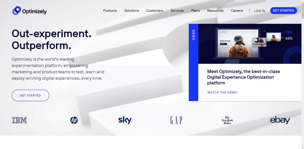
What they’re doing well: Social proof on the homepage.
What needs to be fixed: Demo video on the homepage.
Discussion: Here’s why the demo video on the homepage may not be a good idea: it leads the visitor away from the CTA. Yes, it presents another CTA on the linked page (see the screenshot below), but watching a 10-minute video may not seem appealing to the prospect. It could result in the loss of a lead.
We’re calling them the way we see them, but please understand this: we’re not always correct in our assumptions. That’s why we test ideas before making changes. Sometimes what we think will happen does happen, and sometimes it doesn’t. Either way, learning takes place.
How can Optimizely determine the truth? Test to learn.
Given that this platform is all about testing, we’ll have to assume the Optimizely team is on top of this—so here’s another HUGE lesson: What works well for another company’s site might not convert well on yours. Test, test, test—that’s the only way to find out for sure.
We’re not so wild about the “world’s leading experimentation platform” claim (in the headline copy), but we’ll assume Optimizely has the facts to back it up. If that’s the case, that data should be readily available to the visitor. Truth is a trust-builder. Blowing smoke isn’t.
After a scroll through info about the company, the bottom row shows social proof and case studies. We love that Optimizely uses social proof on the homepage. Here’s one more thing we like: Optimizely copy talks directly to YOU. Personalization is strong on this site.
Uber
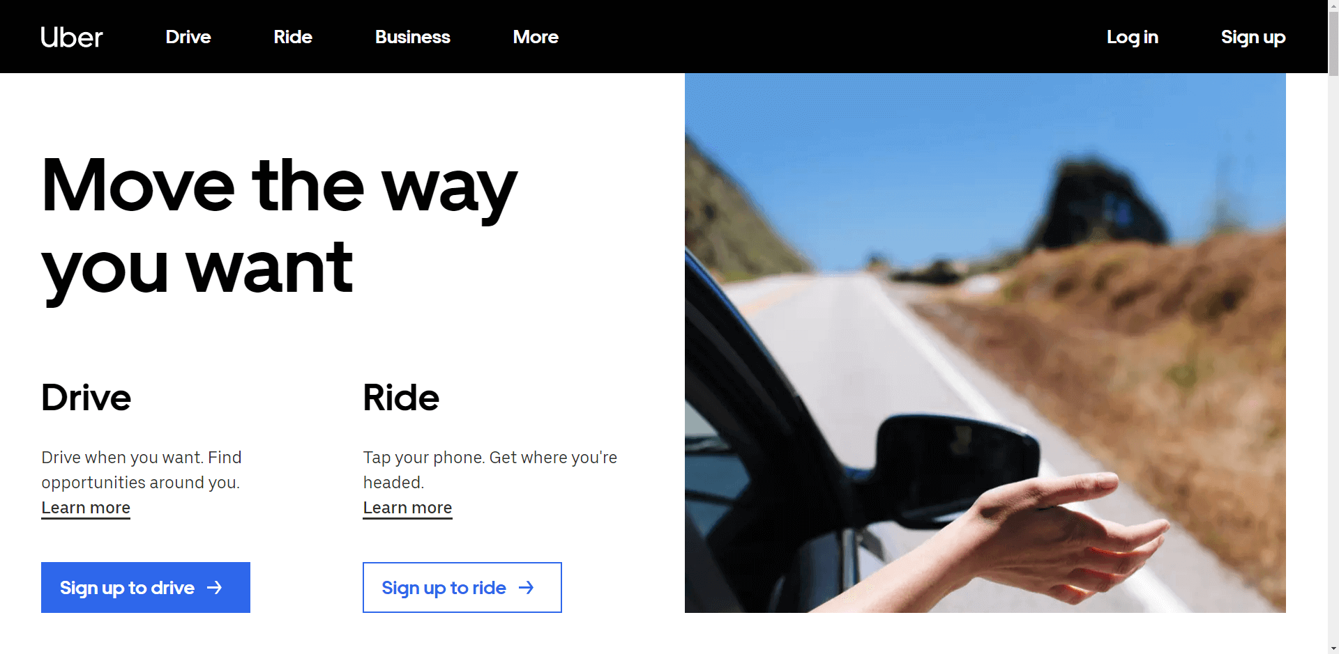
What they’re doing well: Allows the visitor to self-sort
What needs to be fixed: The illustration may not be the best choice
Discussion: Uber cuts to the chase to let visitors identify themselves as either a prospective driver or a prospective rider. Copy is brief and to the point. The Drive button is highlighted in blue, but we’d test putting some color onto the Ride side to make it more apparent.
Our biggest question is about the photograph. We get that it’s projecting a carefree, hand-waving-in-the-wind feeling. Maybe that works. From the rider’s point of view, though, the main concern is typically to get from one point to another quickly, safely, and without busting the bank.
Scrolling down, we see the info we really want to know about: how much will it cost for the ride? We’d test linking that option from the main menu, or maybe even making it the primary CTA.
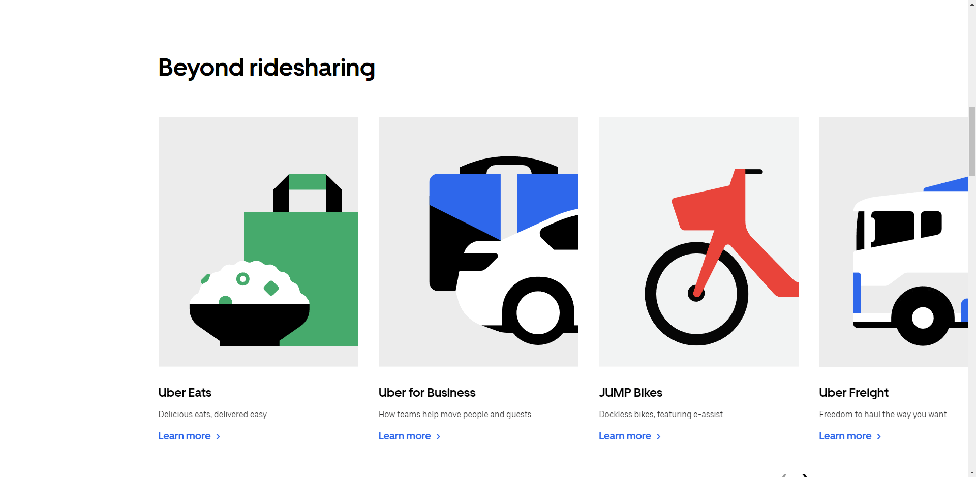
Scroll down to view information on other Uber services, an assurance that safety is a priority, and news about the company and its Visa card.
One issue we encountered is that once we clicked the Uber eats link to find out which restaurants near us are delivering, there was no clear direction back to either getting a ride or getting a job.
Another concern is that the illustrations (see the screenshot above) for other “Beyond ridesharing” services aren’t clickable.
Google Business Solutions
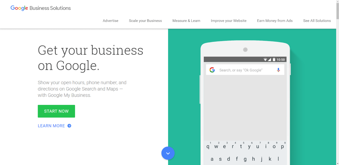
What they’re doing well: Clear, compelling copy
What needs to be fixed: CTA is deceiving
Discussion: We know—it’s Google. How could Googlers do anything wrong? We would call them out for the two CTAs, but here’s the rub: both link to the same page.
Does that sound a little deceptive and under-the-table to you? No doubt, it’s effective. For most companies, though, the potential backlash probably wouldn’t be worth the risk.
We love Google copywriting, though. The messaging is clear and compelling: “Get your business on Google.”
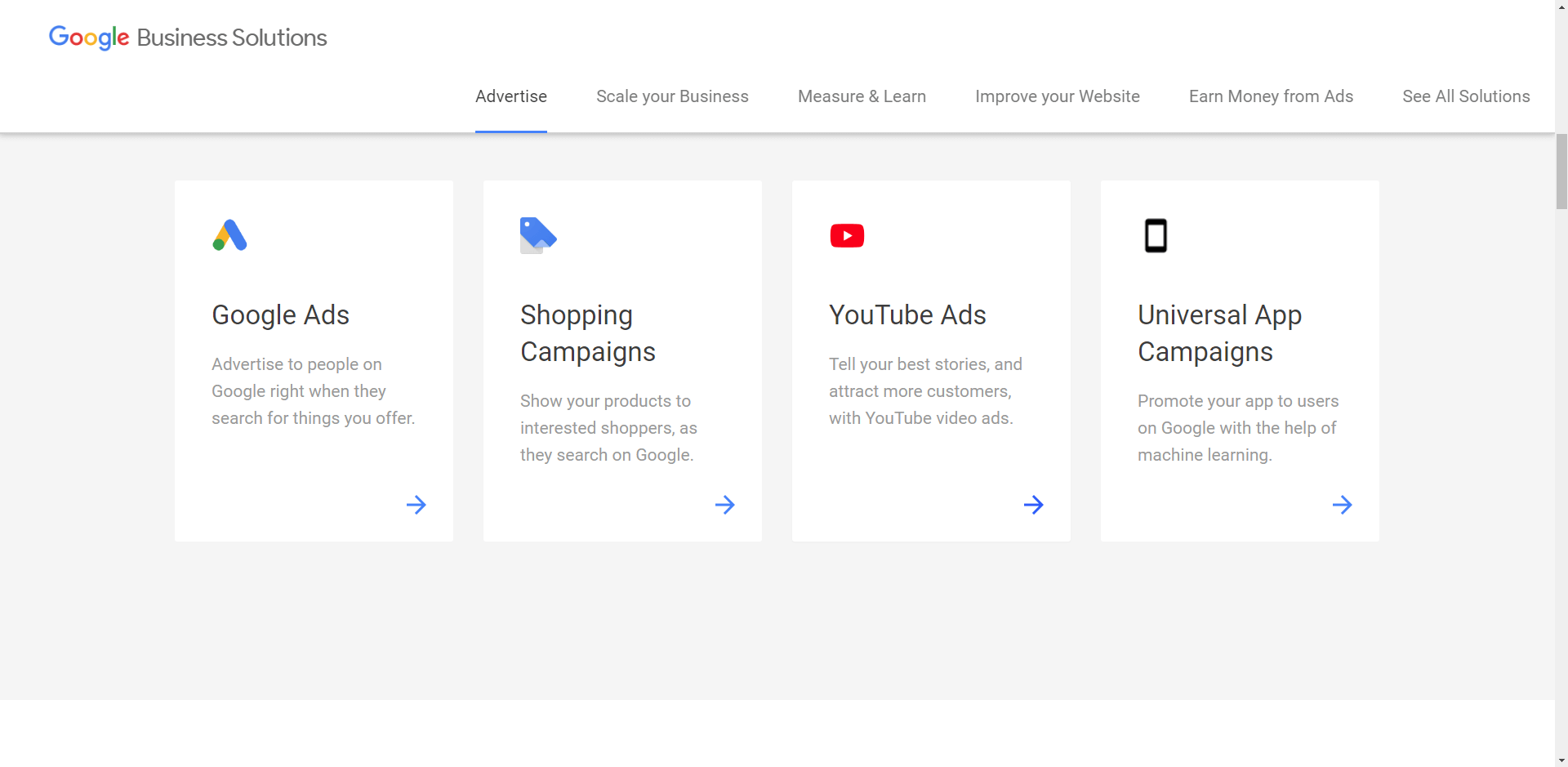
Scroll down (see the screenshot above) and the first thing you’ll encounter is Google Ads—this is no accident. Most of Google’s substantial income flows in via ads, and the company isn’t shy about helping visitors get on board as advertisers.
Keep scrolling to find other ways you can get started with the free versions of Google tools; test your site’s load speed; learn how to earn money with AdSense and AdMob; and then access links to everything Google does for business.
All told, this site is simple and effective.
Kudos to Google.
Microsoft
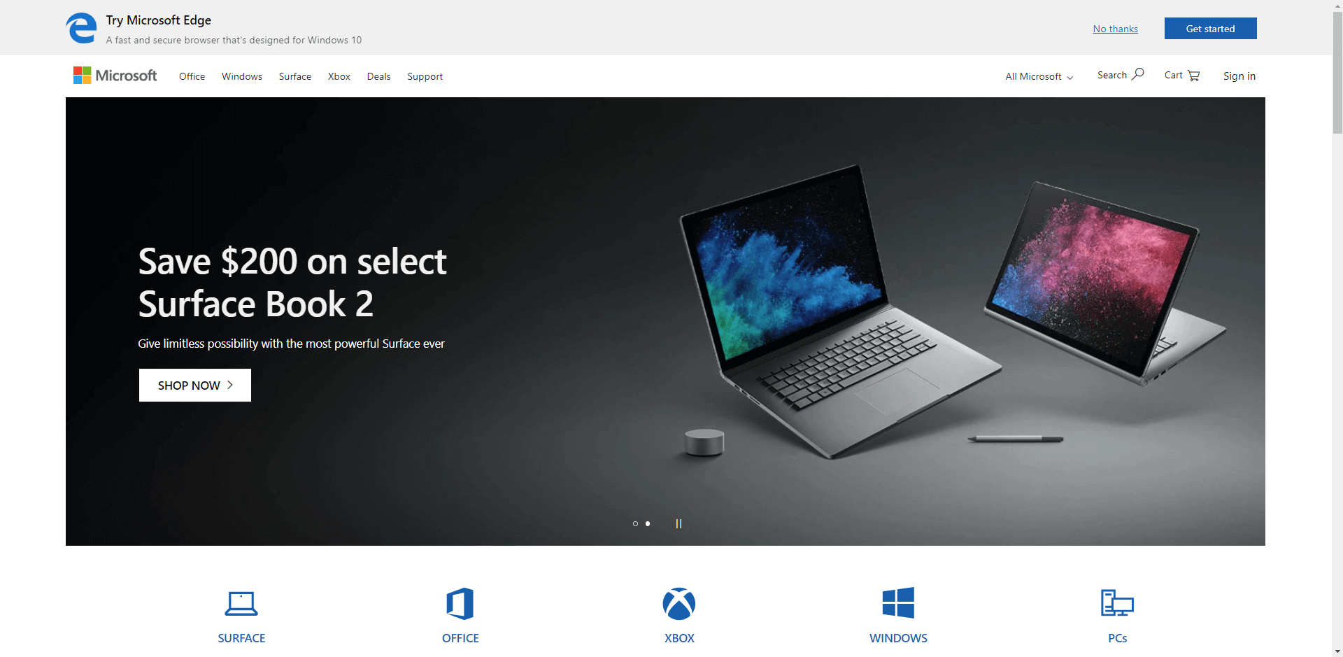
What they’re doing well: Minimalistic design
What needs to be fixed: Multiple CTAs
Discussion: What’s the purpose of the Microsoft homepage? Is it to encourage visitors to try Microsoft Edge? Is it to sell the Surface Book 2? No, hold it, that photo is on a slider that moves about every six seconds, and also pitches the Surface Pro 6 and Surface Laptop 2.
And if that’s not enough confusion for you, check the icons below the illustration. Yes, Microsoft has mastered the art of minimal copy (perhaps), but they’ve done it by naming every worm in the can.
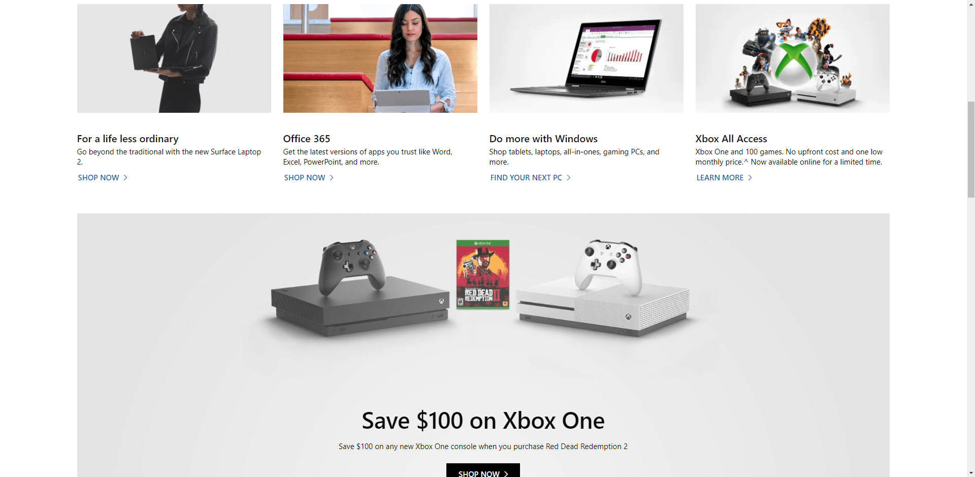
Scroll down and it gets even more complicated (see the screenshot above). However, one could argue that Microsoft is wisely enabling visitors to self-select the product they’re looking for, and that this is the most effective way for the tech giant to arrange their ecommerce website. How could that be determined? You know the answer: test variations.
Keep scrolling to find trending products, info on Microsoft for work, and even an offer to join the “Empower Possibility” contest. At the bottom is a pitch for why you should shop at the Microsoft Store.
Keep Going with Your Own Comparative Review
Here’s something to keep in mind:
Comparative reviews can be a rich source of ideas, but they’re not a data-driven way to make decisions. They can point the way, but they can’t tell you what works and what doesn’t work.
Remember: what boosts conversions for one company may fall flat on another company’s site.
Use comparative reviews to develop concepts to test, not concepts to implement. The quickest way to success is by developing a rigorous testing program that will move ideas from the “Looks good” category to “Sells like hotcakes” category.
Test, test, test … then test again. That’s the path to steady improvement. Tests not only show you what works best now; monitoring the results of ongoing tests alerts you quickly to what’s not working any longer.
One final note: Once you’ve completed your comparative review, you’ll need to develop experiments to test your hypotheses.
If you need help ramping up your A/B testing and conversion rate optimization efforts to turn your comparative reviews into paying customers, contact The Good.
About the Author
David Hoos
David Hoos is the former Director of Marketing at The Good and a trusted advisor to marketing experts.