3 Powerful Design Principles That Improve UX and Conversions
A website's design and usability are two very different things. Design may look nice but usability is key to conversions. Use these three design principles to improve your user experience and increase conversions.
After spending two years and roughly $200 million to relaunch their website, British retailer Marks & Spencer was shocked to see sales plunge 8.1% in a single quarter.
Their new, slick site was designed to drive sales, not lower them.
But the corporation had made an unfortunate (and all-too-common) error: they’d assumed “aesthetics” and “usability” were one and the same.
They’re not.
Your website or landing page design might be ten times as impressive as your competitor’s site or page, but if yours isn’t optimized for conversion, the competition will end up with all the customers.
Aesthetics and usability are not one and the same. Click To TweetIt’s like choosing between a vintage car in mint condition that can barely clear 30 miles per hour, and a 2017 midsize sedan. The first car is much sexier, but the second one will actually get you places.
Fortunately, there is a middle ground. Following these three best practices will both improve your website’s user experience and increase conversions.
Less Is More (to a Point)
Marketers usually want to add content to a page. After all, the longer a form is, the more information they can collect. The more buttons they add in, the more choices the user has. The more content they include, the more convincing their message. Right?
Wrong.
Too much content is overwhelming; plus, your visitors have extremely limited attention spans. Every time you add another element, you’re adding another attention-grab. Consequently, your conversion rates will suffer.
Too much content is overwhelming; your visitors have limited attention spans Click To TweetCase in point: A Columbia University study conducted in a grocery store found that reducing the number of jam flavors from 24 to six made total jam sales increase by 600%.
Because choice can be debilitating, conversion experts typically recommend stripping away everything but the essentials.
The Zendesk “Register” page is a great example.
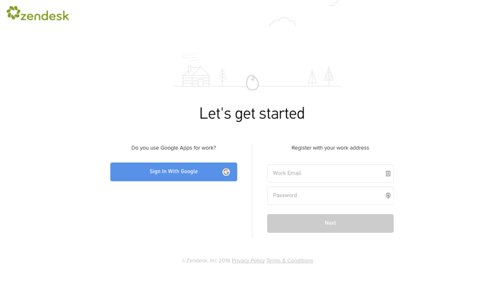
With just two options — signing up via Google, or entering their work email — the user has a clear path forward.
Plus, Zendesk has eliminated the “re-enter email” and “re-enter passwords” other sites use. The cost of having people accidentally type the incorrect email addresses or passwords is outweighed by a faster, smoother, less intimidating sign-up process.
Method, a third-party CRM for Quickbooks, has dramatically simplified its trial page over time.
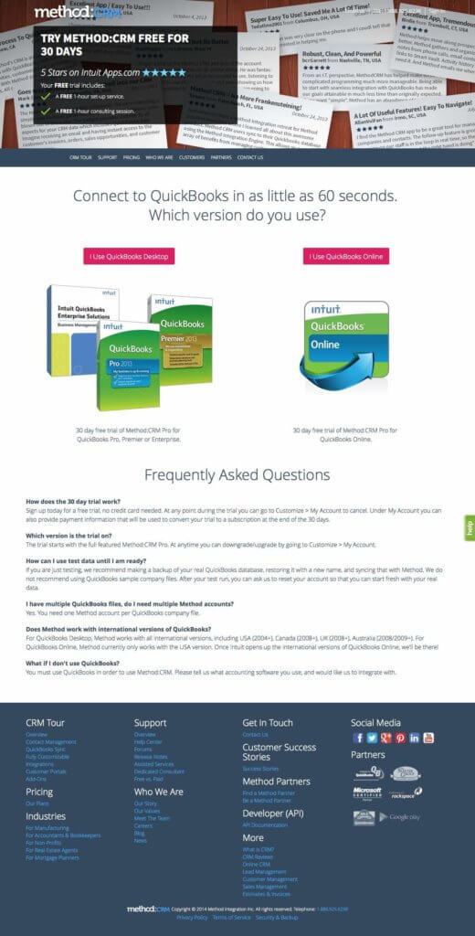
The first version was jam-packed with text, images, and icons. It felt messy and unprofessional — not a comforting vibe when you’re considering using this software to run your business.
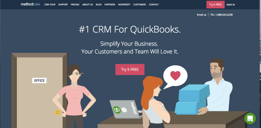
The current version is much cleaner. Although Method loses the credibility provided by its ratings and reviews, the minimal design does far more to inspire confidence in the visitor.
Notice that like Zendesk, this page offers just two options. You don’t have to think: you can simply click.
But Don’t Get Too Minimal
Designers normally take the opposite stance from marketers. They want to take away as much as possible from the interface.
However, there’s no point in designing a page that the user can’t understand or navigate. Without sufficient visual or written cues, people will have no idea what’s going on, and they’ll leave.
Take Bucknell University’s homepage.
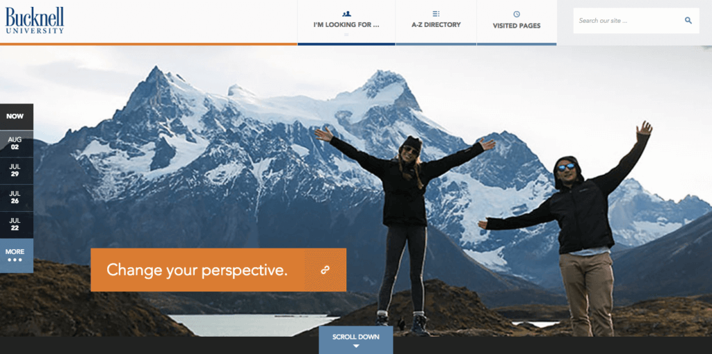
As UX specialist at Nielsen Norman Group Katie Sherwin points out, the inefficient and minimalist navigation is frustrating.
She suggests performing your own mini user test:
- In the top navigation, what does the round icon between The A-Z Directory and the search box symbolize? What will you get if you click it?
- Also on that top navigation, what will you get when clicking I’m Looking For…?
- In the left margin navigation, what will you get if you click one of the dates?
- What information is on the other side of the link “Change your perspective” within the big photo? (Did you recognize this as a link and not just a caption?) Would you click this if you were considering applying to this university?
How did you do? I posed Sherwin’s questions to five different colleagues (two of them designers themselves!), and no one got more than half the answers right.
According to Julie Zhou, Facebook’s VP of Product Design, you should make every design decision with your target audience in mind.
If you’re designing for digital natives who have grown up tapping a hamburger icon to access the menu, then use a hamburger icon.
However, Zhou says, “If you’re making an app with the idea that lots of people in the world will use it, consider that being super explicit with labels and text, using tried-and-true interaction patterns, and resorting to familiar iconography is going to make people’s lives easier, even if it adds more clutter or feels less ‘innovative.’”
Highlight Your Call-to-Action
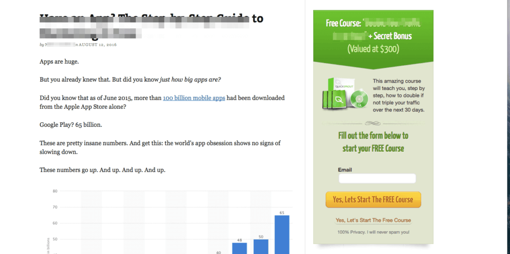
Wars have been waged over issues less contentious than the call-to-action. Typically, marketers want to “break” the page design to make their CTA stand out.
Examples include a slide-down window that covers the entire page (asking for your email nonetheless), a clashing color scheme, annoying animation, etc.
Take a look at this ugly — yet unequivocally eye-catching — CTA:
Designers, on the other hand, typically opt for a subtle and unobtrusive CTA.
This Pottery Barn email newsletter is a good example:
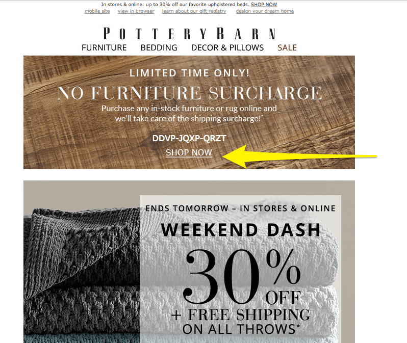
While this link definitely won’t burn anyone’s eyes, it’s also fairly hard to spot.
You want to hit the sweet spot between overly aggressive and blink-and-you’ll-miss-it. Not only will you drive more conversions if your visitors can actually see your offer, but they’ll have an easier time figuring out what to do next. It’s a win-win.
There are four main characteristics to a CTA: color, size (and shape), placement, and copy. Let’s start with color, since that’s probably the most misused design element.
There are four main characteristics to a CTA: color, size (and shape), placement, and copy. Click To TweetJust right
To make it visible, your CTA should contrast in color with both the background of the page and the items surrounding it. But that color should also complement the overall scheme. If you choose an off-putting or unappealing color for the sake of visibility, your website will look less credible and professional. Usability research proves that aesthetics are correlated with visitor trust and brand perception. In other words, the uglier your site looks, the sketchier it seems. Good luck getting people to purchase your products, sign up for your newsletter, and/or download your content if they don’t trust you.
Zapier has executed their CTAs extremely well:
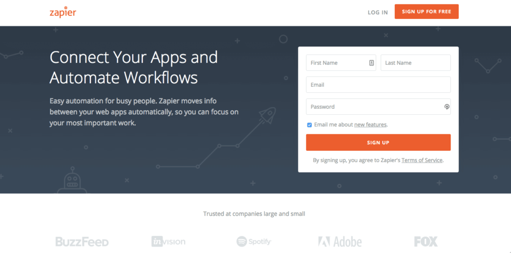
The orange is vibrant and impactful. Notice how the CTAs match the logo, which pulls the entire design together. And because the orange is balanced out by the cool gray and white tones, it’s not overwhelming.
The size and shape of your CTA is also important. If your design incorporates a lot of angular shapes, try a rectangular CTA. However, if it uses more free-flowing or organic shapes, go with something circular.
The CTA should always be big enough to see and click, especially if you’re designing for mobile. But don’t go overboard. As Unbounce senior conversion optimizer Michael Aagard discovered, increasing the CTA’s size can actually decrease conversions:
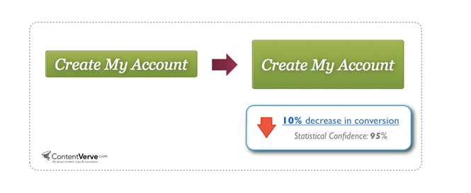
“My hypothesis is that the larger button simply became too big, drew too much attention, and thereby made the prospects feel pressured to carry out the conversion goal,” he explains.
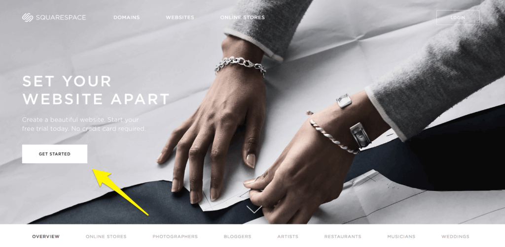
When it comes to placement, make sure the CTA is above the fold. Conversions will drop off dramatically if users need to scroll to see it. In fact, Squarespace was roundly criticized for placing its homepage CTA below the fold. They’ve since updated it.
Most pages have one or two CTAs. Remember that more choice can actually be disempowering, so don’t fill up the screen with buttons in a play to drive clicks.
When it comes to placement, make sure the CTA is above the fold. Click To TweetOf course, sometimes including three-plus CTAs is inevitable.
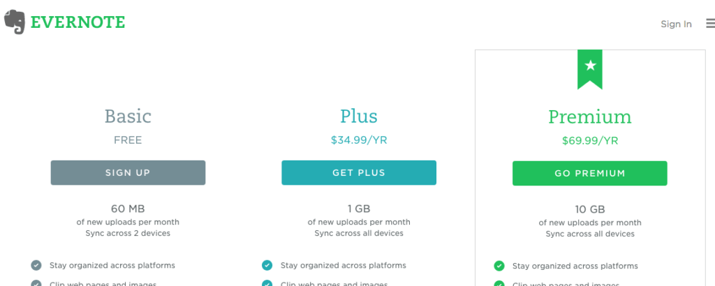
Take Evernote’s “Plans” page, which has sign-up options for Basic, Pro, and Premium. They’ve wisely used color to differentiate the different plans. Premium, the best option from the company’s perspective, is the most eye-catching, followed by Plus in an attractive blue, followed by Basic in a ho-hum gray.
If you’re including multiple CTAs on a single page, follow Evernote’s lead and give them a visual hierarchy. You want to draw the user’s eye toward your most appealing offer.
(It’s also worth pointing out the star icon and container on the Premium plan. The design definitely makes it obvious which plan is the “best.”)
Your CTA’s copy is the final piece of the puzzle. It should be as detailed as possible—to get an idea of the specificity you’re striving for, checking out this example:
Bad: “Download.”
Better: “Download your ebook.”
Best: “Download your 30-page email marketing ebook.”
Not only does a specific CTA increase user confidence—which in turn, improves the UX—but it also promotes conversions. People are usually likelier to convert when they know exactly what they’re getting into.
Stop Marketing, Start Selling
Designers and marketers might not always see eye to eye, but we’ve shown with these three examples that you can definitely find a happy medium.
A simple methodology to follow when thinking about design and marketing is to Stop Marketing, Start Selling (which also happens to be the title of our latest book).
Understand that if a visitor has reached your site, your marketing has already won. Now it’s time for the site to start selling by getting the design (and the marketing!) out of the way.
About the Author
Jon MacDonald
Jon MacDonald is founder and President of The Good, a conversion rate optimization firm that has achieved results for some of the largest online brands including Adobe, Nike, Xerox, Verizon, Intel and more. Jon regularly contributes content on conversion optimization to publications like Entrepreneur and Inc. He knows how to get visitors to take action.