
How to Design an Effective Ecommerce Product Category Page
The product category page is an essential step on your consumer's pathway to purchase. Keep these rules in mind as you design it.

Is this statement true or false?
“The best ecommerce website design makes it quick and easy for visitors to locate desired goods, make comparisons to confirm the choice, then navigate the checkout procedure and arrange delivery with minimum friction.”
Before you answer, envision yourself shopping at a local brick-and-mortar store.
Which do you appreciate more – a store with clear navigation, properly marked items, and a short line at the register… or stores you can get lost in, wandering through a labyrinth where you can spend hours without worrying about buying anything at all?
If your answer is, “It depends,” then you’ve discovered something critical about marketing. The best stores help on-purpose shoppers get what they want and keep moving, but provide browsers the luxury of exploration.
That can be a tough bill to fill in a physical store, but it’s absolutely possible in ecommerce. And the hub of it all is one particular page: Product Category. Get it right there, and you’re on your way to getting rave reviews from happy shoppers. Fail there, and you… well, you fail.
Let’s take a look at product category page best practices. Your ROI on taking the time to review and share this article with your team could make it the best-leveraged decision of the year.
There’s a tough way and an easy way to approach ecommerce optimization:
- The tough way: go at it as hard as you can and hope something sticks
- The easy way: understand the buyer’s journey and remove barriers to their conversion
Let’s talk about the easy way. It’s not only more enjoyable but a whole lot more effective.
Know the purpose of your product category page
Every page on your website has a purpose. Your job is to know what that purpose is and grease it as well as you can so the visitor will glide effortlessly through to the next step on the path leading from discovery to purchase.
Here are the two most important page types on your ecommerce website:
- Product Category
- Product Detail
The first allows the visitor to self-select the next step on the journey. The second provides enough information to either cement the sale or guide the prospect to a better-suited product.
Get those right and you will make sales. Confuse them, and you’ll confuse your visitors.
We’ve already gone over best practices for product detail pages. As we noted in that guide, the product detail page (PDP) is where “the prospect will determine whether to purchase your product or keep looking.” The PDP invites the prospect to go deeper. It provides in-depth information about the product it highlights, helping the consumer conduct their research.
Not so with the product category page (a point many ecommerce website designers fail to grasp). It stands at a critical juncture on the path to sales. It’s an intersection where the visitor must choose a direction… but it doesn’t provide detail. It says, “Choose and keep moving.”
The job of the category page is to make that choice painless and simple.
It’s here that shoppers on a mission can quickly take the next step towards becoming an owner and browsers can decide which section of the store they want to investigate next.
The Category Page must be both obvious and humble:
- Obvious, in that the choices it provides must stand out and be easily recognizable (this isn’t a page for obscurity)
- Humble, in that it must never draw attention to itself; rather, it must point clearly to the product categories it displays
Know every page’s purpose, and make sure the page is optimized to carry out that purpose. That maxim is a good candidate for being named the “First Rule of Website Design” (or, in this case, the “First Rule of Category Page Design”).
Having a clear path through your store also helps improve your SEO efforts, since you can use relevant keywords at each step of the journey. If a customer is searching for “Ladies Sandals,” Google will serve your product category page for sandals where they can find the right product listing or discover other items in your collection.
Build a customer-centric product category page
Your product category page is a traffic director, and it’s up to you to erect helpful road signs.
So, the best-designed product category pages begin with road maps.
One question is central to the process: what does the visitor most need to know in order to continue along the sales journey?
For instance, let’s say your ecommerce website sells guitars. What would your visitors most need to know at a category level?
Remember, you don’t want to try to sell guitars on the product category page (though you should use every opportunity to build confidence in your ecommerce brand and products). You want to be helpful. You want to help the prospect take the next right step.
Here’s a short list of potentials for guitar categories:
- Electric guitars
- Acoustic guitars
- Student guitars
- Youth guitars
- Pro guitars
- Beginner guitars
- Guitar accessories
- Used guitars
- Sale guitars
- Taylor guitars
- Gibson guitars
- Ovation guitars
- Guitars under $500
- Guitars made in the USA
“Wait!” you say. “That many categories will confuse the visitor.” And you’re right. Most ecommerce stores will need to use special features (sort by brand, for instance) on the product category page.
Getting to the bare bones essentials requires a sound knowledge of your audience, the terms they use in search (keywords), and how they approach the task of finding products in your niche.
The last thing you want to do is enlist categories based on terminology you use instead of on terminology your potential customers use.
If your products aren’t findable in search, then your ecommerce store doesn’t exist. It’s absolutely essential that you know the words your customers use to describe your products and the way they categorize them in their minds.
Your ecommerce job isn’t to design a website that makes sense to your staff, your peers, or your industry; it’s to make sense to the people who purchase what you sell.
That could lead us into a discussion of keyword research and user testing. For now, though, we’ll not go that route. Our aim here is to focus on the elements you’ll want to include on the page, not talk about how to choose those categories. Don’t miss this critical point, though: effective product category pages begin with research and strategic planning.
Let’s first list the common elements just about all product category pages should contain. Then we’ll consider extras that may or may not apply to your business.
Essential elements of product category pages
Here are the two basic elements:
Product category name
Every case is unique, but you’ll typically want to use the product name your prospects use for the category or individual products, not a branded or esoteric name. That not only helps the customer understand your categories, it helps the search engines key in on them.
Example: The guitar online store may choose to go with Acoustic Guitars, Electric Guitars, Classical Guitars, and Guitar Accessories on their primary product category page. That would allow visitors to take a giant step towards honing in on the exact guitar needed. The next category selection would drill down to the specifics within each of those main categories. Using cute or branded terms like “Rock Star Guitars” or “Electric Vibe Axes” probably wouldn’t be a great choice.
Category image
Make sure this is a generic image representing the entire category. Make it a hero image of the product by itself. The simpler and more obvious the better. The images should be consistent in size but should stand out as different from one another. Guide the eyes and the minds will follow.
Example: The guitar store wouldn’t use a Gibson or Ovation guitar photo. The image shouldn’t portray the unique features of any particular brand. Rather, it would go with a stock acoustic guitar, stock electric guitar, stock classical guitar, and perhaps an image showing a guitar case, strings, and capo as the accessories icon.
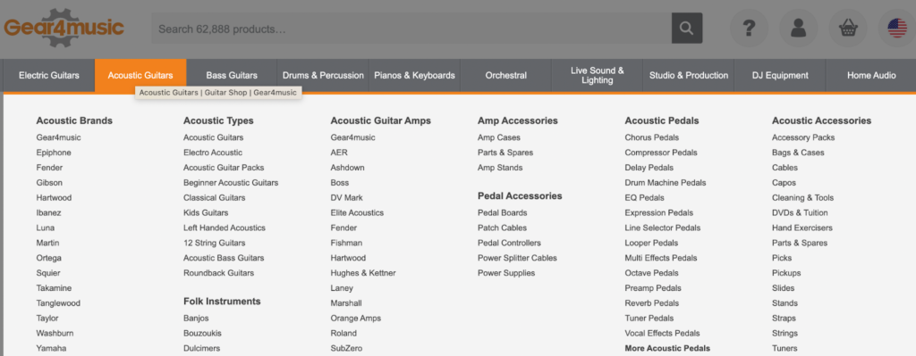
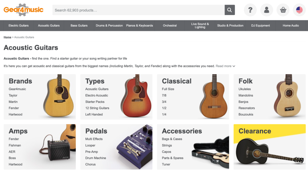
Take a look (see the screenshot below) at how the Gear 4 Music ecommerce site handles categories and subcategories.
That’s it.
Your product category pages start at the most logical first decision point your visitors will need to make: Name and Category.
From there, guide them via sub-categories to the next logical decision, and do that as many times as you need until prospects end up at the Product Detail Page for the item they have chosen.
The sequence doesn’t change, but the method of travel through the sequence can.
Let’s move on to list the features most likely to be helpful to shoppers as they move from the primary category, through the sub-categories, and on to the selected Product Detail Page.
Enjoying this article?
Subscribe to our newsletter, Good Question, to get insights like this sent straight to your inbox every week.
Category price ranges
Depending on your products, it’s often helpful to list price ranges at the Category Page level. That helps qualify shoppers and can prevent disappointment.
It’s usually better to give shoppers the option of selecting the price range that best fits their budget than to lead them to a product way out of range. The sales department may argue the strategy, but we’ve found well-informed customers are usually the happiest customers.
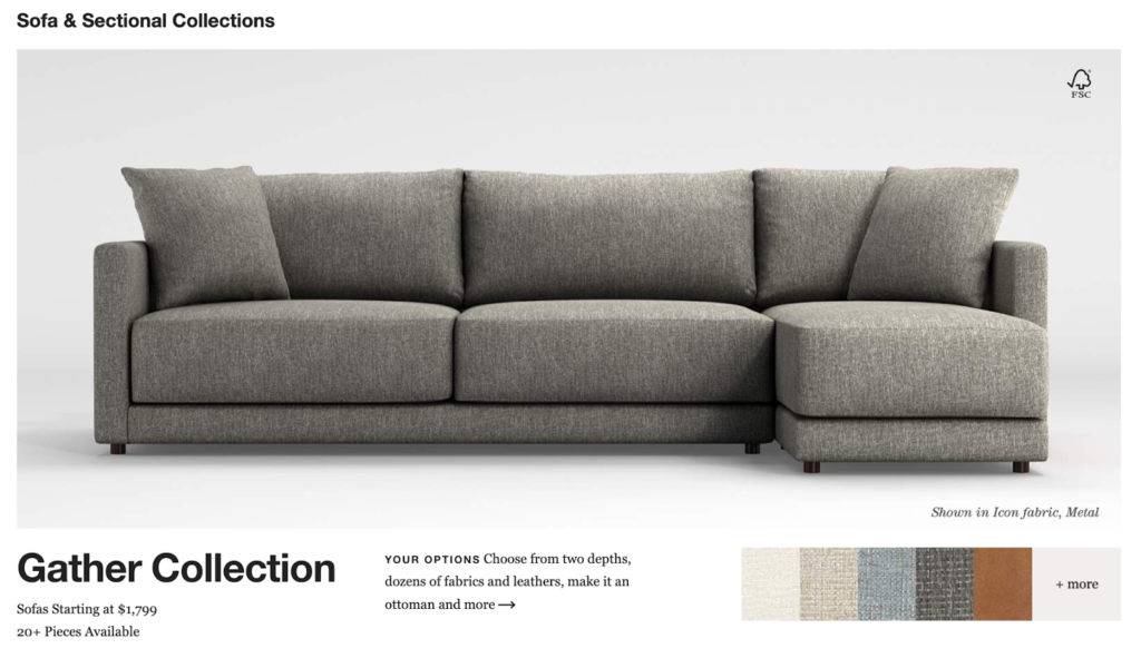
Crate & Barrel’s sofa category page lists the starting price of its products.
Category ratings
Ratings and reviews can be valuable additions at the product category level. Here’s where the sales department may indeed have valuable input. Shoppers will often bump up in price for higher quality… and quality is typically reflected in the reviews.
Featured items
Don’t confuse the shopper, but don’t be afraid to make suggestions either. Depending on placement, featured items can draw the eye and lead to a larger sale.
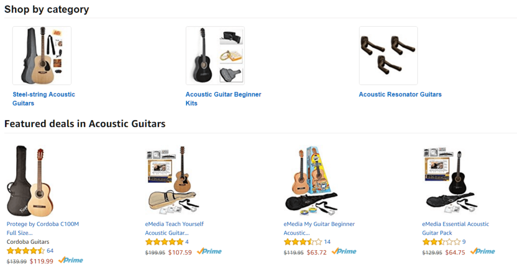
Note (see the screenshot below) how Amazon handles the positioning of their “Featured deals.” This example also highlights the strategic use of Ratings.
Filtering
We’ve seen conversion rates jump by 20 percent or more when product category page filtering is optimized. There’s no easy answer here, and no one-size-fits-all prototype to offer.
With our clients, here at The Good, we begin by assessing the site to look for roadblocks in the conversion sequence, then we work with the client to create an individual strategy, test the assumptions, and optimize for conversions leading to sales.
This is an area where you can stay simple and effective or get elaborate and effective… just be sure to maintain the “effective” part. Note Chewy’s filtering solution in the screenshot below:
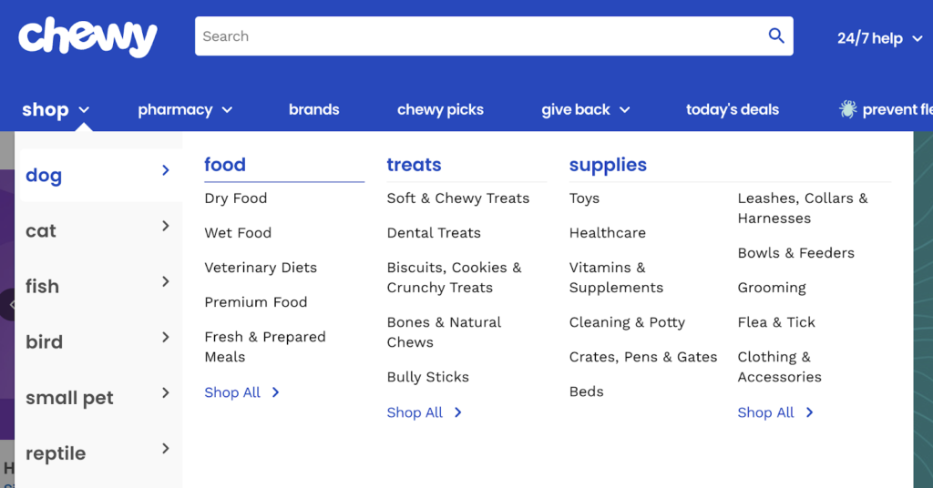
Chewy opts for pop-out subcategories that appear when the visitor hovers the mouse pointer over the primary categories. It’s simple and effective.
6 Awesome ecommerce category page examples
1. Kohl’s
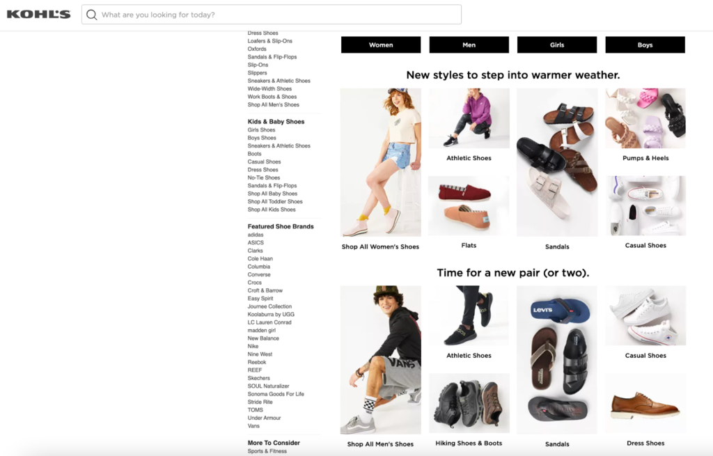
Kohl’s “Shoe” product category page has tabs to drill down further depending on whether the shopper is looking for men’s, women’s, or kid’s shoes, but it also provides shopping inspiration with guides and bestsellers to attract consumers who might not know exactly what they’re looking for.
2. Jimmy Choo
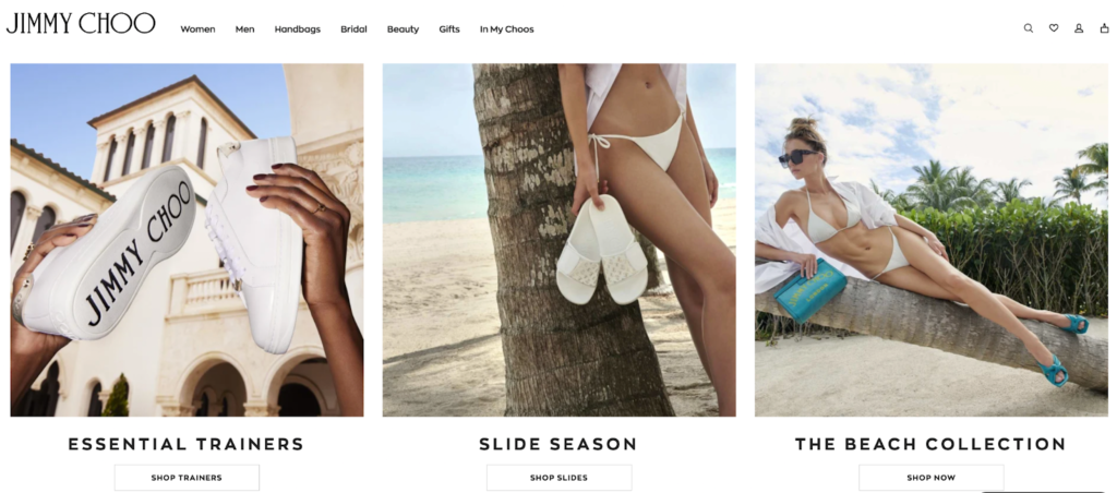
Jimmy Choo’s Women’s Shoes product category page provides a launchpad for a personalized shopping experience. As well as popular collections, the page also highlights the brand’s current bestsellers.
3. John Lewis
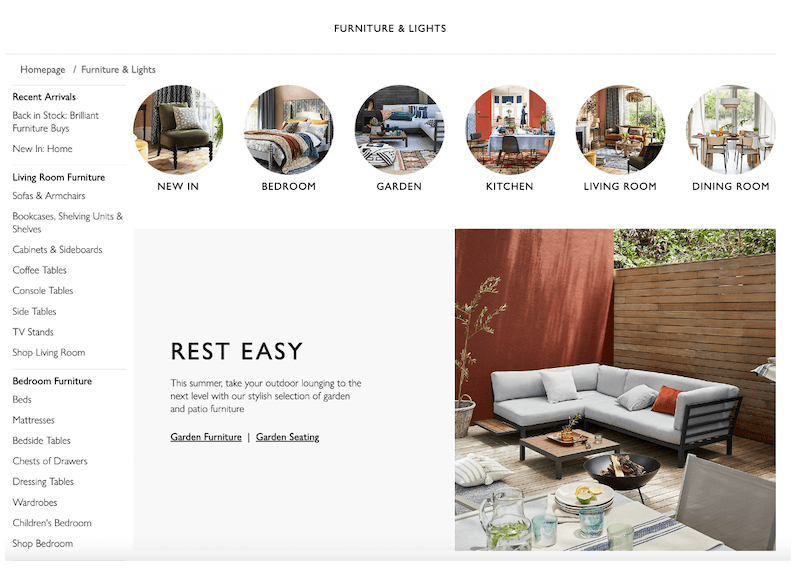
John Lewis makes it easy for shoppers to dig deeper into the type of furniture they’re looking for with a selection of subcategory pages linked from the primary category page. It also serves “lookbooks” that provide inspiration and popular styling choices.
4. Away
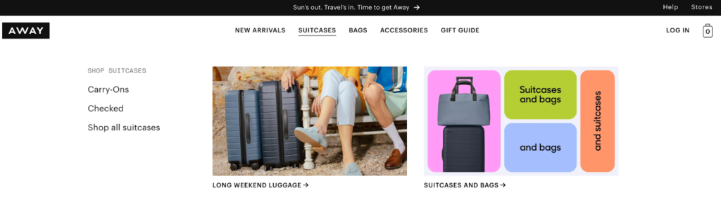
Away’s product category page drops down from the main navigation menu to provide shoppers with a selection of options to keep them moving. The added product images create a more interactive user experience and allow customers to get really specific with the kind of bag they’re looking for.
5. Nordstrom
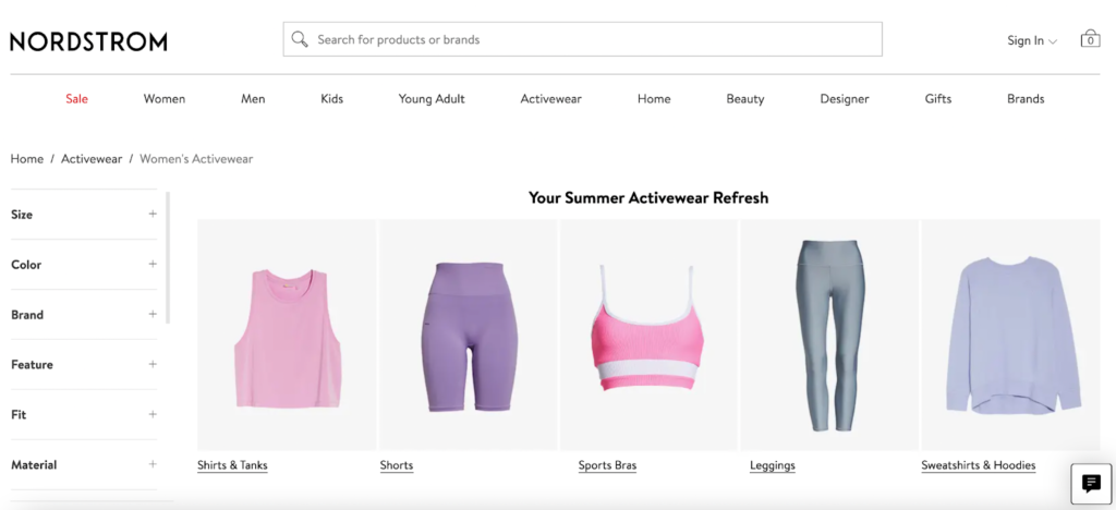
Nordstrom’s product category pages act as a gateway to subcategories, giving shoppers the options they need to find their dream item. As well as a selection of subcategories, the page also lets customers filter their search depending on their size, favorite brand, and other key product differentiators.
6. Lowes
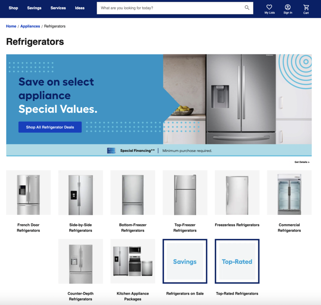
Lowes’ refrigerator category page displays the different types of fridges available as well as a banner for customer deals and an option to browse top-rated products.
What successful product category pages have in common
So what is it about these product pages that stand out and create an enjoyable shopping experience?
- They put shoppers in control: these product category pages let customers take the helm of their journey by providing subcategory options that help shoppers continue toward the checkout
- They provide options: these pages don’t start listing off products, instead, they give shoppers the chance to filter based on their preferences and needs
- They use high-quality imagery: these pages feature powerful visuals that compel shoppers to click and find out more
The best product category pages put the customer first and create a landing page where shoppers can create their own journey. This might include subcategory options, the opportunity to filter the search, or inspiration in the form of lookbooks, guides, and bestseller features.
One thing’s for certain: these brands have tested their product category pages to ensure they offer a delightful customer experience. If you want to follow suit, it’s crucial that you test, track, and tweak your product category pages until they’re performing at their best.
How to conduct an ecommerce CRO audit on your category page
Conducting a conversion rate optimization (CRO) audit on your product category pages will help you identify what’s working and where improvements can be made. For example, if you’ve got a list of subcategories that no one is clicking on, you might be using the wrong keywords or highlighting subcategories that your audience has no interest in.
For best results, conduct audits regularly and use your findings to tweak product category pages so that you generate more click-throughs and conversions and keep shoppers on-site for longer.
Here are the key elements you can test to conduct an ecommerce CRO audit on your product category pages.
1. Information structure
The structure of the information will determine which steps shoppers take next. If your bestsellers are tucked away at the bottom of the product category page, there’s a low chance that customers will navigate there.
To figure out what product information is most important to your audience, run user tests and heat mapping which will show which parts of the page customers spend the most time on and which links get the most clicks.
2. Filter, sorting, and discoverability
Do customers use the filter option on your product category pages? A CRO audit will reveal whether shoppers are customizing the shopping experience to suit their needs or whether they struggle to find how to sort and filter products. A good product category page has the option to filter products by material, size, and other key attributes, but they also make it easy to sort products into subcategories so that shoppers can discover the best items for them.
3. Language and copywriting
The words you use matter – if your copy doesn’t connect with shoppers, they’re unlikely to click through onto subcategory pages and continue their shopping journey. A CRO audit highlights where shoppers are dropping off which could indicate a disconnect in communication. Then, you can use customer surveys and feedback to find out which search terms and words your audience is using to find relevant products.
Keyword research is a huge part of optimizing your product category pages. As we mentioned at the start, you want to use language that your customers are using, not language that you and your team use. Run extensive keyword research to see what terms are popular and implement those on your product category pages for best results.
4. Clearly visible decision-making criteria
Product category pages are a launchpad for the rest of the shopping journey. Their entire purpose is to keep shoppers moving through the buying process and serve them the right information and product suggestions at the right time.
This means there needs to be a clear next step: do you want them to choose a subcategory page? Do you want them to explore an inspiration guide for your latest collection?
A CRO audit will identify what most shoppers do next so you can better understand their journey and the next steps. When you know this information, you can ensure you’re displaying the right information at exactly the right time which removes friction from the experience to increase conversions and sales.
A product category page CRO audit in action
When DTC furniture brand Fully came to The Good, it wanted to increase its conversion rate on its category pages and create a balance between providing helpful information and increasing visibility to the various product categories.
We conducted a heat map analysis to understand why website visitors were dropping off from category pages and where there was the most friction. The results revealed high engagement rates on the product category filters which showed that customers might not understand the different types of desks on offer.
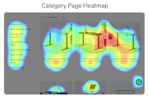
To tackle this, we redesigned and simplified the product filtering system so that shoppers could quickly find what they were looking for depending on functionality, material, and price.
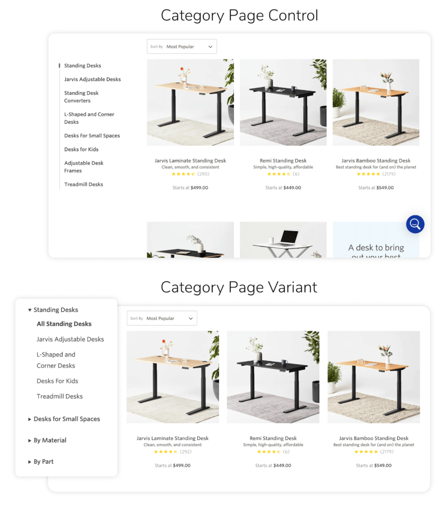
This small and simple tweak lead to an average 5.97% conversion rate lift.
TL;DR:
If you want to learn more about product category pages but don’t have the time to dig into the guts of this piece, here’s a brief overview of everything you need to know.
Product category pages are a pivotal point in the shopping process. They act as a gateway between the homepage and product detail pages and help both intent-heavy shoppers and window shoppers to find what they’re looking for.
There are 6 key parts of a product category page:
- Product category name
- Category image
- Category price ranges
- Category ratings
- Featured items
- Filtering
A/B testing your product category pages is crucial for increasing usability and creating a slick shopping experience. Conduct a CRO audit to find out where the sticking points are before tweaking your pages based on real-life customer feedback and data.
Get an expert perspective
Let’s face it, ecommerce digital marketing is a dynamic and fast-paced field of work. What’s true today may be old news tomorrow.
Our aim is to pass on the lessons we learn from our daily work with clients. What would it do for your bottom line sales revenue if you could get just a five percent uptick in conversion rates? What if you were able to gain twenty percent?
We see those things happen on a regular basis. Let us help you do the same. Get in touch with The Good.
Enjoying this article?
Subscribe to our newsletter, Good Question, to get insights like this sent straight to your inbox every week.
About the Author
Jon MacDonald
Jon MacDonald is founder and President of The Good, a conversion rate optimization firm that has achieved results for some of the largest online brands including Adobe, Nike, Xerox, Verizon, Intel and more. Jon regularly contributes content on conversion optimization to publications like Entrepreneur and Inc. He knows how to get visitors to take action.